Adding a study and review feature to Duolingo.
Duolingo is a free language learning app and the world’s most downloaded education app. Upon researching the Duolingo forum, it is apparent that users want an easier way to study and review what they have learned. Duolingo’s premium version has a review feature but provides no way for users to customize their review sessions and self-study. This project is an attempt to solve this problem and allow users to increase their language fluency through practice and review.
Client: Duolingo (student project)
My Role: UX/UI Designer
Project Time: Two weeks, 80 hours

PATSY
Take a minute to write an introduction that is short, sweet, and to the point. If you sell something, use this space to describe it in detail and tell us why we should make a purchase. Tap into your creativity. You’ve got this.

Make it stand out
PATSY
Listen Now •
Listen Now •


More Music


About Me
Marta is a musical genius best known for her fantastic booty.
Let’s Get in Touch!
Hours
Monday–Friday
10am–6pm
Phone
(555) 555-5555
Location
123 Demo Street
New York, NY 12345
The Challenge
Design a new feature for Duolingo that enables users to review past lessons and self-study.
My Role
I worked as the solo UX/UI designer on this project. Throughout this project I presented my work to my mentor and other students who acted as project managers and design teams.
The Process
Understanding the Problem
In order to better understand the problem space, I conducted secondary research, competitive analysis, user interviews, and user surveys.

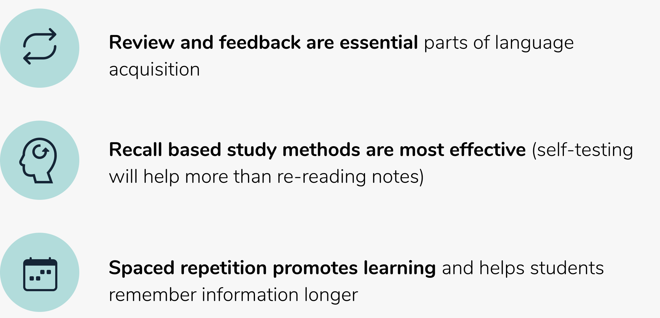
SECONDARY RESEARCH
“What research and data about language learning might inform this new feature?”
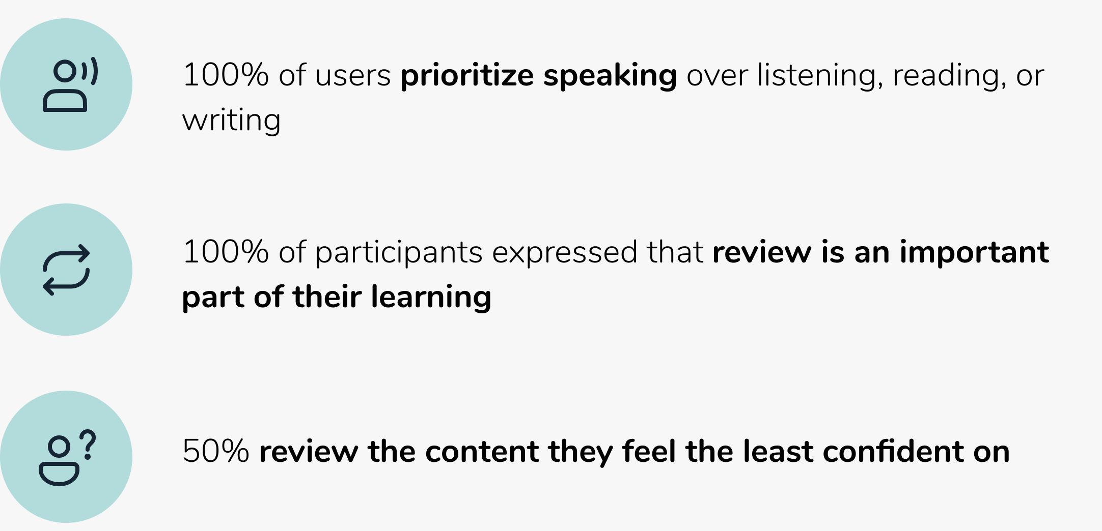
I conducted secondary research in order to learn more about best practices and how people learn.
Studies show:
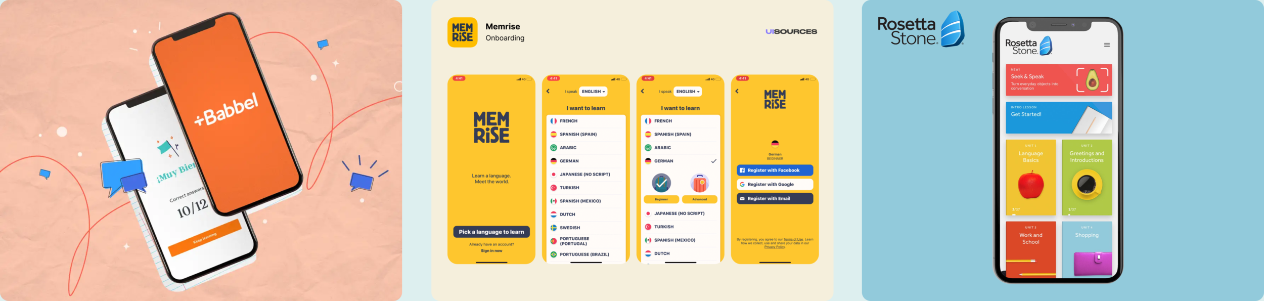
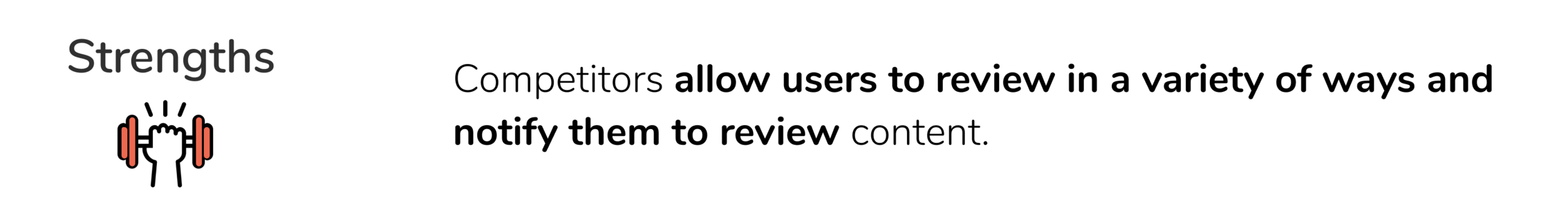
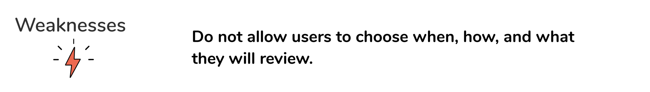
COMPETITIVE RESEARCH
“How have competitors incorporated practice and review into their product?”
My competitive research focused other popular language learning apps that users reportedly use in addition to or instead of Duolingo. I researched how these apps have incorporated practice and review into their lessons.
USER INTERVIEWS
“How and why do people learn foreign languages? What role does review play in their studies?”
User interviews for this project consisted of seven 1-on-1 interviews with participants ranging from 20-30 years of age who have studied a foreign language with Duolingo.
Crucial Findings
USER PERSONA
“Who is my user?
Using the data from quantitative and qualitative research, I identified the target group and created a persona to represent my user.
Meet Hannah the Capable Conversationalist!
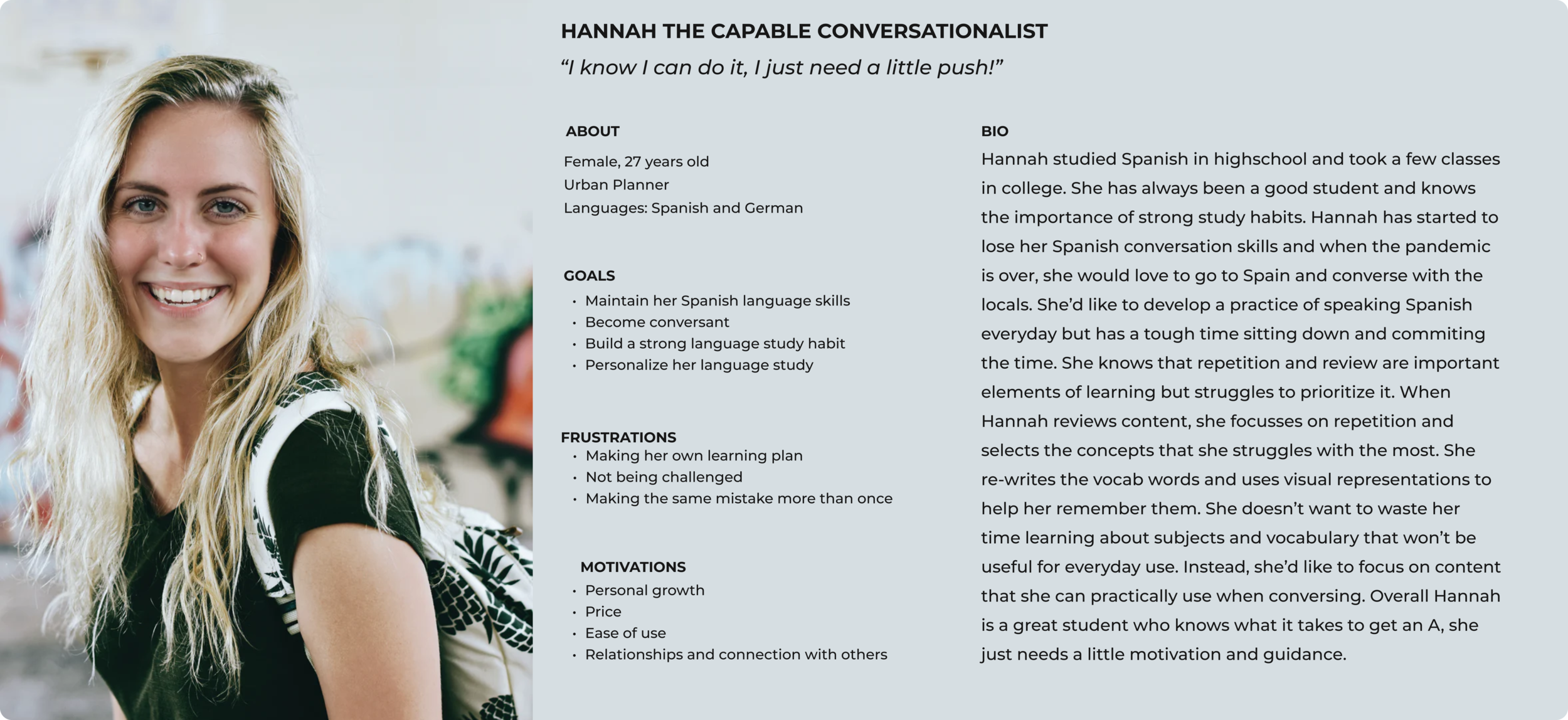

The Problem
Hannah wants a personalized language study plan that includes review so that she can become conversant in Spanish.
Building the Solution
After defining the problem, I created a customer journey map and sitemap, sketched and digitized wireframes, and built a high-fidelity prototype.

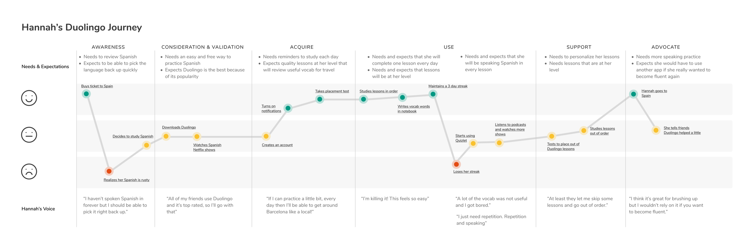
CUSTOMER JOURNEY MAP
“What are the key moments in Hannah’s Duolingo journey and how do they influence her?”
I mapped out Hannah’s journey through the app to understand how she feels when she is learning with Duolingo and what she is thinking along the way. This helped identify areas that need improvement.
SITE MAP
“How should the information of this feature be structured within the current app?”
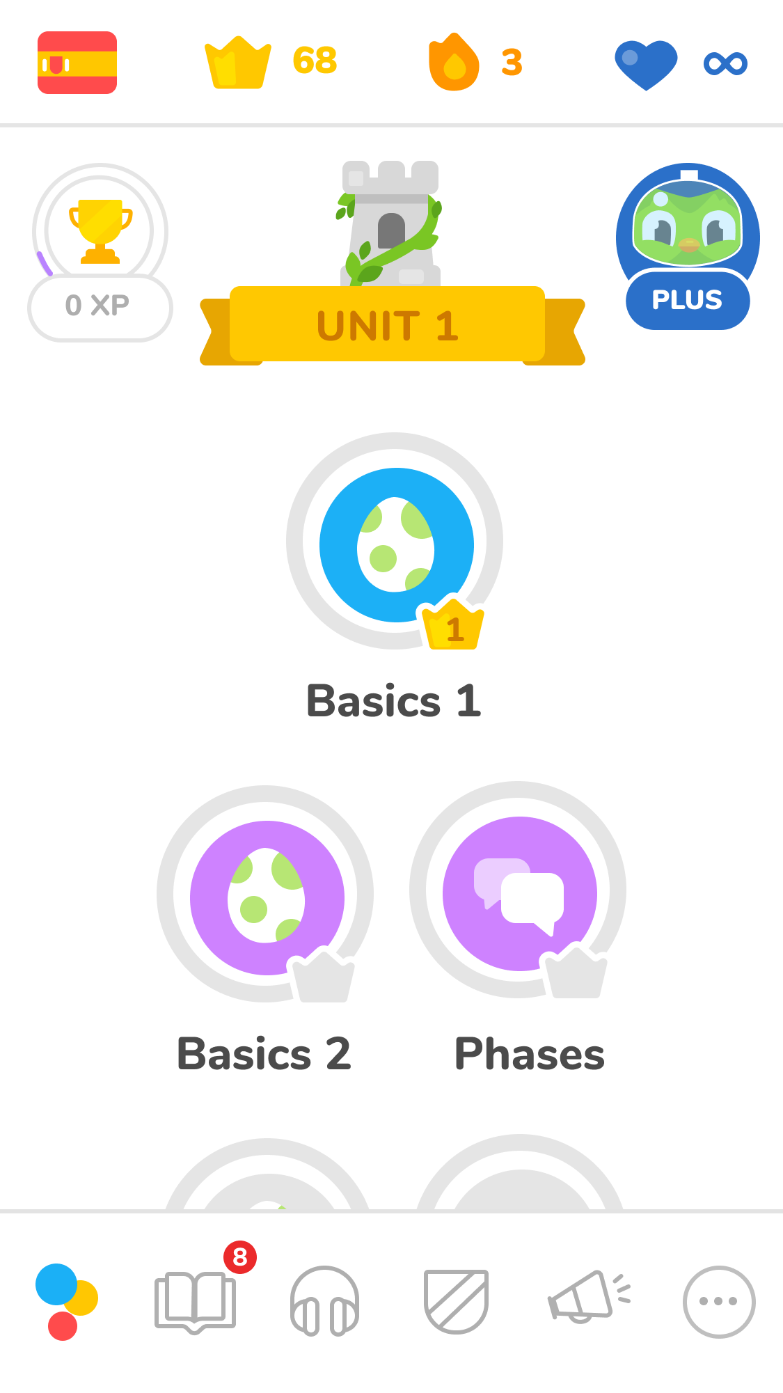
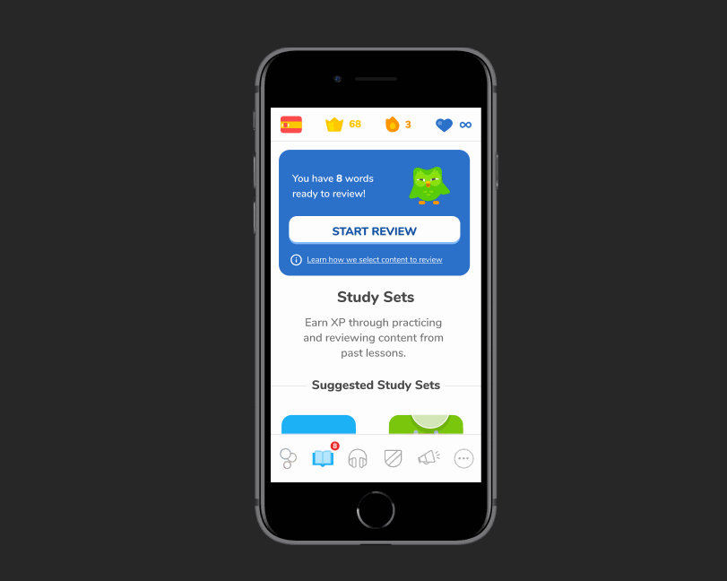
The site map allowed me to visualize all of the content for this feature and decide where it should live on the app. Duolingo currently has a feature called “Duolingo Stories” where a user can practice her listening and reading comprehension. I chose to incorporate my new feature with “Duolingo Stories” and grouped them together in the navigation bar under a new section called “Study”.
SKETCHING AND WIREFRAMES
“How should the information be visually represented on the page?”
With the site map in mind, I sketched out different designs for every screen of the app. I selected the optimal sketches and digitized them into high-fidelity mockups with in-depth notes about how the elements on each screen function.

The Solution
After creating the structure of the app, I created a clickable prototype in Figma.
PROTOTYPE
The Problem:
Hannah wants a personalized language study plan that includes review so that she can become conversant in Spanish.
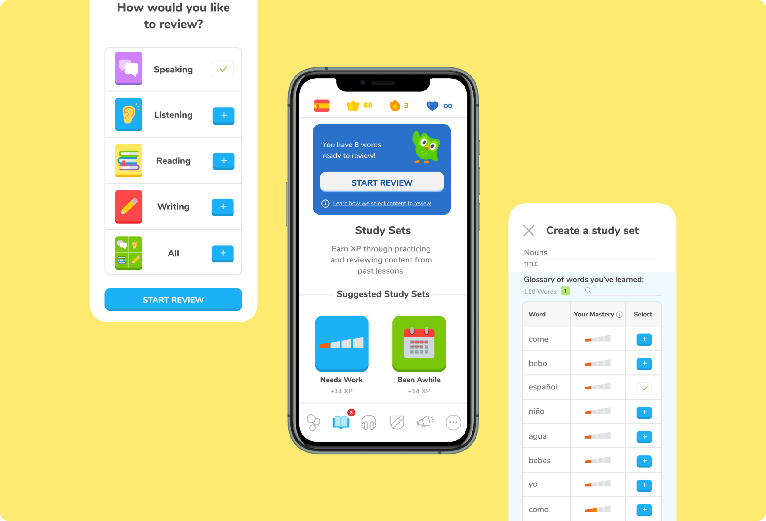
Solution 1
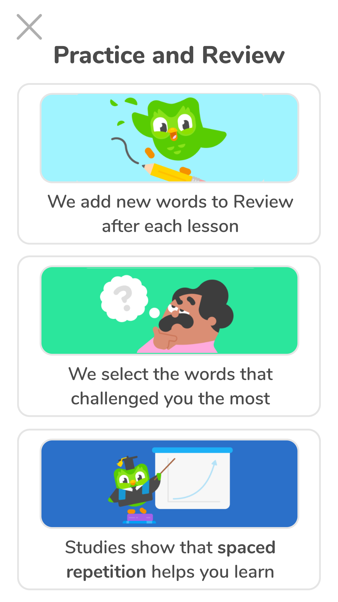
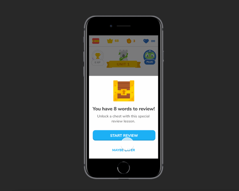
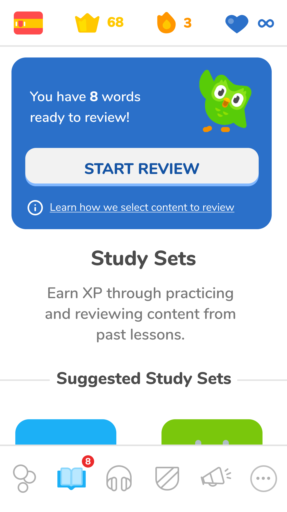
Review Notifications
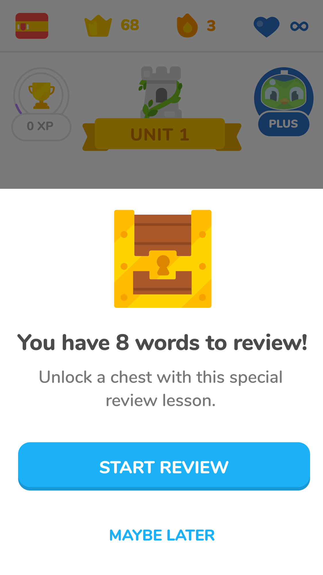
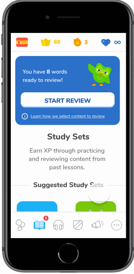
Once Hannah has completed a lesson, Duolingo will send her a notification that she has new content to review. This builds review into her daily learning plan and focuses on the words that challenged her most in the previous lesson.
Solution 2
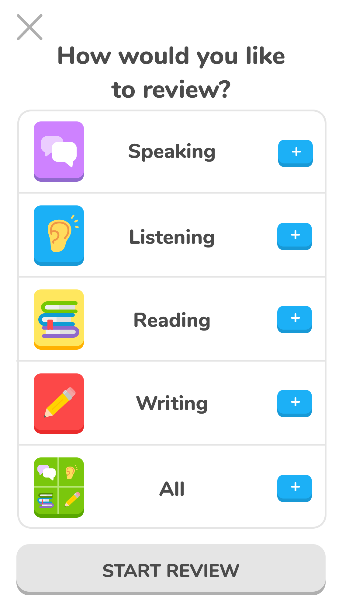
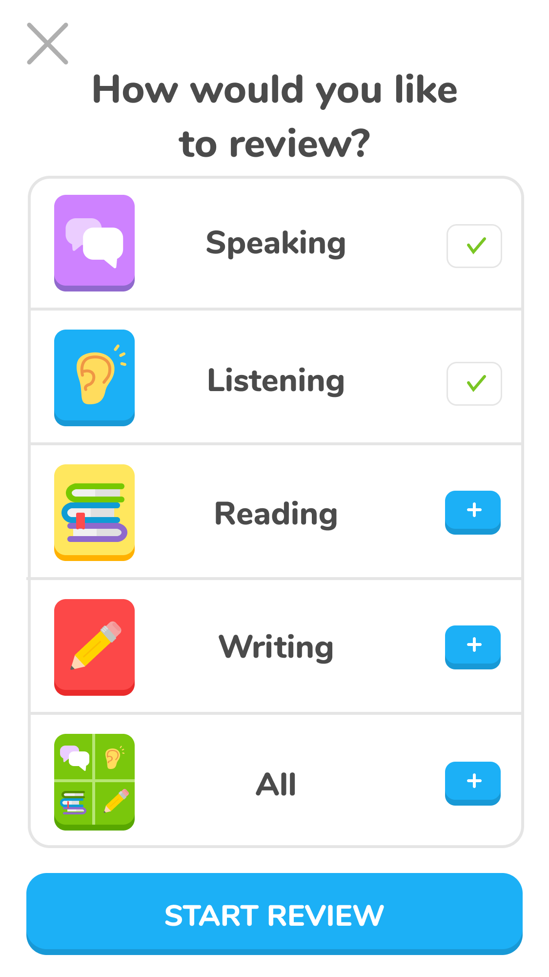
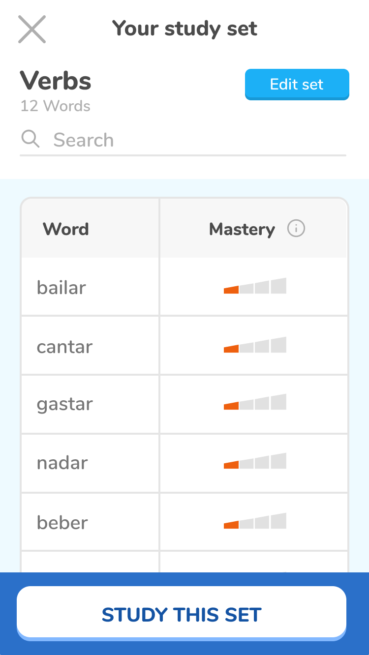
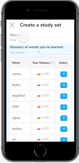
Customizable Study Sets
Hannah can create her own sets to study and categorize her review content. She selects from a glossary of all the words she has learned and categorizes them into groups that she would like to study.
Solution 3
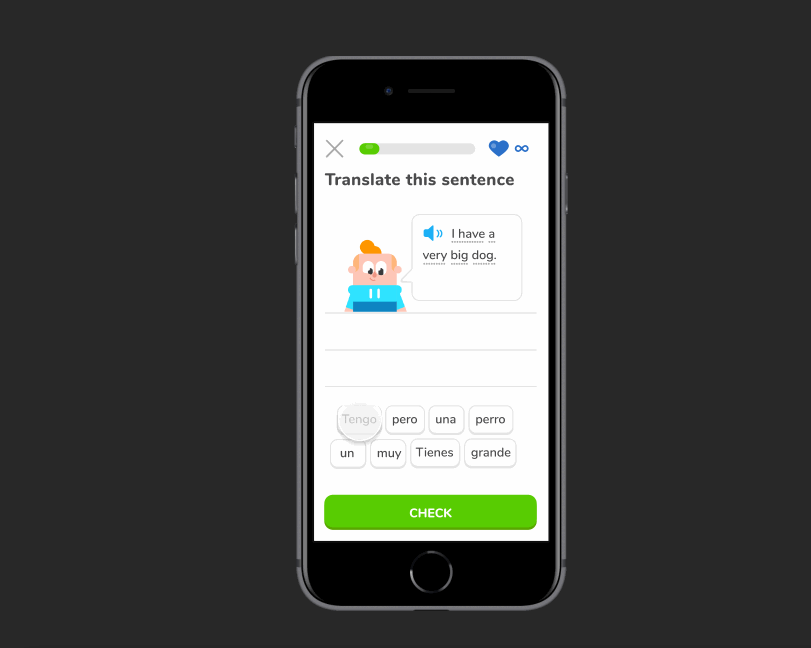
Customizable Review Method
Hannah can choose how she wants to review her vocabulary words and Duolingo will quiz her based on her selections.
Solution 4
Correct Answer Feedback
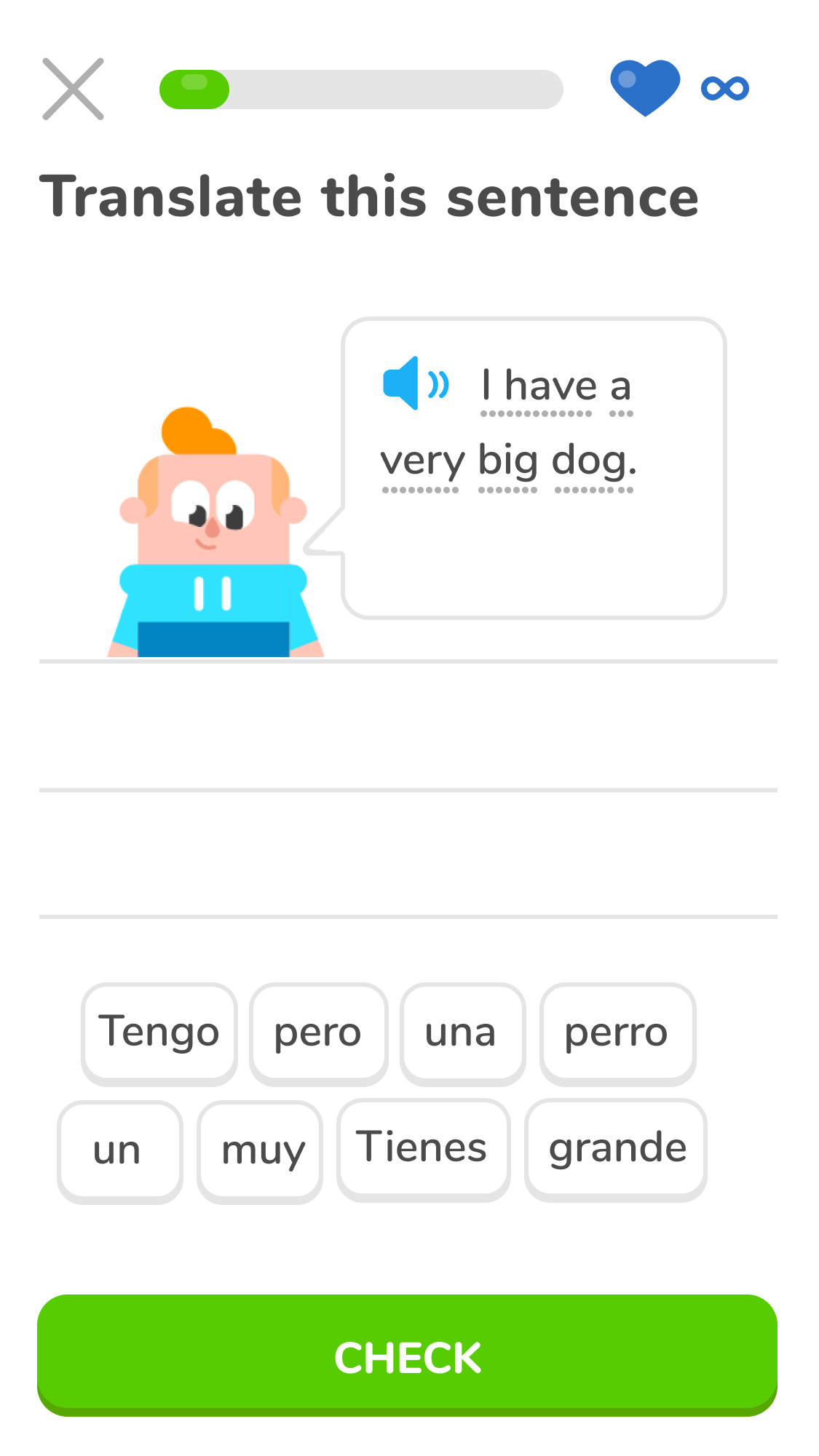
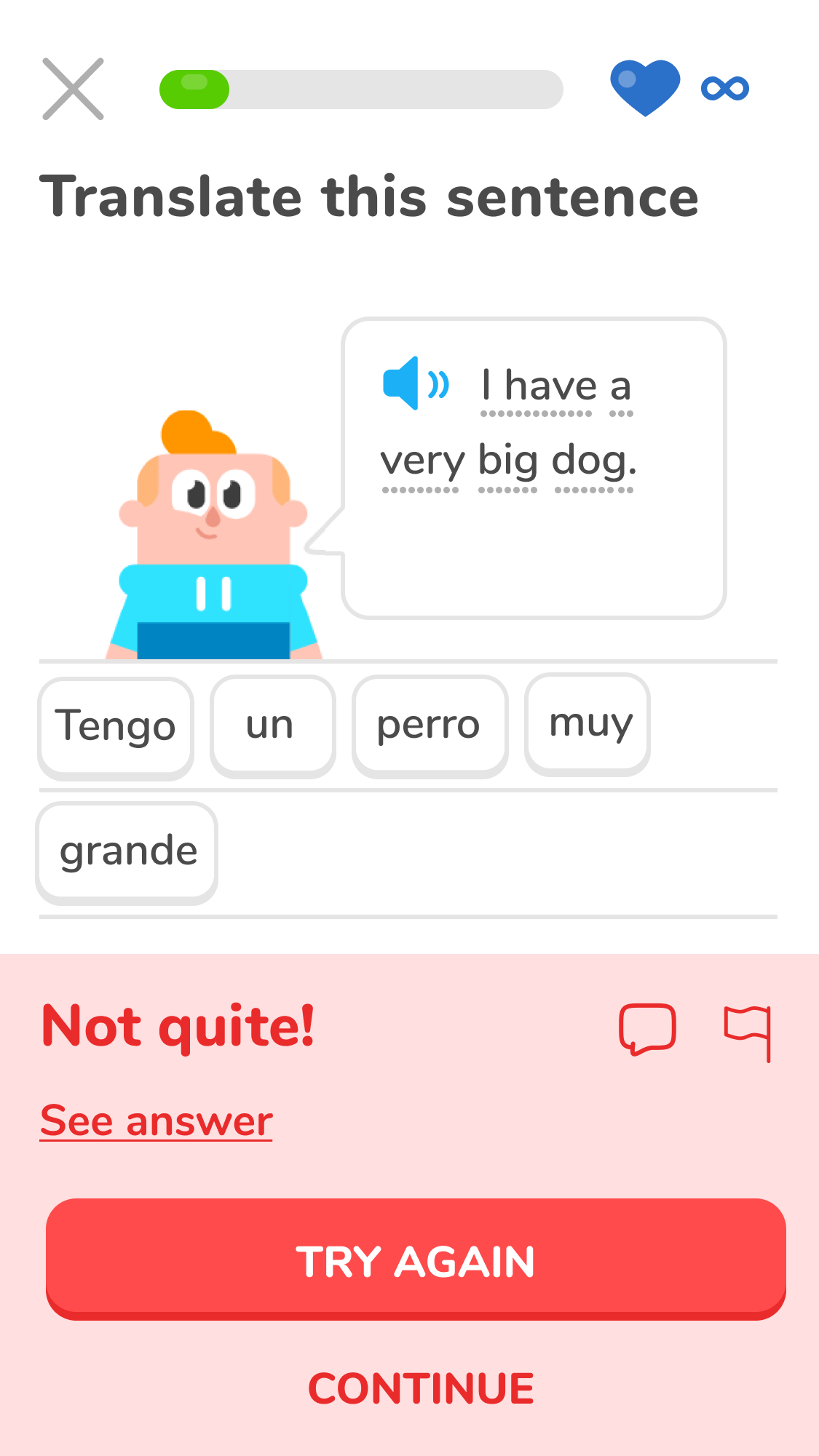
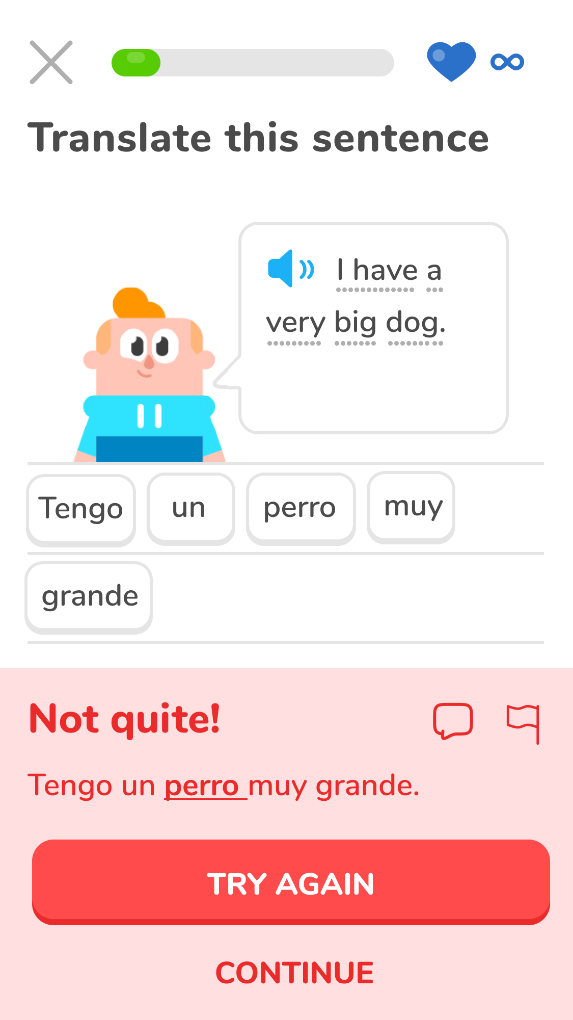
Hannah is prompted to fix her mistakes immediately so that she does not make them again. These questions will also be reshuffled back into the deck for repetition. Currently Duolingo does not ask the user to fix their mistakes.
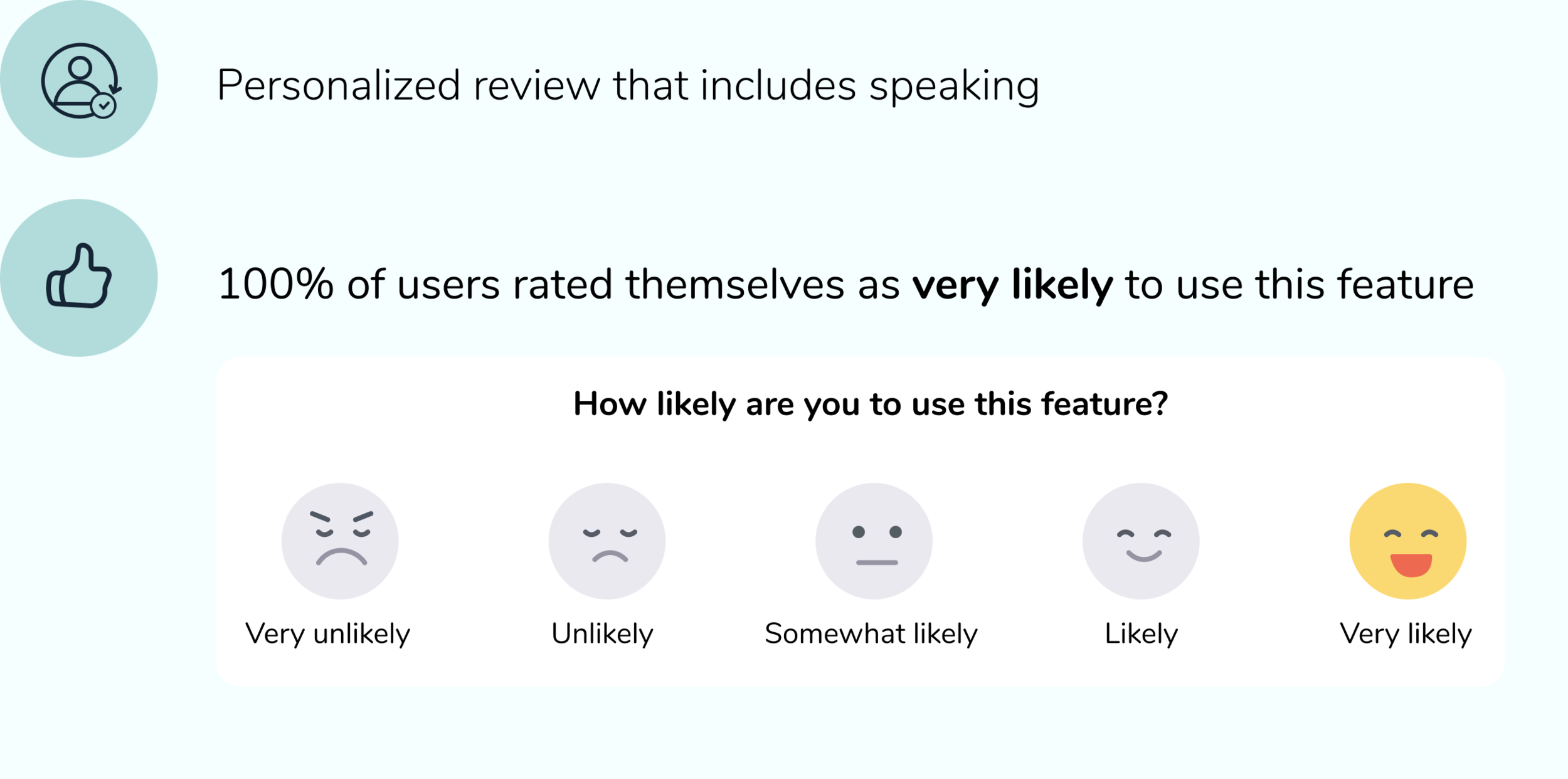
Testing the Solution
After I built my solution, I conducted usability tests and iterated on my designs based on the feedback that I received.

USABILITY TESTS
“Are my designs effective and did I solve Hannah’s problem?”
After conducting usability tests with twenty participants, it is clear that the designs solved Hannah’s problem. The participants were very excited about this feature and reported that they would be very likely to use it.
AFFINITY MAP & PRIORITY REVISIONS
“How can I utilize user feedback to improve my designs?”
In my usability tests, participants identified aspects of the app that needed improvement. I utilized an affinity map to determine which improvements should be prioritized based on user value and amount of effort.
Iterations
Made information about how review content is selected more visible because it was difficult to find
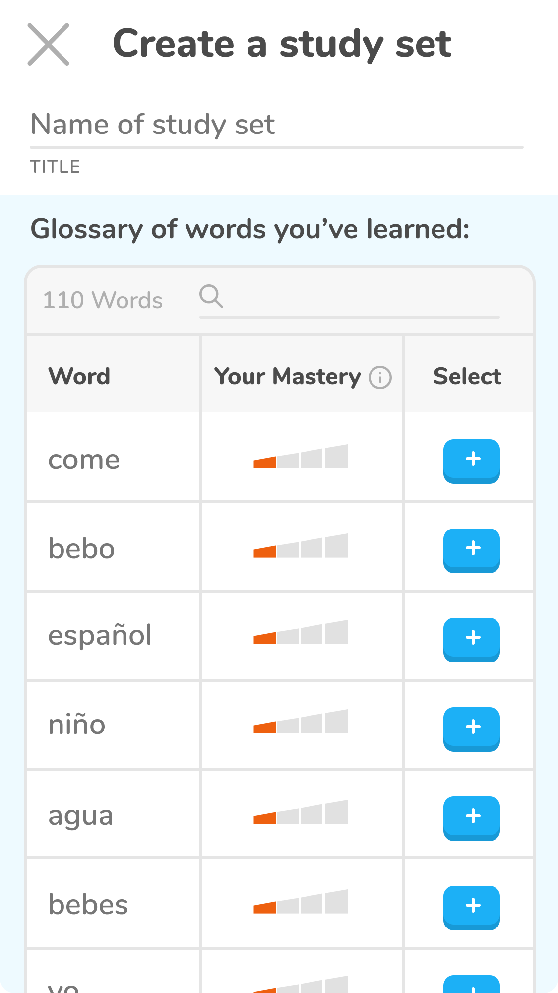
Clarified copy to “Your Mastery” instead of “Strength” and rearranged the glossary for clarity
Allowed user to choose to see the answer instead of it being shown automatically
Reflecting on the Process
Once I finished the project, I reflected on what I would have done differently and provided next steps.

REFLECTION
“What would I have done differently?”
I would have spent more time taking lessons and being a student with Duolingo during the research process so that I had a deeper understanding of the current ways that Duolingo allows users to review.
NEXT STEPS
“What would I do next if there was time available?”
I would test the new designs and specifically further test the current user flow for creating a study set. There was a mild pattern of confusion with this task and I would want to test it out on a larger population before making any major structural changes.