Redesigning a library catalogue for divergent personas.
The Englewood Public Library online catalog houses all of the library’s content, connecting users to physical and digital resources. Given the small size of the city, the library also fills the role of the local history museum due to their large archives of historic materials.
Client: Englewood Public Library
My Role: Contracted Designer
Project Time: Two weeks
The Challenge
Redesign a responsive online catalog for the Englewood Public Library that is browsable and searchable.
My Role
I worked as a contracted product designer on this project. I also performed the duties of a project manager by creating a timeline for the project and communicating with all of the stakeholders involved.
On average this redesign helped users checkout a library book 16 seconds faster.
Understanding the Problem
In order to better understand the problem space, I conducted user interviews and crafted user personas.
USER INTERVIEWS & CONTEXTUAL INTERVIEWS
“Who uses the online catalog and for what purpose? How does the catalog influence their reading choices?”
I conducted user interviews and contextual interviews with library patrons and librarians at the physical library to learn about how they currently use the catalog. I also interviewed locals who do not use the library services to learn more.
Crucial Findings
USER PERSONA
“Who is my user?”
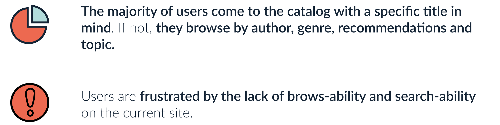
The qualitative and quantitative data revealed that the library has two very different user groups:
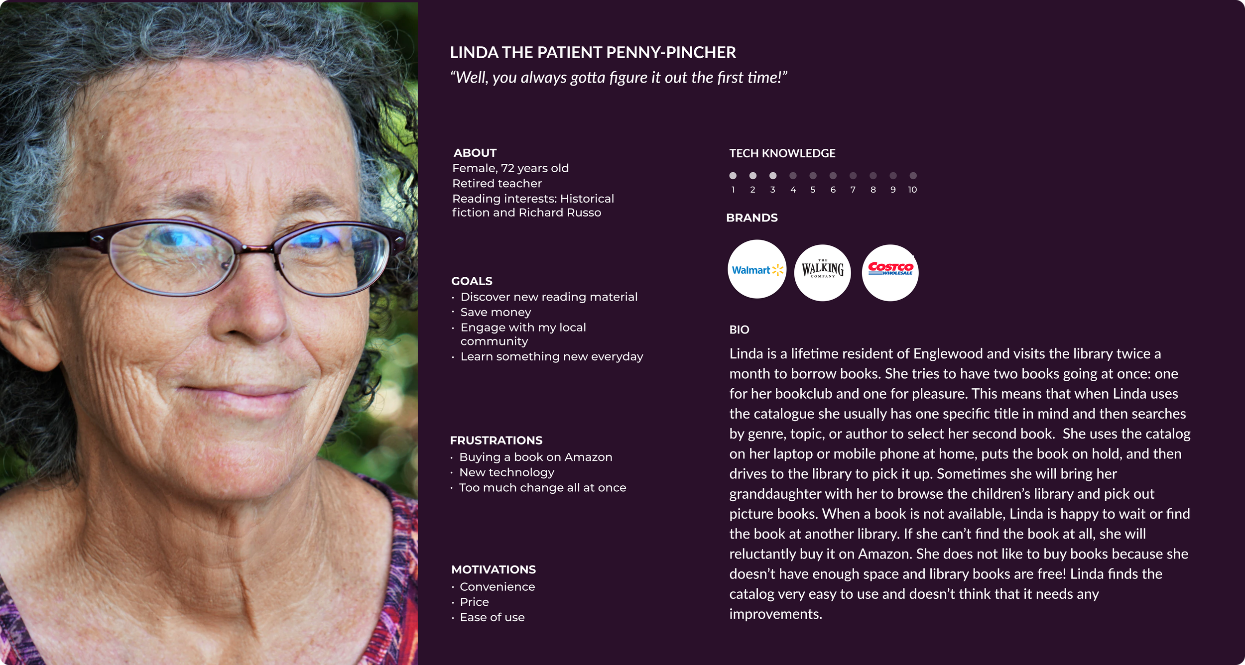
Frequent catalog users over the age of 70 with limited tech knowledge who have learned how the catalog works and find no need for improvement.
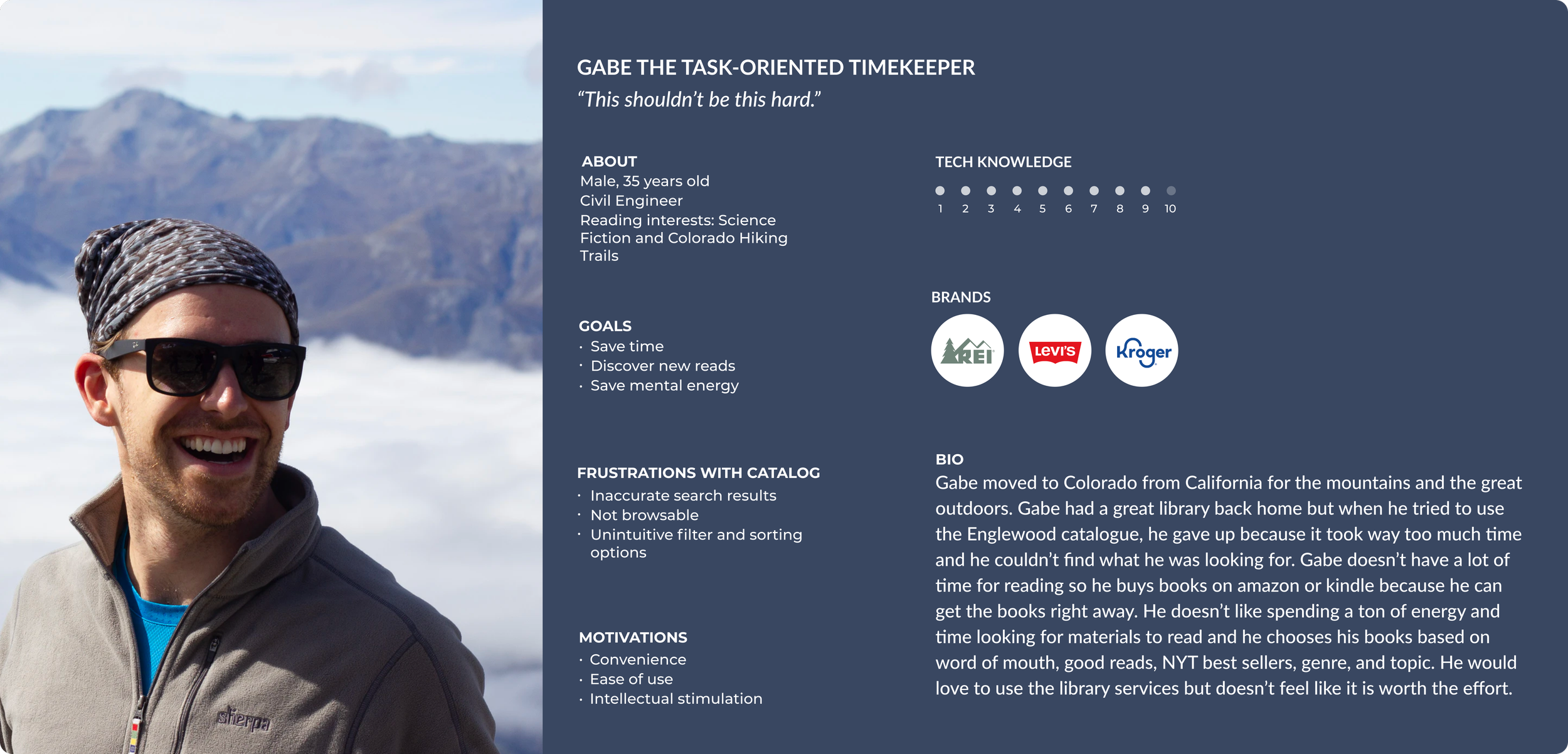
People under the age of 70 with strong tech knowledge who don’t use the library because the online catalog takes too much time and is not user friendly.
With these user groups in mind, I created two personas: Linda the Penny Pinching Pragmatist and Gabe the Task-Oriented Time Keeper.
The Problem
Gabe wants a fast and easy way to check out a library book. Linda is happy with the current catalog and does not want to relearn how to use it.
Building the Solution
After defining the problem, I conducted a card sort, built the sitemap, sketched and digitized wireframes, and built a high-fidelity prototype.
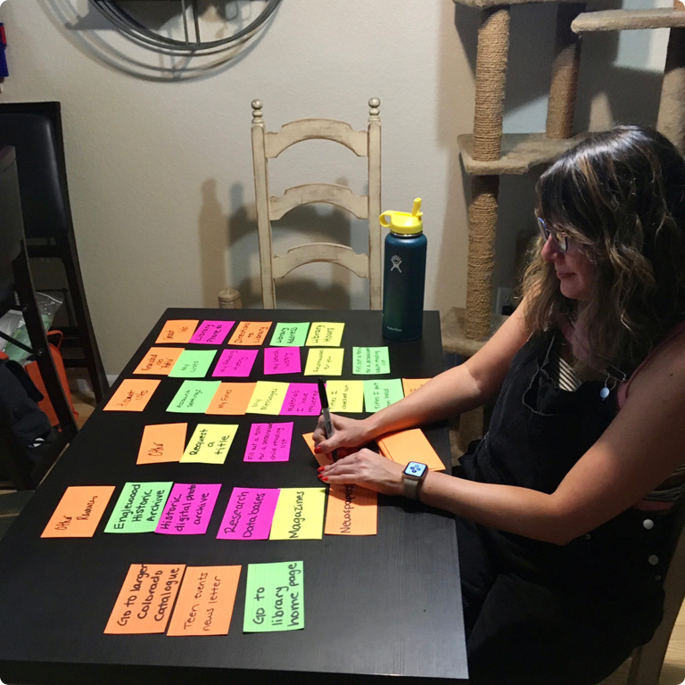
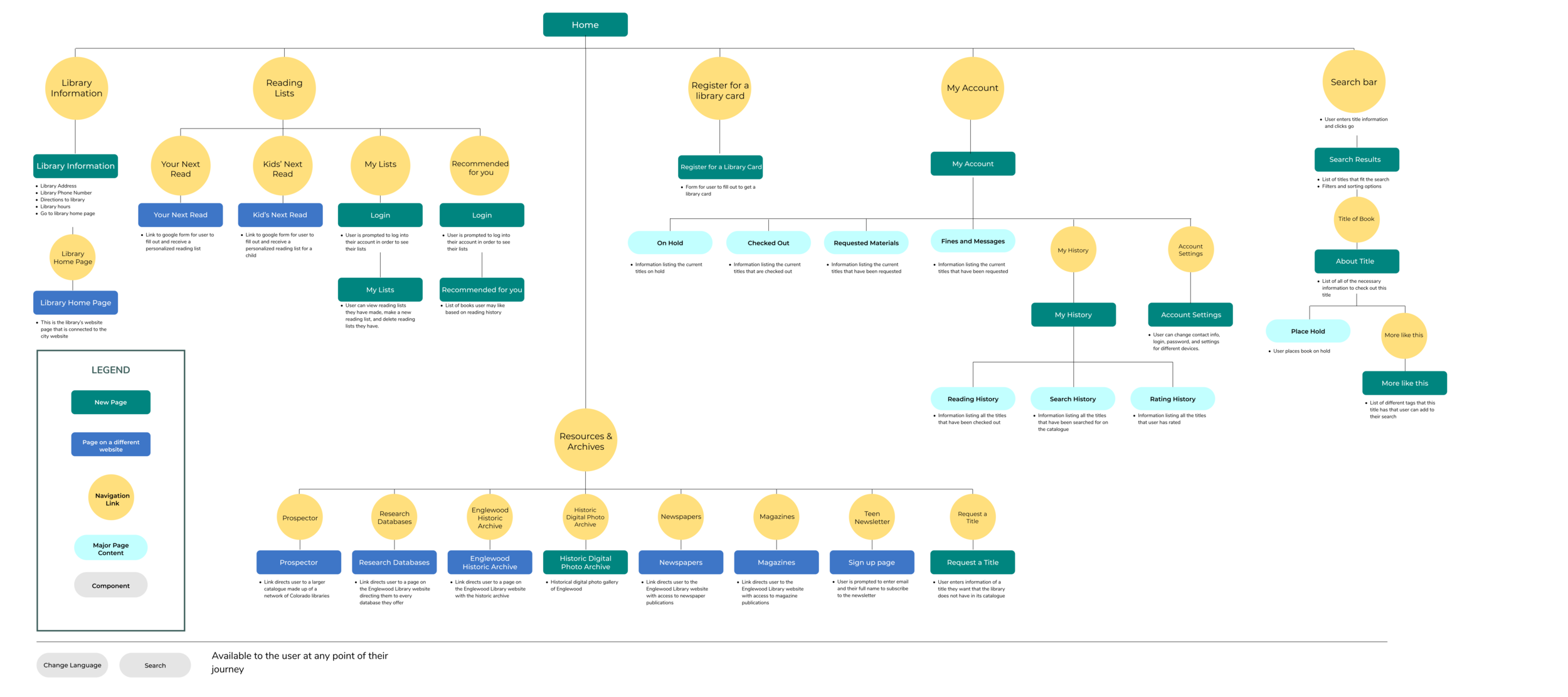
CARD SORTING AND SITE MAP
“How should the information on the catalog be categorized and structured?”
Given the extensive list of resources that the library provides, I conducted card sorts to better understand how to categorize the information in a navigation bar. I synthesized the results, identified common patterns, and created a site map detailing how all of the catalog content will be organized.
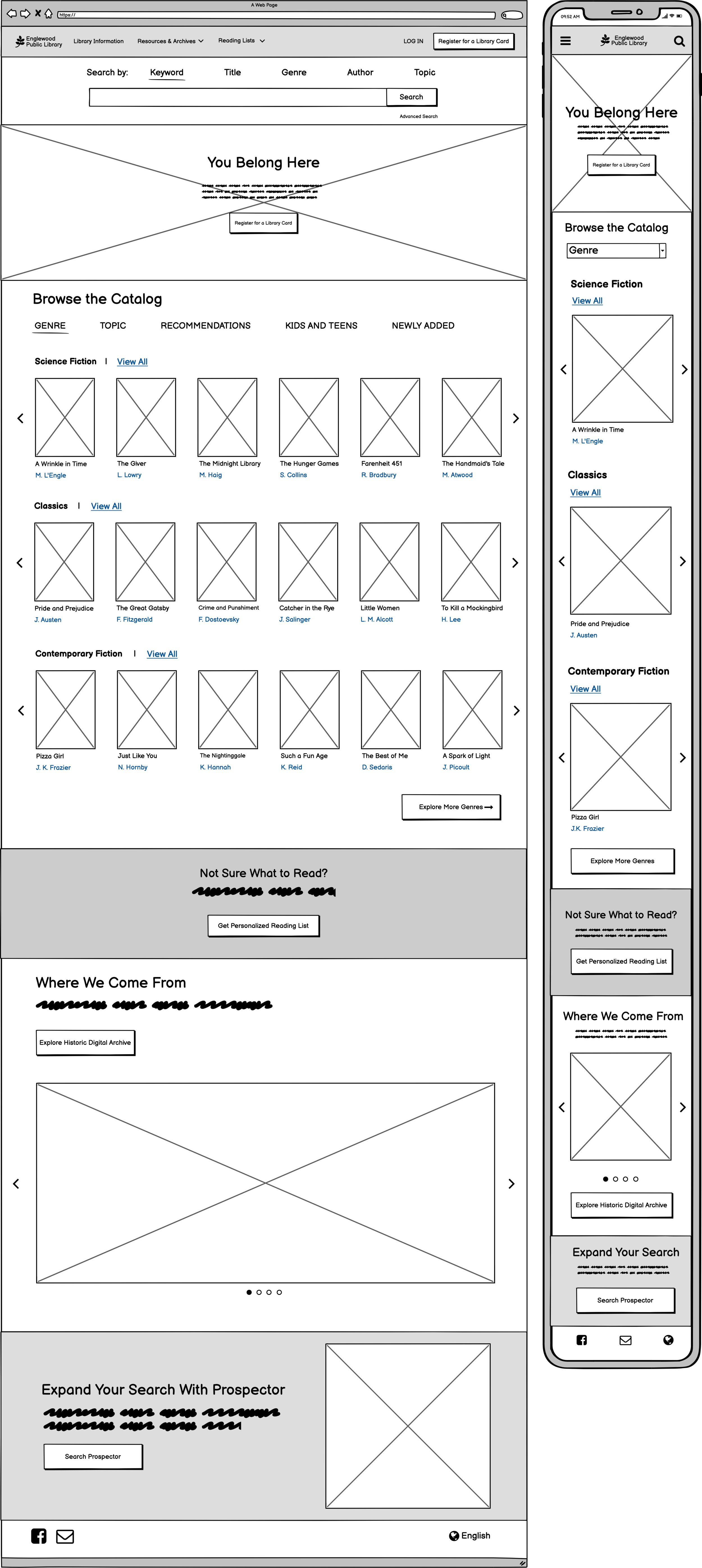
SKETCHING AND WIREFRAMES
“How should the information be visually represented in the catalog?”
With the site map in mind, I sketched out different designs for the screens I planned to prototype and test. I selected the optimal sketches and digitized them into high-fidelity mockups.

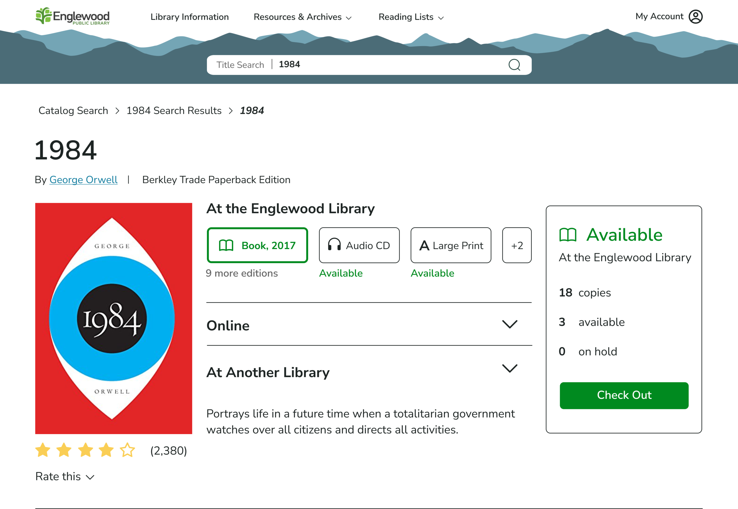
The Solution
After creating the structure of the website, I created a clickable prototype in Figma.

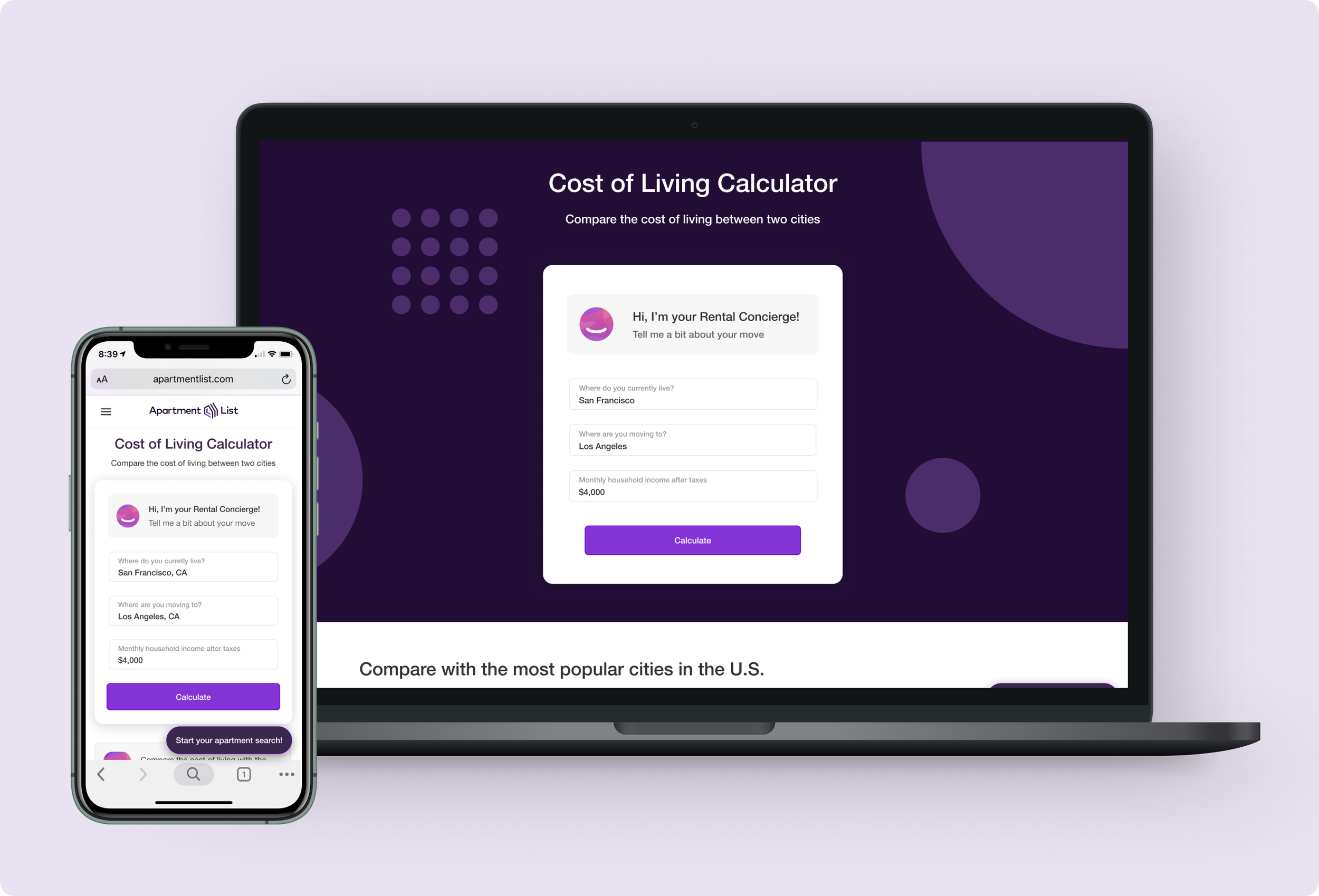
PROTOTYPE
Problem 1: Gabe wants a fast and easy way to check out a library book.
Search bar with filter options 🔎
The homepage features a search bar that allows Gabe to specify and narrow his search from the very beginning.
Filter and sorting options 🗃️
Dropdown menus in the search results allow Gabe to narrow his results and save time. Instead of searching multiple times with a text-based search, he can quickly narrow and sort his results.

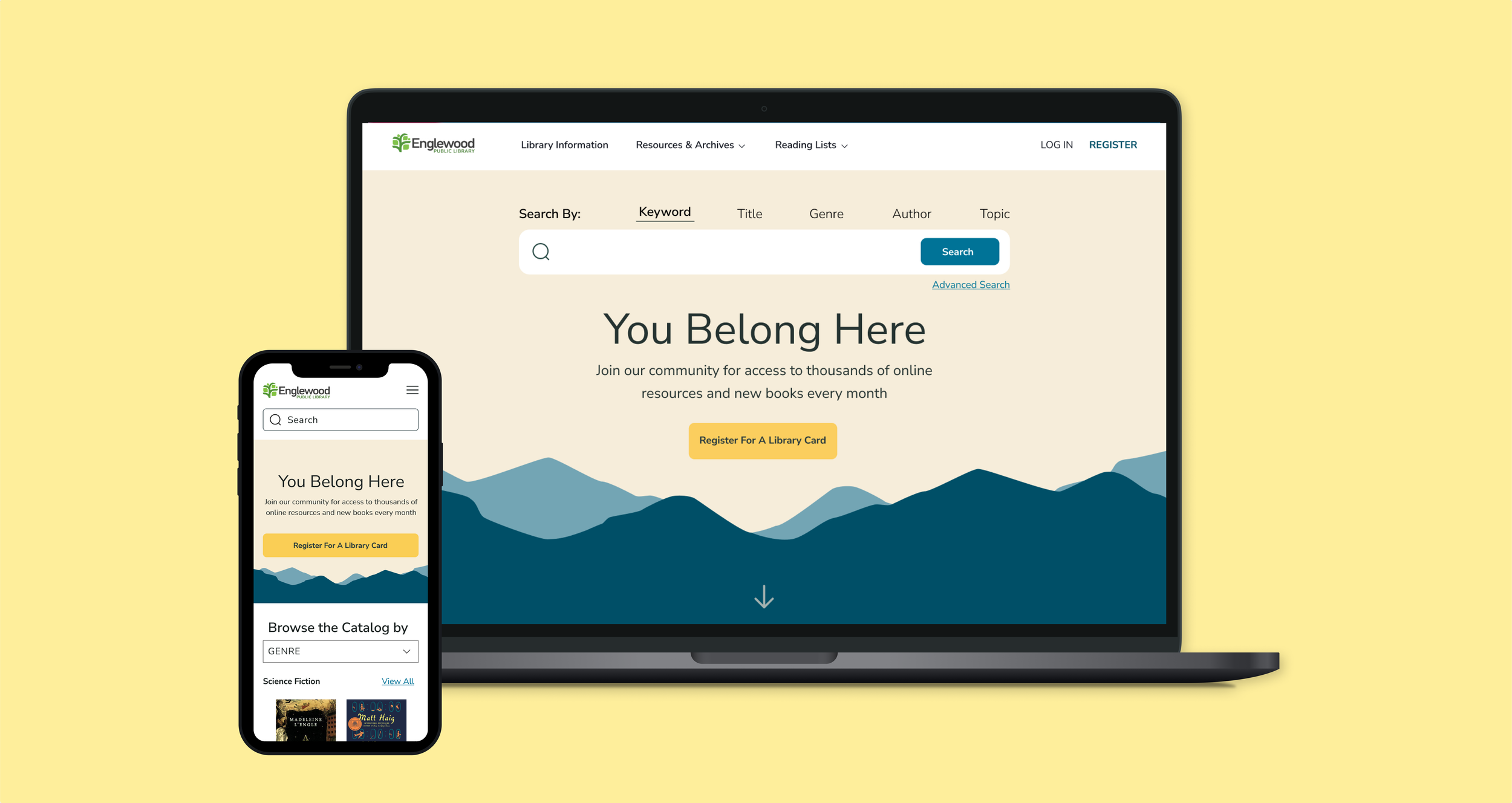
Problem 2: Linda does not want to relearn how to use the catalog.
Simplify the design
I stuck to a very simple color scheme and familiar font from the Englewood City website so that the catalog still feels familiar to Linda. All of the features of the original catalog are there, but now they are organized in a simpler and less cluttered way.
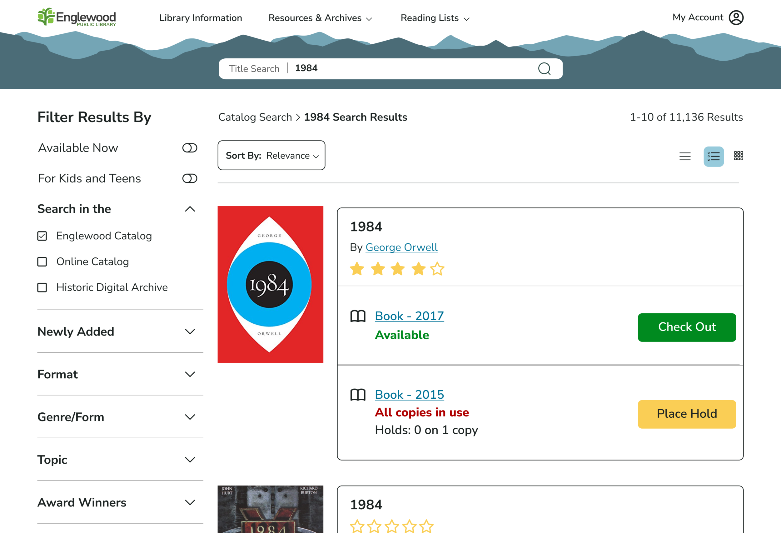
Before
After
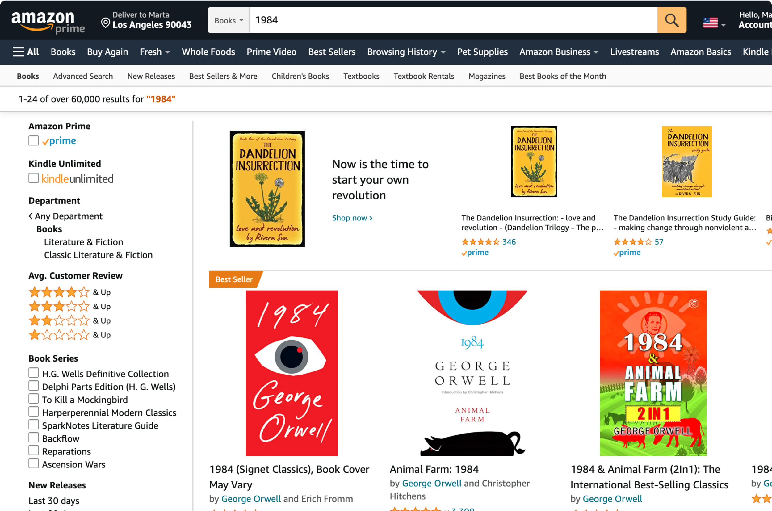
Utilize features from other familiar websites
In my user interviews participants expressed that they often buy books on Amazon. I adapted elements from the Amazon website into the library catalog so that users can rely on their past experiences to help them navigate the new catalog.
Amazon Search Results
Catalog Search Results
Reflecting on the Process
Once I finished the project, I reflected on what I would have done differently and provided next steps.

REFLECTION
“What would I have done differently?”
I would have narrowed my designs for a single user action earlier in the process. I originally planned to prototype and test screens for both checking out a book and browsing, but towards the end of the project I realized that was too much to complete in the given time. I wished I had realized that earlier so that I could have used my time more intentionally.
“What would I do next if there was time available?”
I would build out the expanded navigation bar and test how users respond.
Additionally I would prototype the filter and sorting features and test those as well.