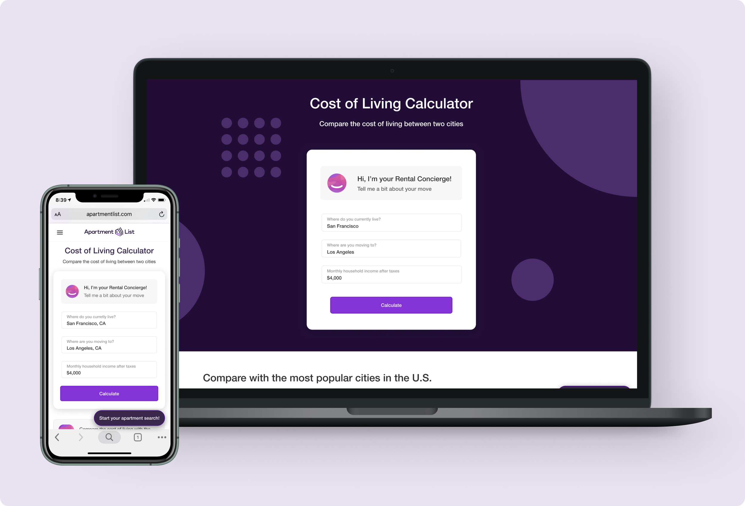
Personalizing the registration experience based on persona.
Apartment List tricks their users into taking a 17 question quiz about their apartment search and then requires them to create an account in order to see their apartment matches. Our user research found that this method works very well for some renters but alienates others.
Client: Apartment List
My Role: Product Designer
Project Time: Three weeks
The Challenge
Design a more personalized quiz and registration experience that bifurcates based on user persona and how they search for apartments.
My Role
I worked as the lead product designer on this project. I shared my work in design critiques with our design team and collaborated with stakeholders to build the final product.
I was the team lead for this project and we won our annual company Hack Week.
Understanding the Problem
In order to better understand the problem space, I collaborated with our Product & Analytics team and created persona cards.
THE CURRENT EXPERIENCE
“What does our current experience look and feel?”
In the current experience, users who land on our site are pushed into a 17 question quiz that asks a series of very detailed questions about their apartment search. After taking the 17 question quiz, the user must register in order to see their results.
DATA & ANALYTICS
“How is our current experience performing? Where is there room for improvement?”
I partnered with our Product and Analytics team to pull statistics about our current quiz experience. We found that very few users register to create an account and that most drop-off as the quiz goes on.
USER PERSONA
“Does the quiz fit the needs of our personas?”
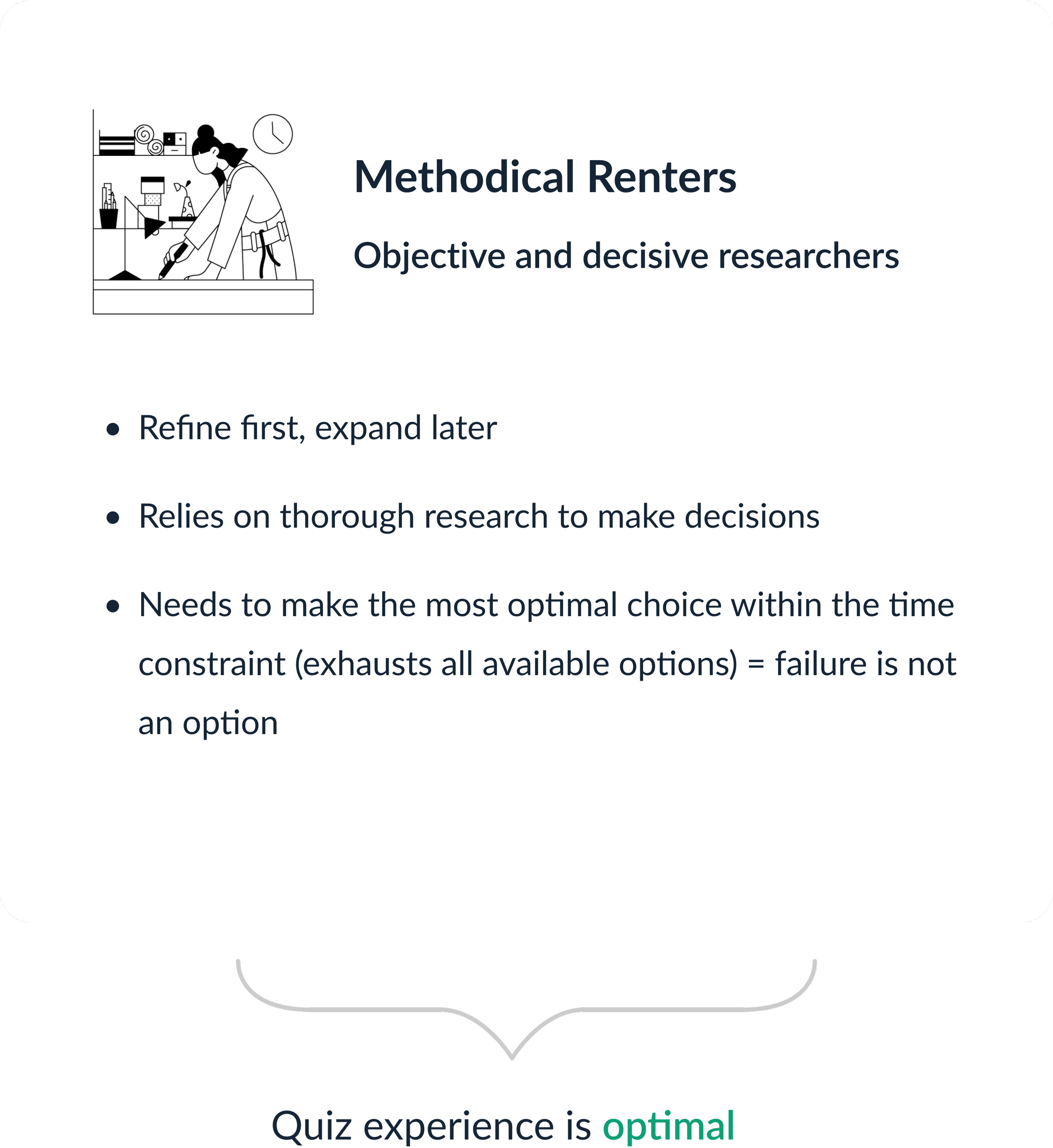
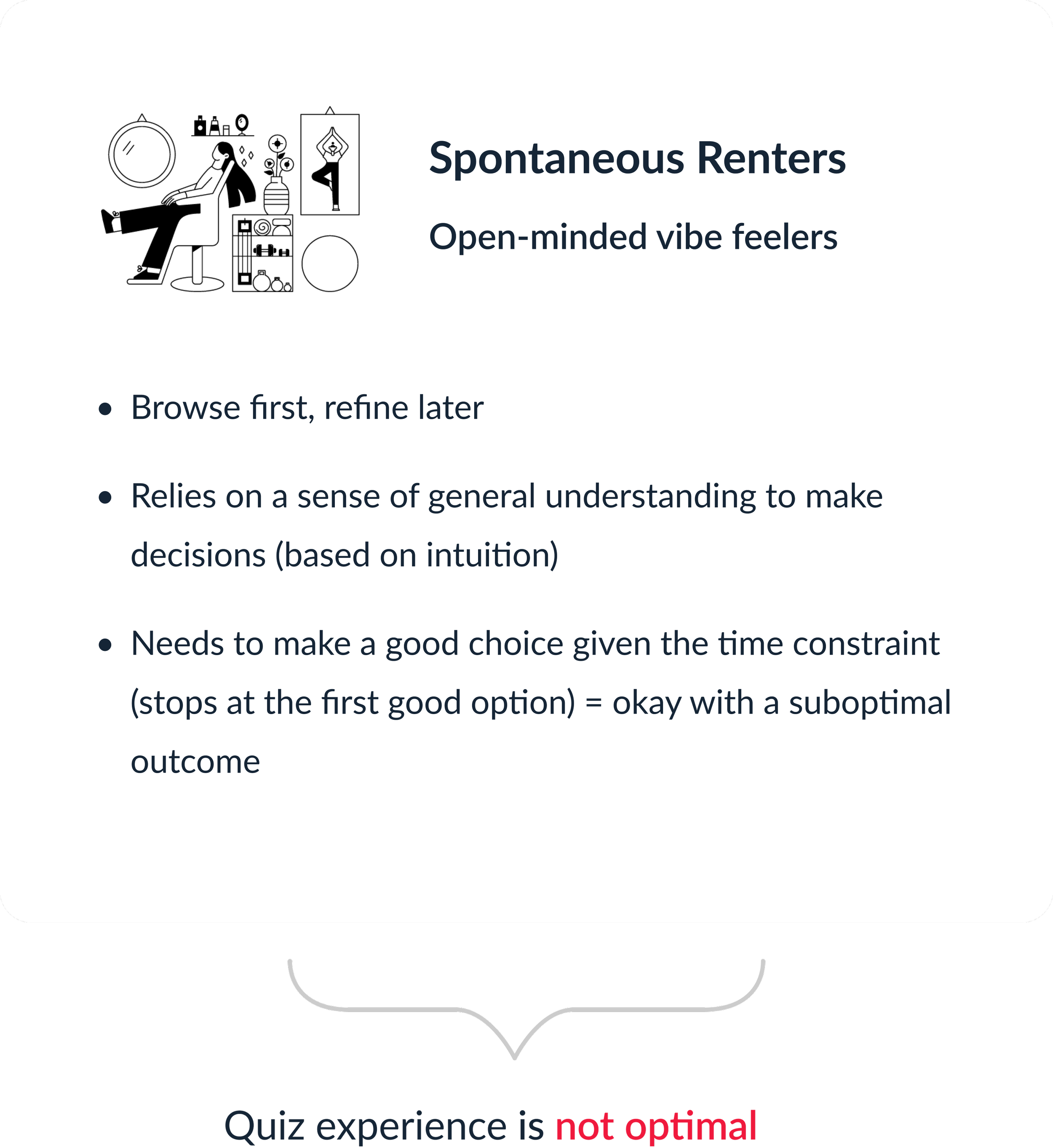
In order to better understand our users, I partnered with our Director of User Research to create persona cards that summarize Apartment List’s users. His research found that most renters are either spontaneous or methodical.
The User Problem
Our quiz experience fails Spontaneous Renters because it filters options when they don’t want it to and forces them to spend more time tinkering with the platform than they need.
Building the Solution
After defining the problem I began my design explorations, presented them to our design team, and iterated towards the final product.
DESIGN EXPLORATIONS
“How should we approach quiz bifurcation?”
I explored several different bifurcation directions, presented my solutions to the design team, and prepared two different bifurcation approaches for usability testing.
Treatment A
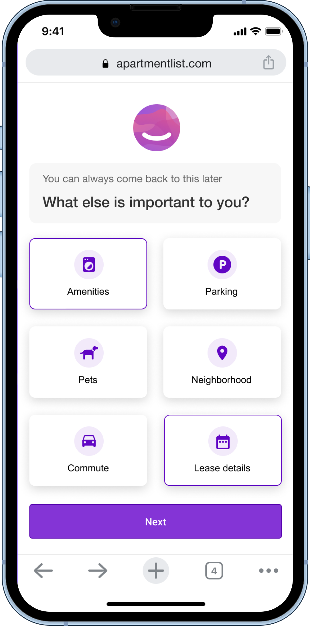
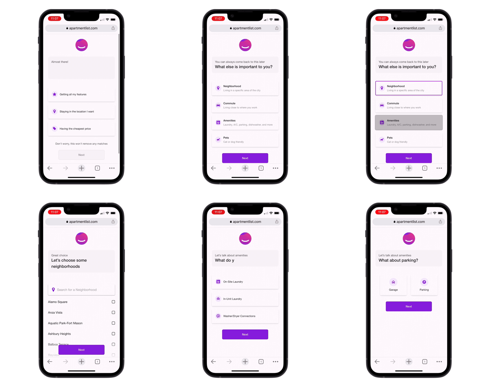
A user is only shown quiz questions that they select as “important to them”. If it is not important, then they will not be shown that quiz question.
Treatment B
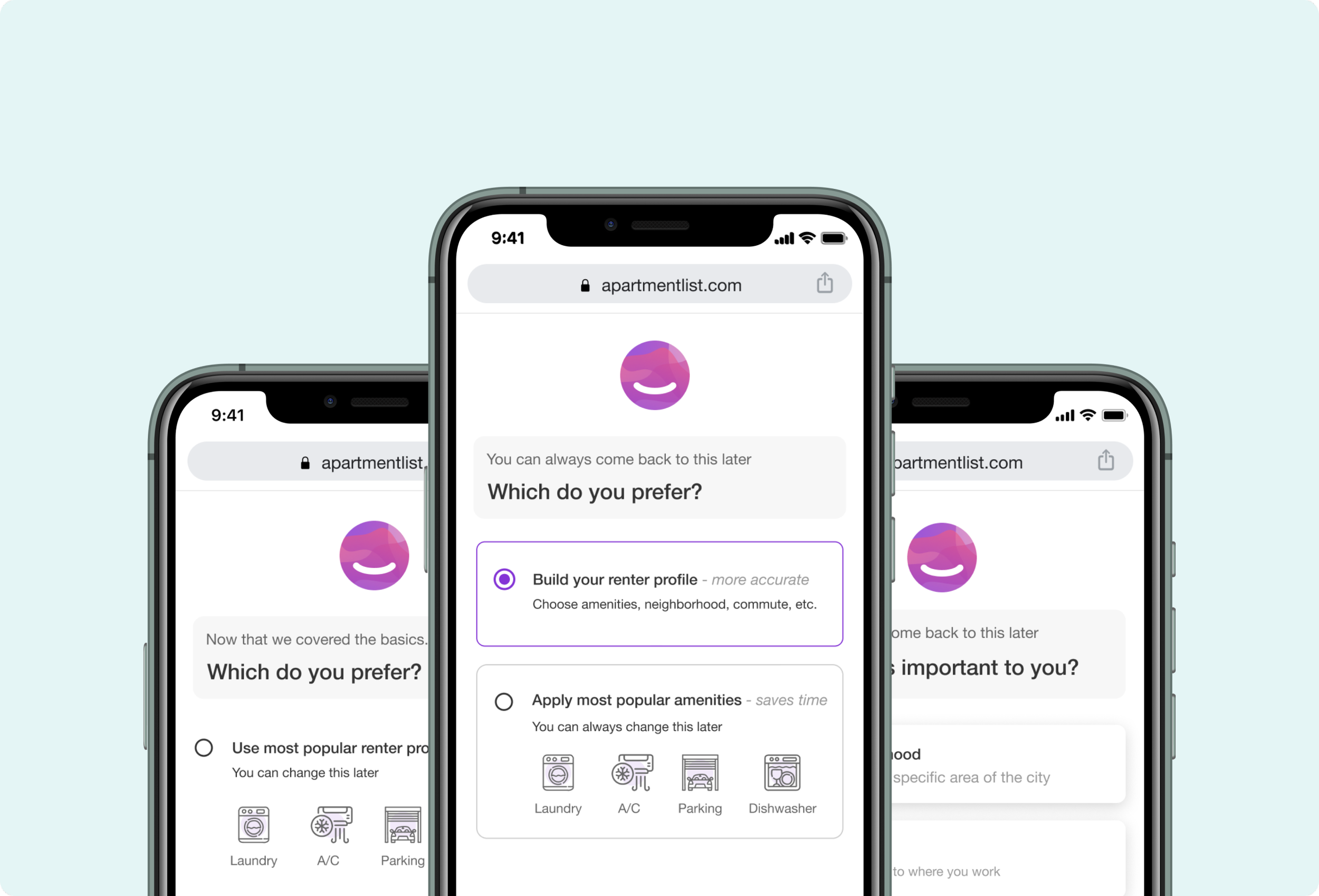
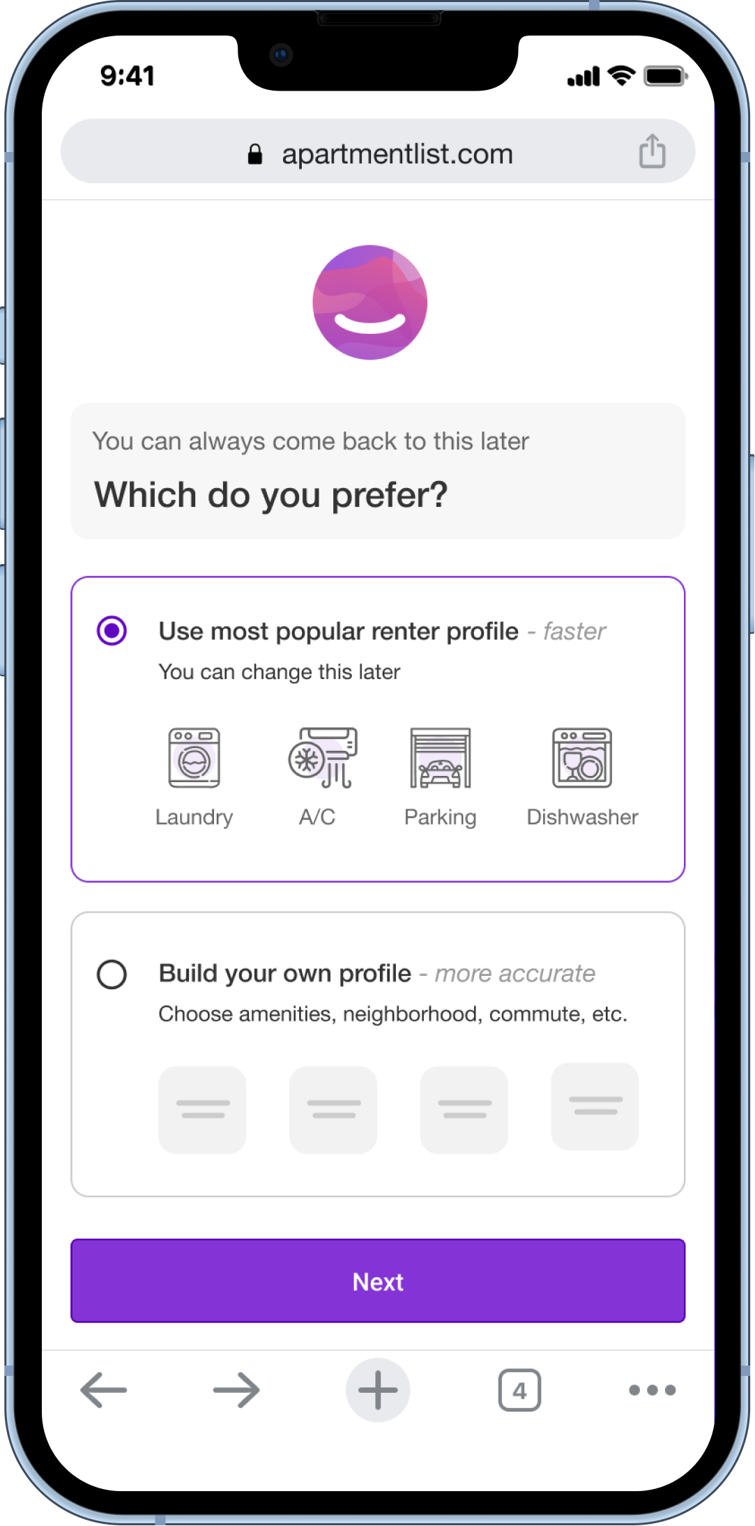
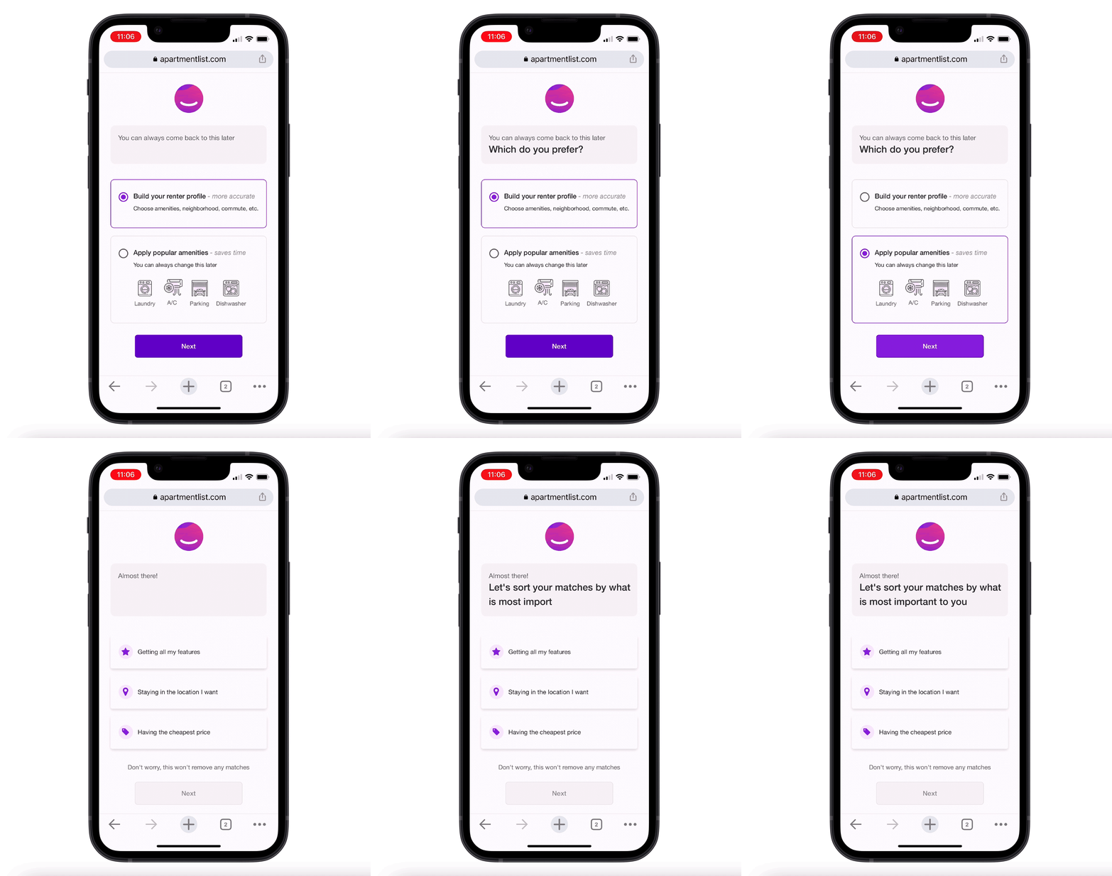
User can skip a handful of questions by selecting the most popular amenities and jumping to the end of the quiz.
Testing the Solution
After designing the solutions, I built prototypes, conducted usability tests and iterated on my designs based on the feedback that I received.
USABILITY TESTS
“Are there any major usability issues? How can we improve?”
I conducted usability tests on usertesting.com with 12 participants on mobile devices. The goal of these tests was to determine if there were any major usability issues and to discover opportunities for iteration.
Treatment A
“I don’t know what’s in each of these categories. What’s included in amenities?”
“I love that this gives me more options for my search!”
Treatment B
“I wouldn’t choose the ‘Most Popular Renter Profile’ because it doesn’t sound personalized.”
Treatment B
The Solution
After iterating on the feedback, I handed off the designs to our engineering team
SOLUTION REVIEW
“Do these designs meet the product requirements and solve the user problem?”
Treatment A
All users experience a more personalized and expedient quiz as they are only presented with the quiz questions that matter most to them
Based on usability feedback, categories now show which quiz questions live within each category so users know what they can expect to be asked next
Treatment B
Spontaneous users have an “escape hatch” that will allow them to skip to their matches and browse apartments faster
The quiz experience remains unchanged for renters who choose to build a profile
Based on usability feedback, copy has been changed to “most popular amenities” since “most popular renter profile” was not well received
Caution! - Roadblock -
Caution! - Roadblock -
This project got deprioritized for a full quarter due to a Google algorithm update that tanked our SEO.
Caution! - Roadblock -
Caution! - Roadblock -
Our team won Hack Week 🎉
In response, I formed a team during our company Hack Week and led us to build a shippable test in under one week.
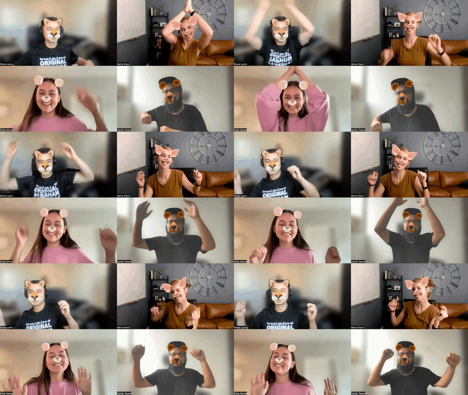
We also won a dance challenge 🐷🐱🐻
Reflecting on the Process
Once I finished the project, I reflected on what I would have done differently and provided next steps.
REFLECTION
“What would I have done differently?”
I would have run some initial usability tests with very simple prototypes before designing higher fidelity mockups. I think I could have come to some more innovative solutions and more insights if I spoke to users earlier in the process.
“What would I do next?”
I would redesign the registration experience so that it complements the new bifurcation quiz experience.


