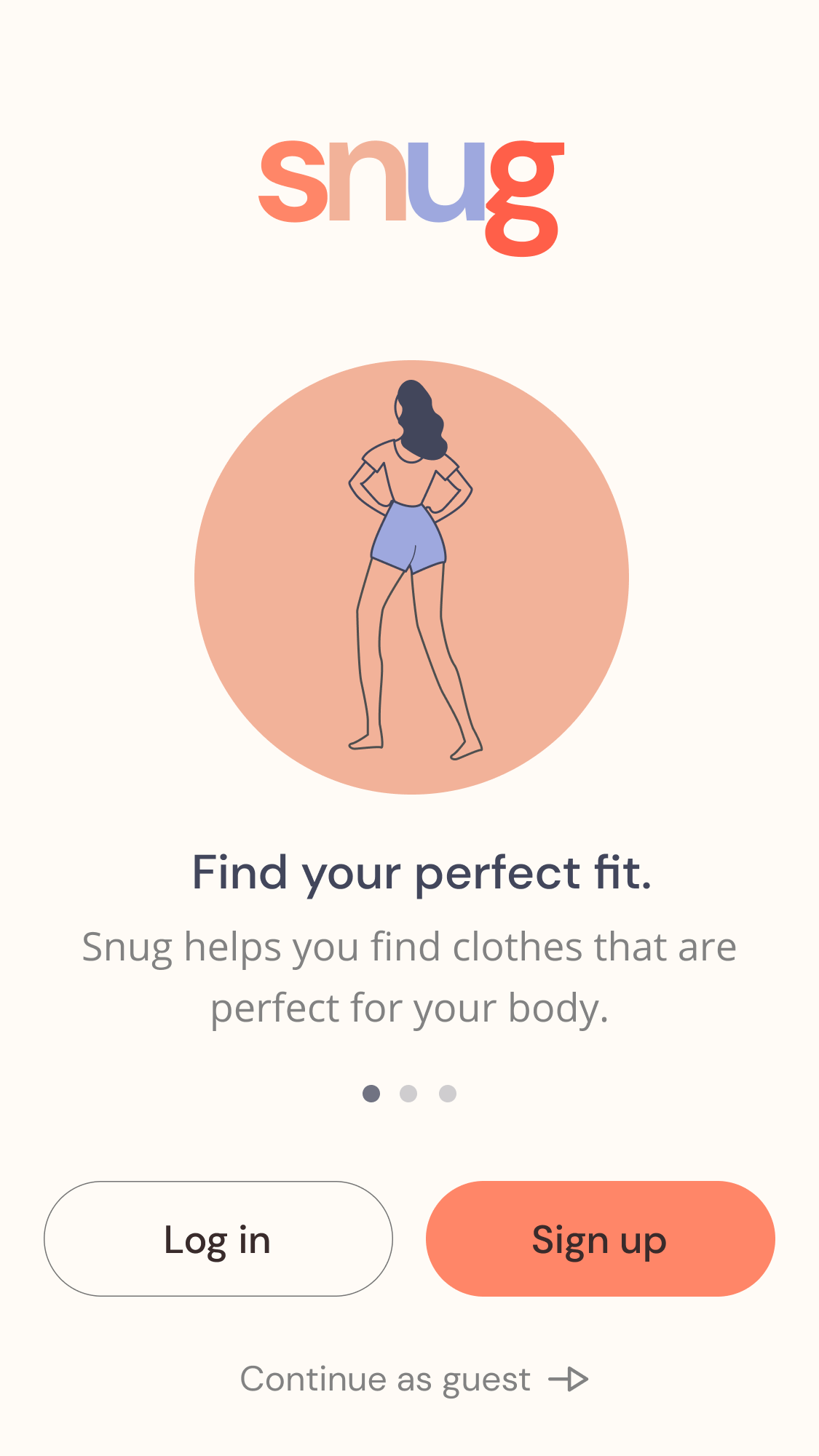
Eliminating the guesswork for online clothing sizes.
Snug is a mobile app that helps online shoppers find their perfect fit by measuring their body proportions and providing them with reviews and photos from shoppers with their same measurements. Users post reviews and photos of clothes that they have purchased to help others find the correct size.
Client: Snug (student project)
My Role: UX/UI Designer
Project Time: Two weeks, 80 hours

The Challenge
Design the MVP of an end-to-end mobile app.
My Role
I worked as the solo UX/UI designer on this project. Throughout this project I presented my work to my mentor and other students who acted as project managers and design teams.
Understanding the Problem
In order to better understand the problem space, I conducted user interviews, user surveys, secondary research, and competitive analysis.

USER INTERVIEWS
“What problem do online clothing shoppers need solved?”
Initial research showed that Millenial and Gen-X women shop for clothes online the most. With this information I created an online survey and conducted 1-on-1 user interviews with people in this target audience who reportedly shop for clothes online frequently.
Patterns
SECONDARY RESEARCH
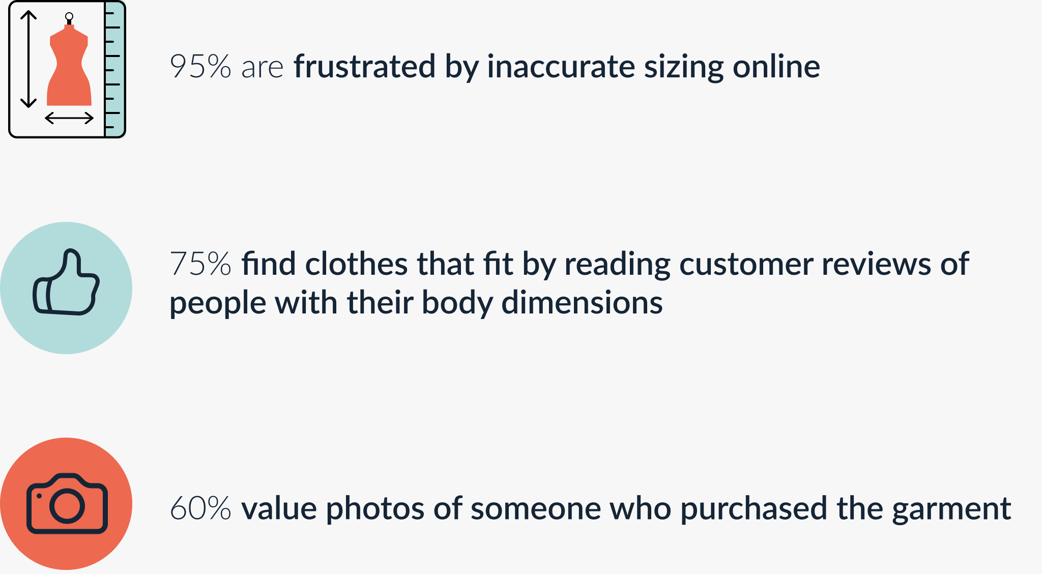
“What can data about shopping for clothes online and size charts teach me about the problem space?”
I conducted secondary research in order to learn more about the market, trends, and how size charts work. This research helps ensure that my solution stands the test of time and innovates on current models.
Crucial Findings

COMPETITIVE RESEARCH
“Who are the competitors in this space and how do they help shoppers find their correct size?”
There are no direct competitors with Snug. The only sizing products in the market are being sold to the retailer and not directly to the shopper. Given that my research participants value online reviews and photos, I focussed my competitive research on sizing products used by retailers and popular review sites like Yelp and Amazon.


USER PERSONA
“Who is my user?
Using the data from quantitative and qualitative research, I identified the target group and created a persona.
Meet Jessica the Review-Centered Bargain Shopper!
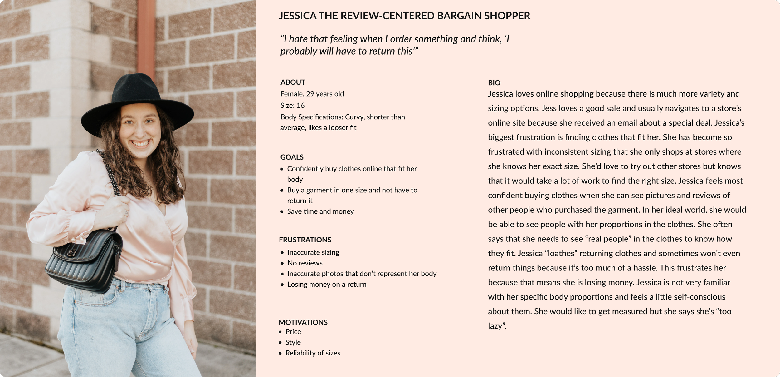

The Problem
Jessica wants to confidently buy clothes online that will fit her body. She strongly trusts reviews and photos of people with her body type.
Building the Solution
After defining the problem, I created a customer journey map and sitemap, sketched and digitized wireframes, and built a high-fidelity prototype.

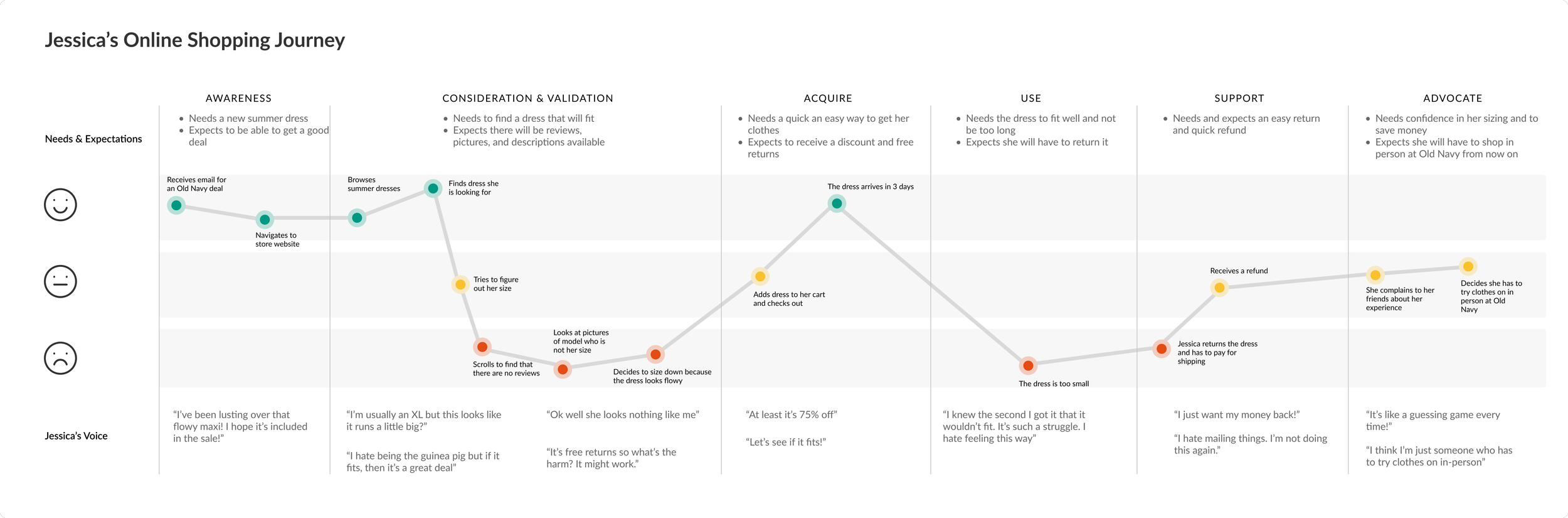
CUSTOMER JOURNEY MAP
“What are the key moments in Jessica’s online shopping journey and how do they influence her?”
I mapped out Jessica’s journey when online shopping for clothes to understand exactly how she feels when she is shopping and what she is thinking along the way. This helped identify areas that need improvement.
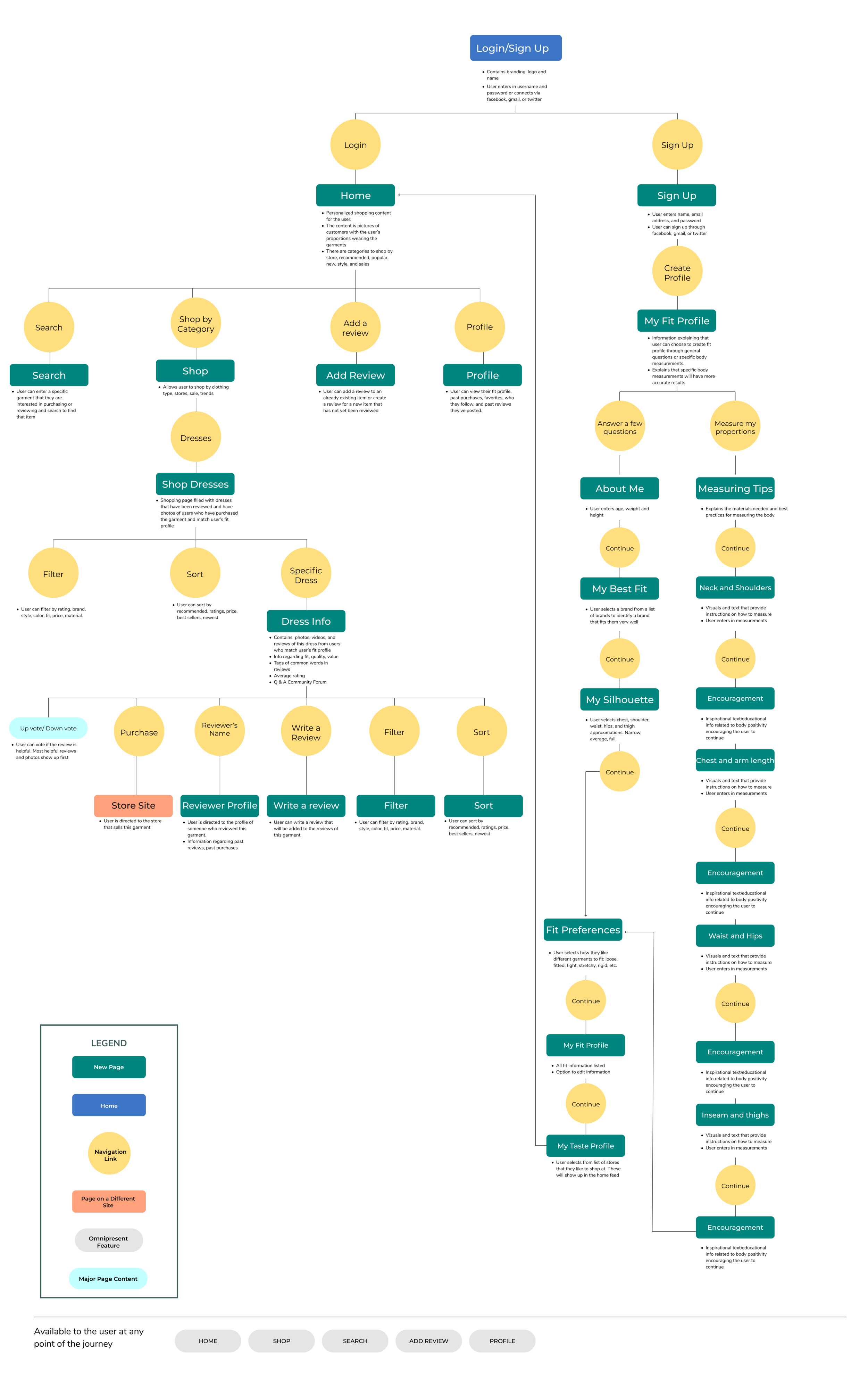
SITE MAP
“How should this app be structured?”
The site map allowed me to visualize all of the content and decide where it should live in the app. This site map outlines every screen and action that a user could take within the app and will be the skeleton for the app moving forward.

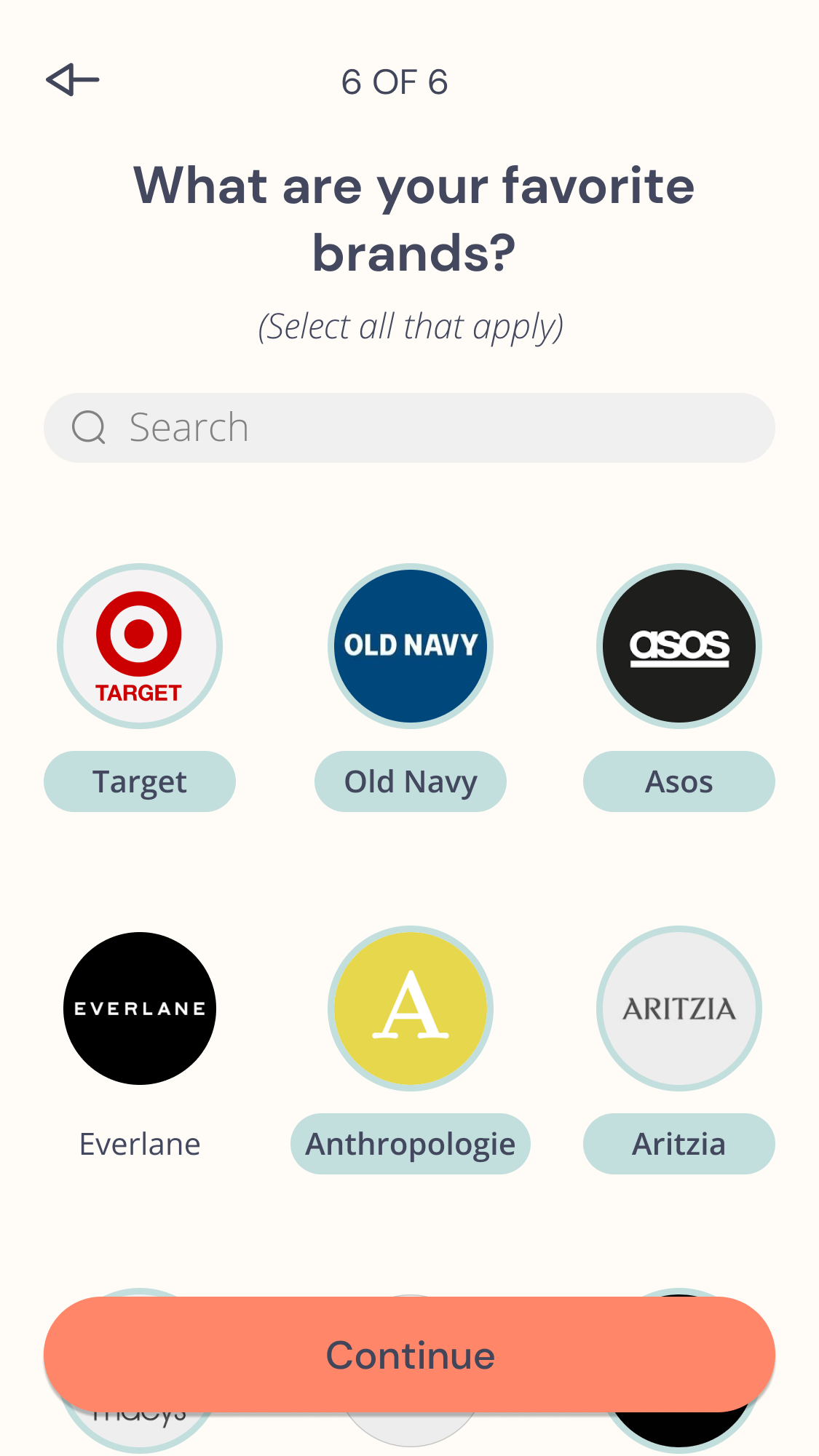
SKETCHING AND WIREFRAMES
“How should the information be visually represented on the page?”
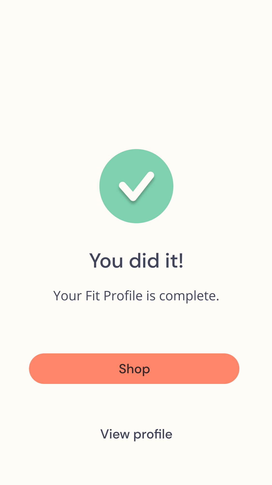
With the site map in mind, I sketched out different designs for every screen of the app. I selected the optimal sketches and digitized them into high-fidelity mockups with in-depth notes about how the elements on each screen function.
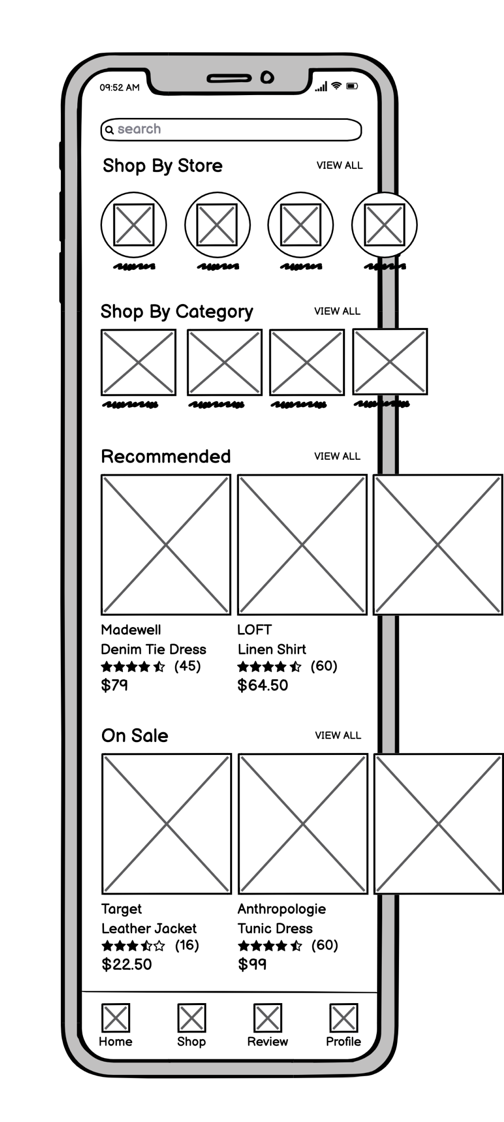
The Solution
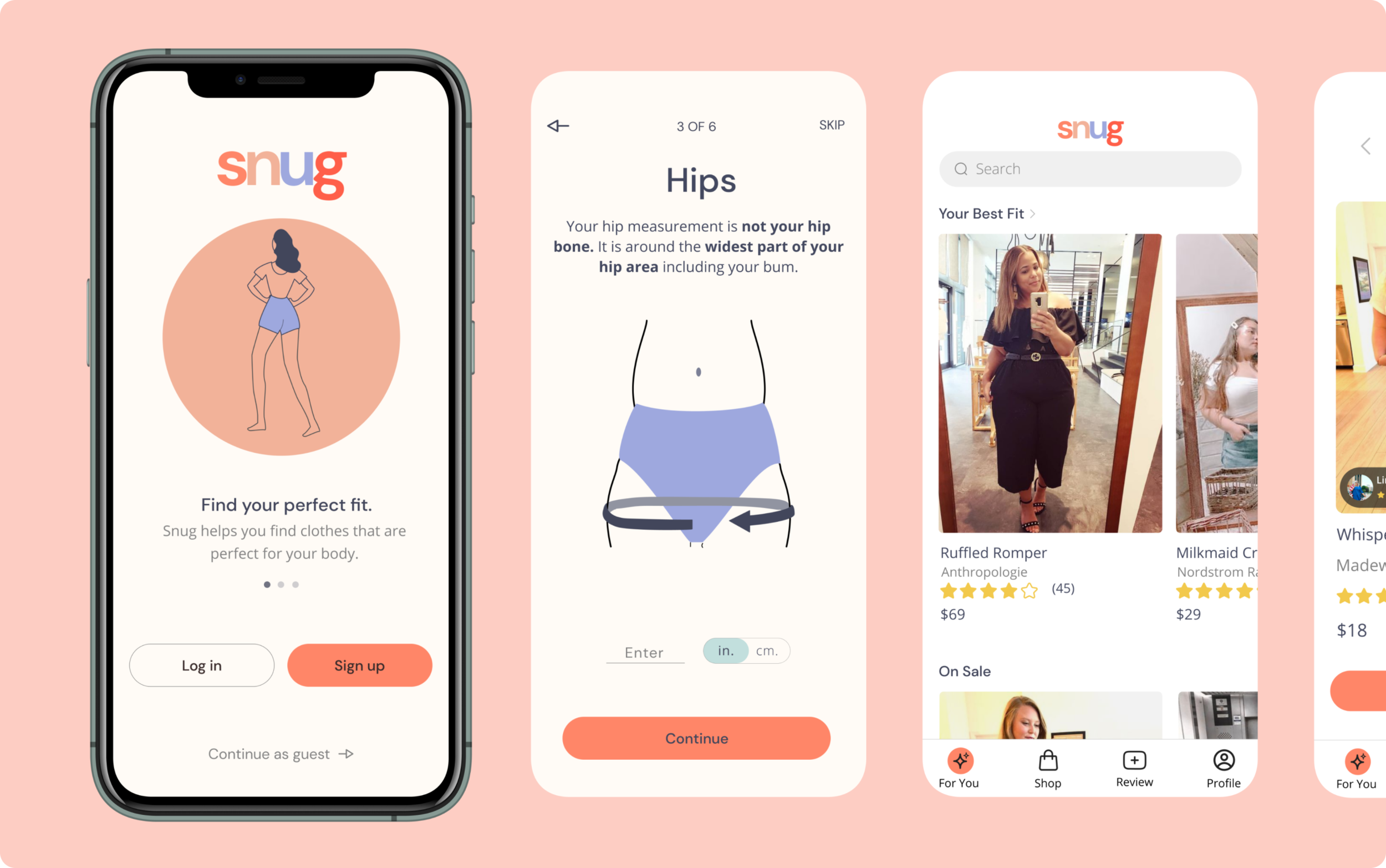
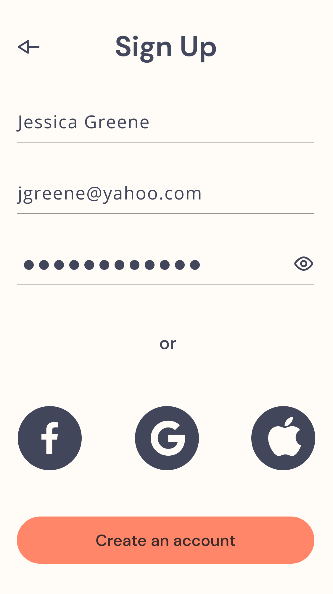
After creating the structure of the app, I created a clickable prototype in Figma.
PROTOTYPE
The Problem:
Jessica wants to confidently buy clothes online that will fit her body. She strongly trusts reviews and photos of people with her body type.
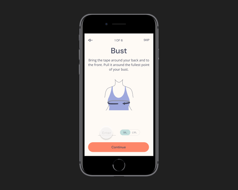
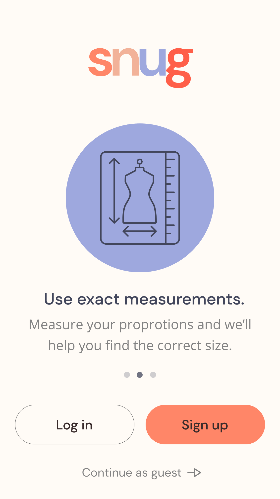
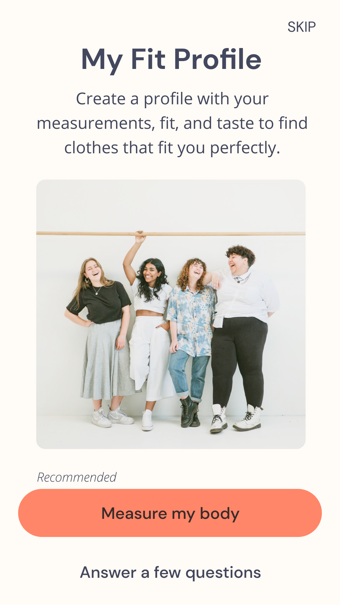
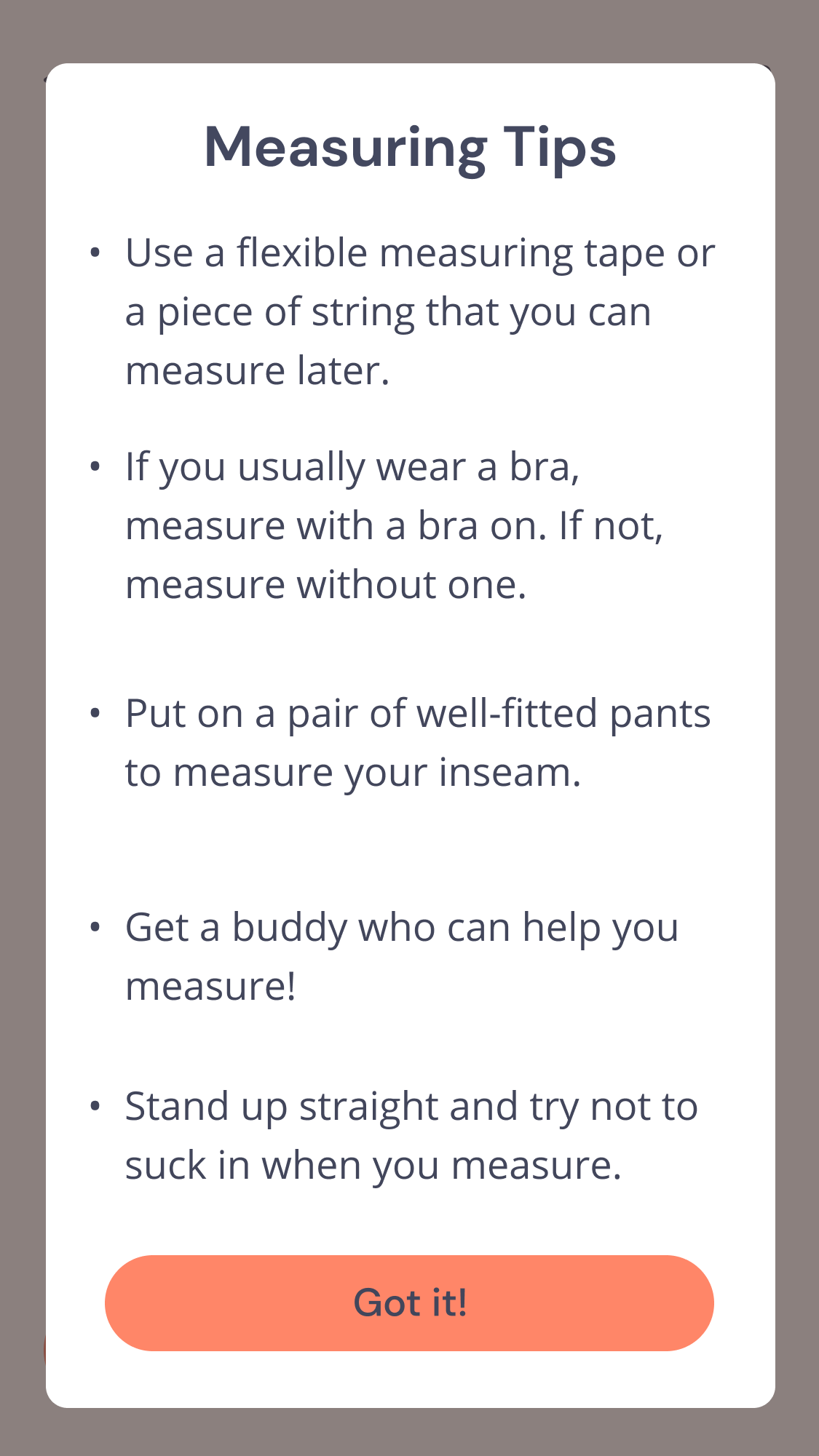
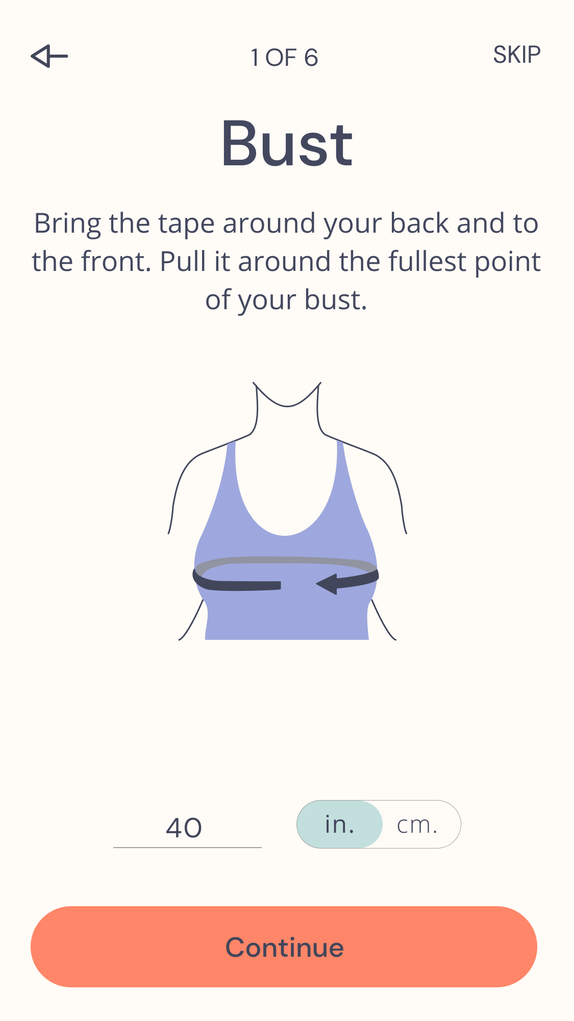
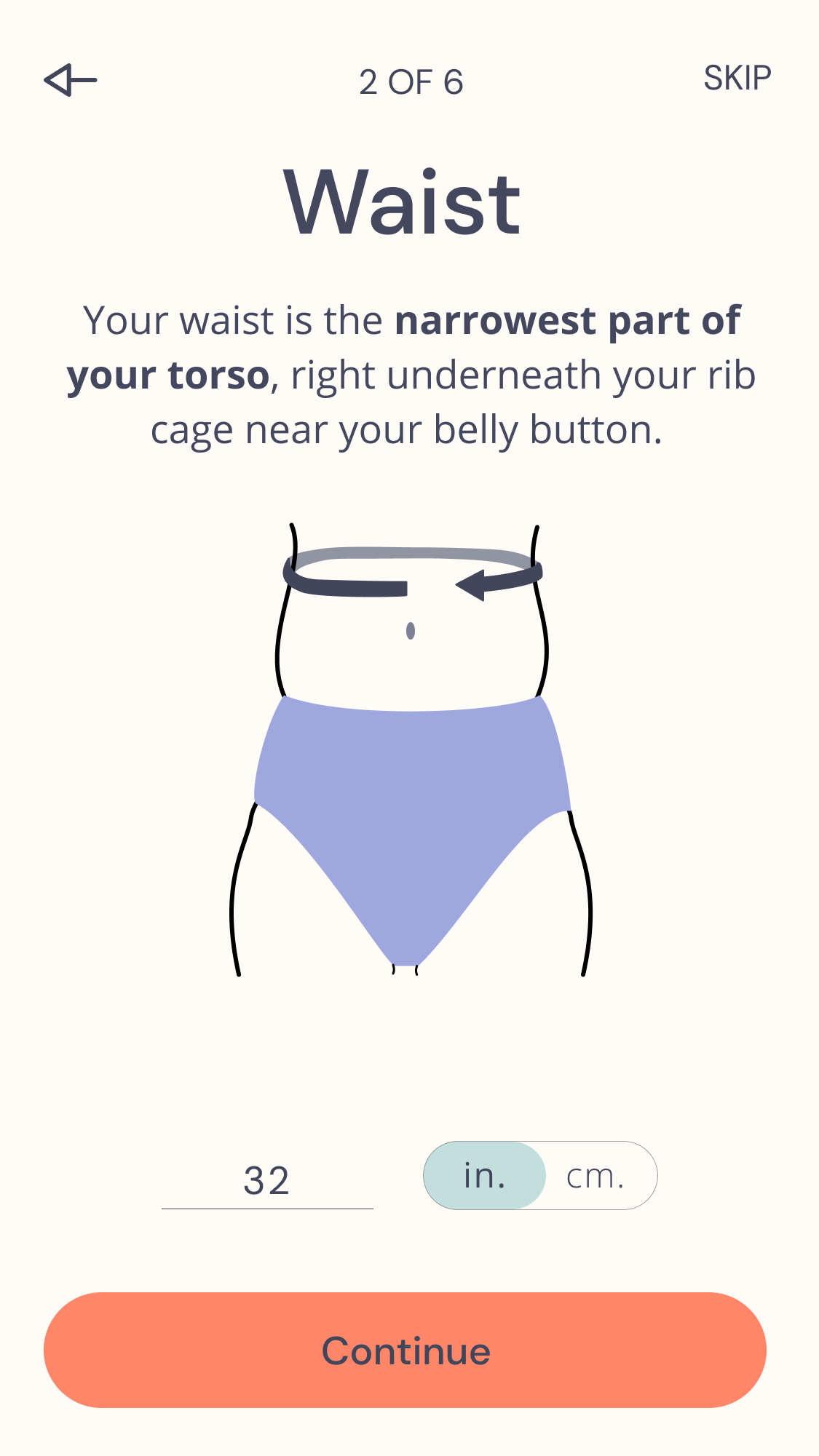
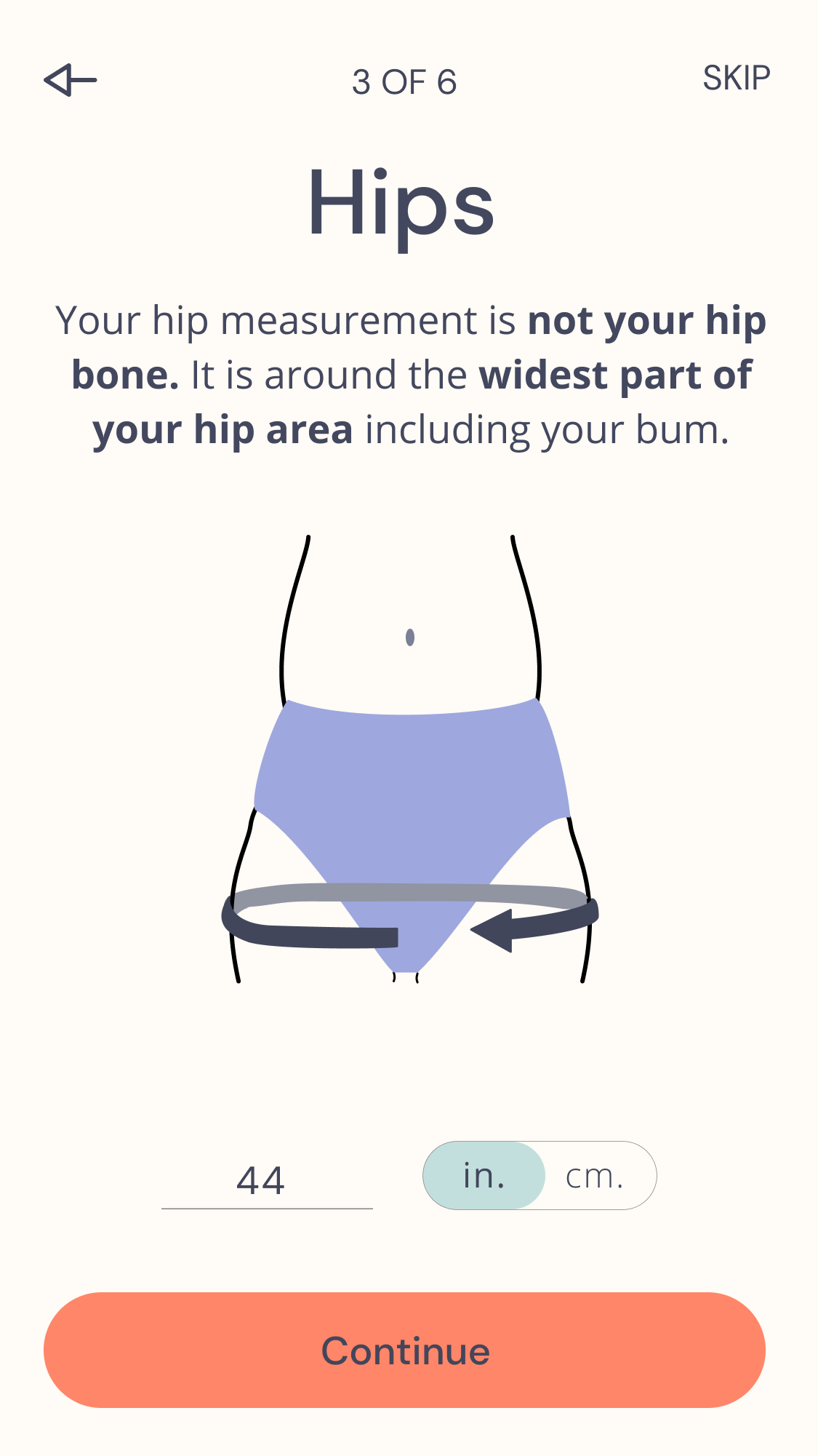
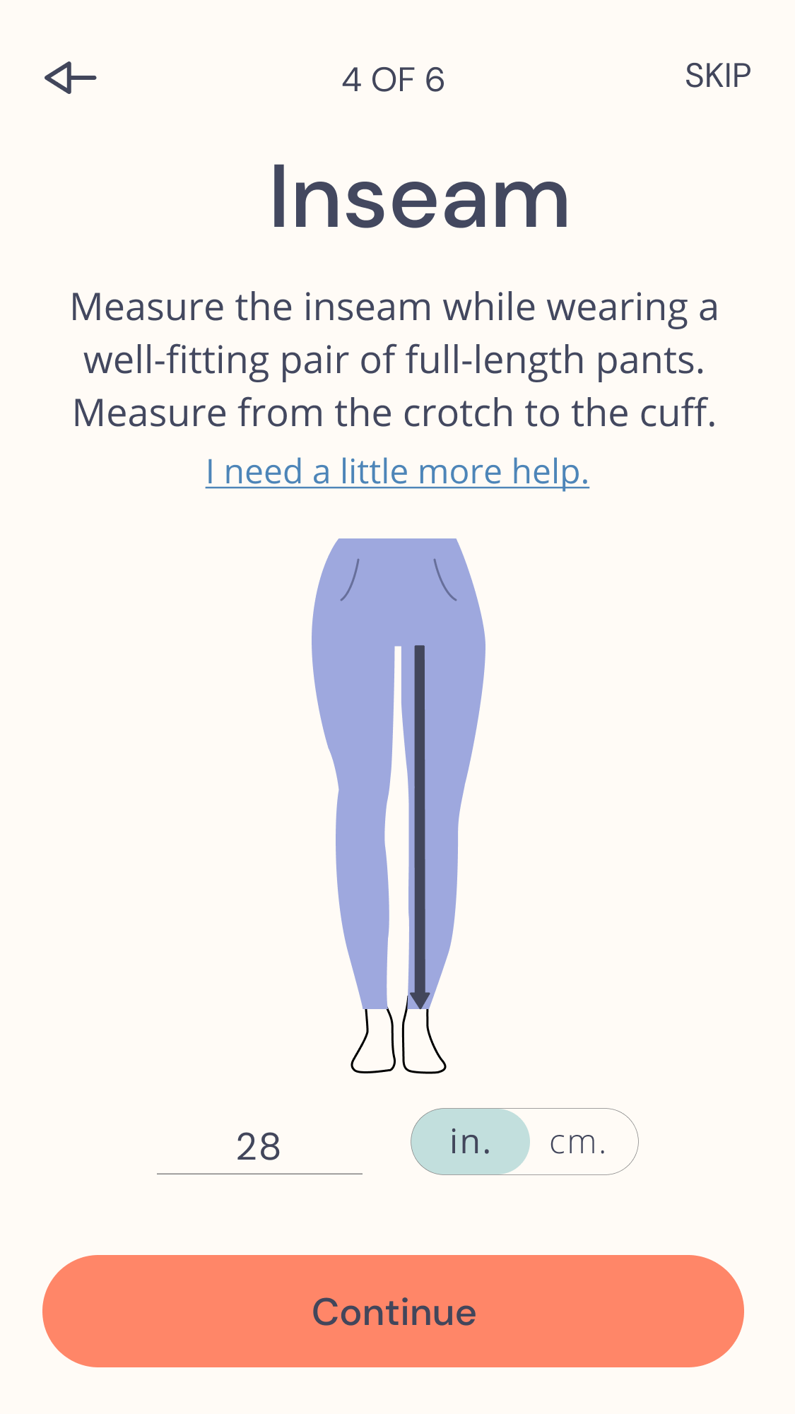
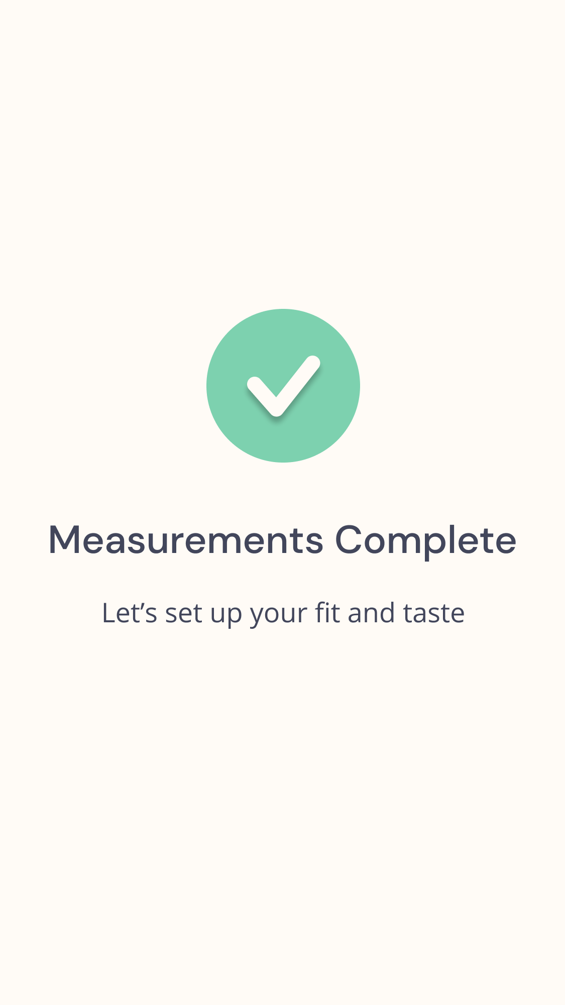
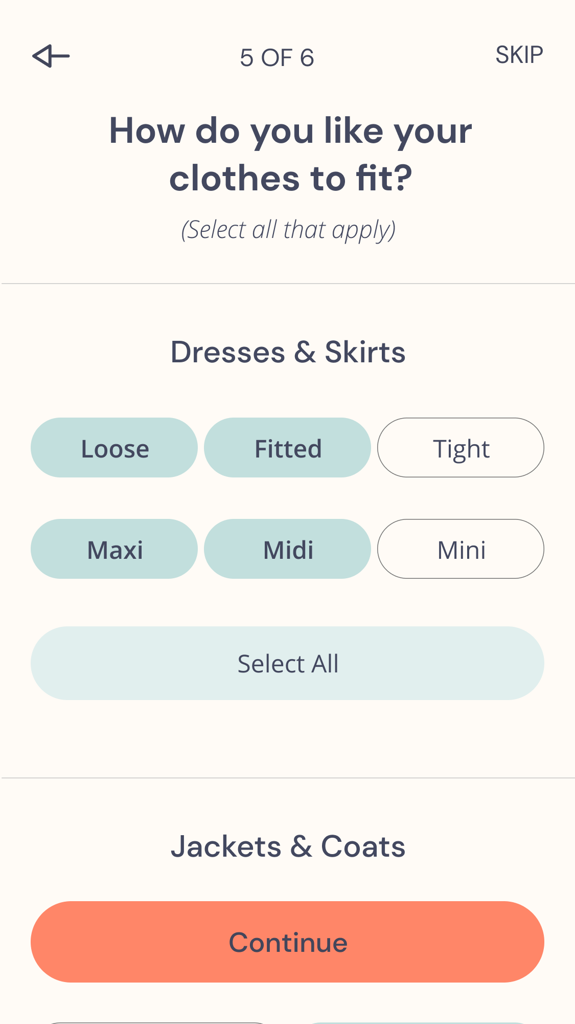
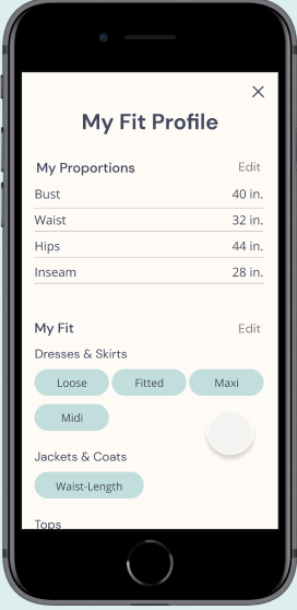
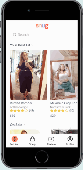
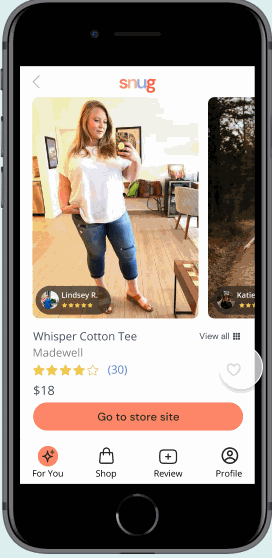
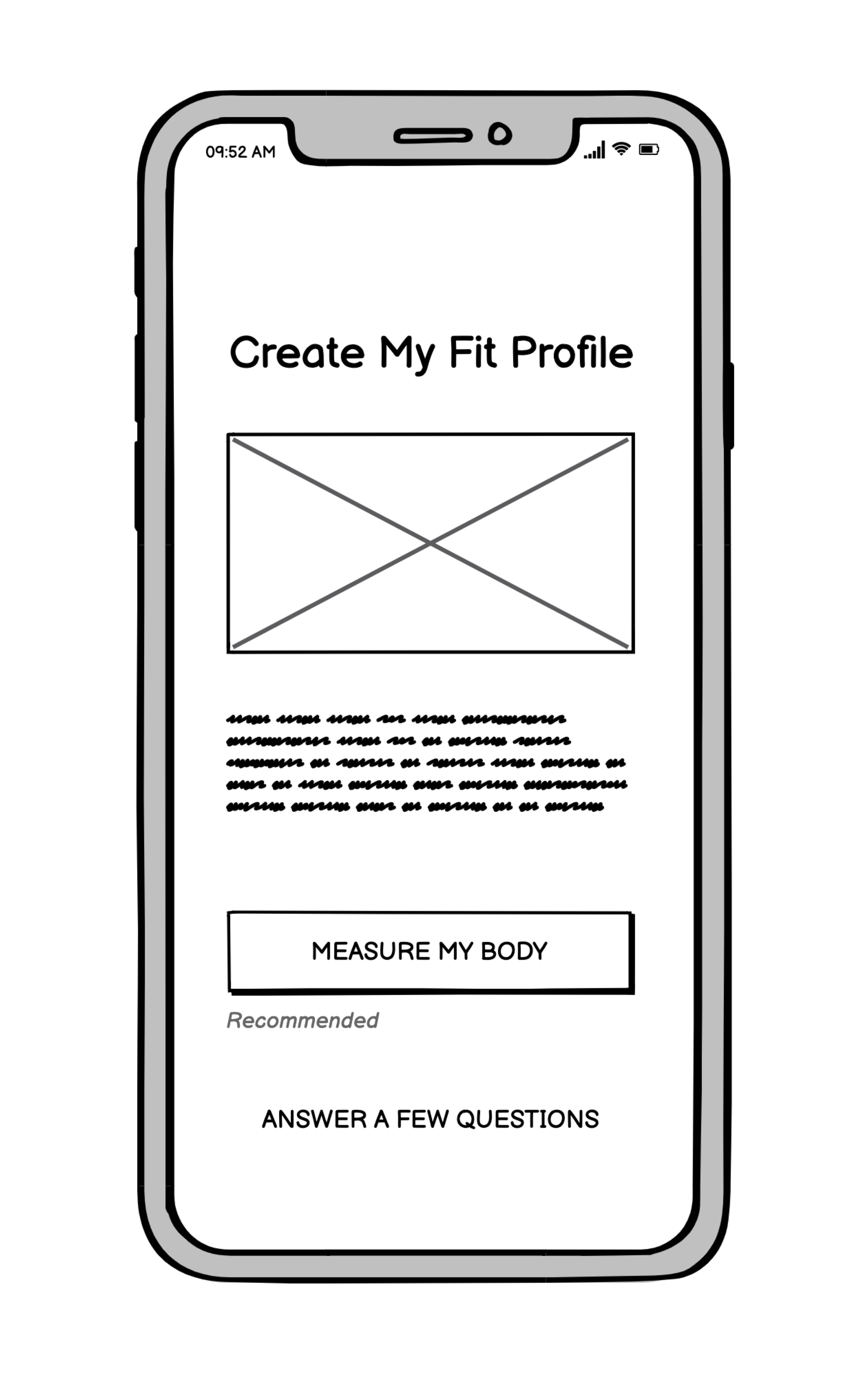
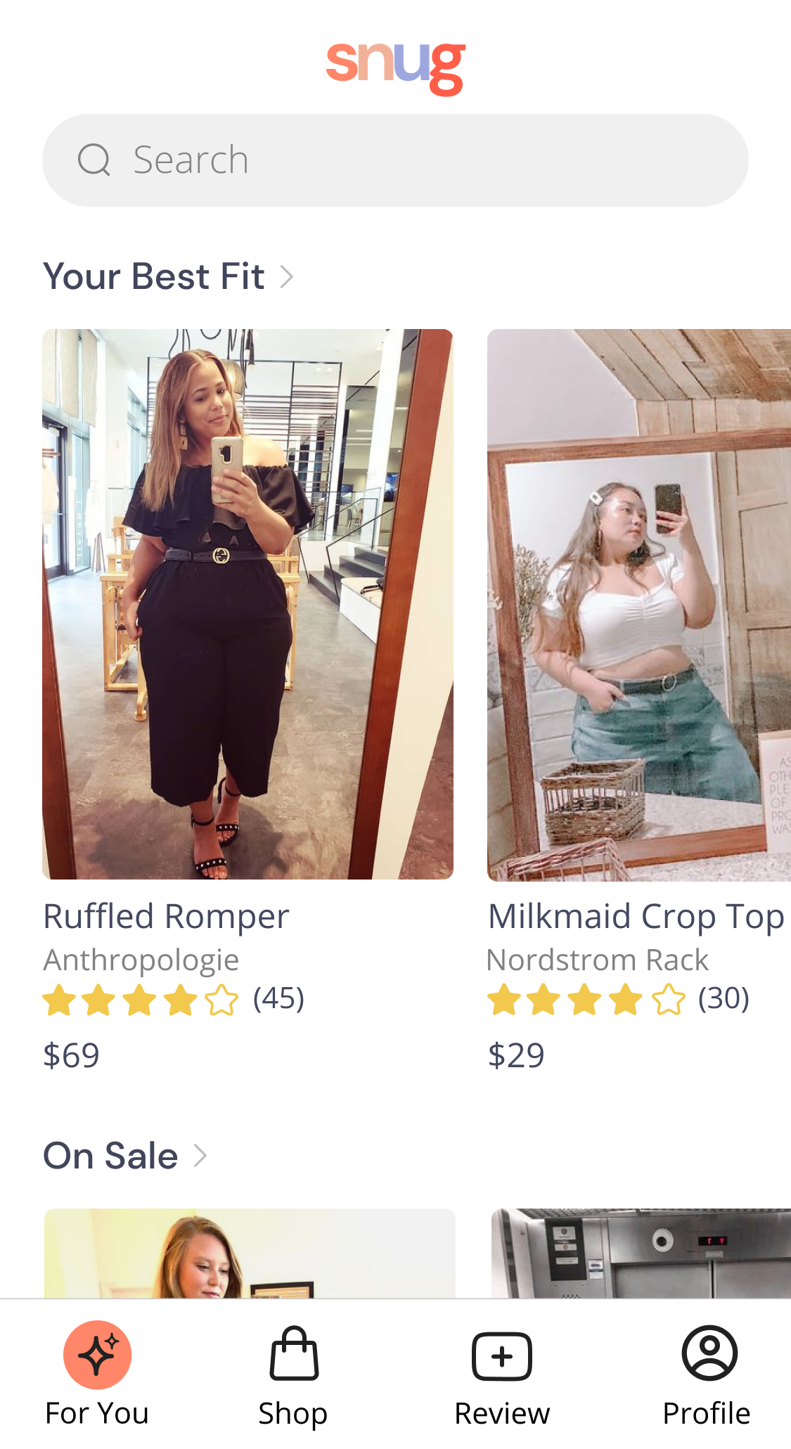
Personalized Fit Profile
When onboarding, Jessica sets up a profile with her exact body measurements, preferred fit, and favorite brands. This accuracy and specificity will help her find the perfect fit.
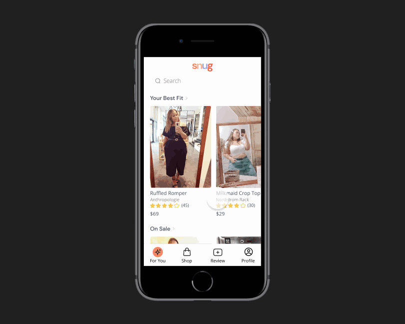
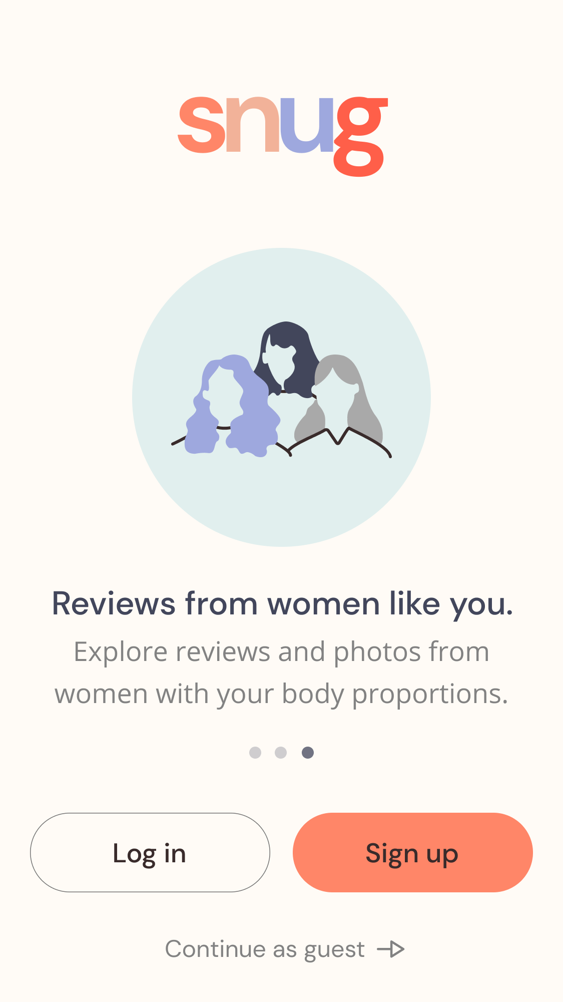
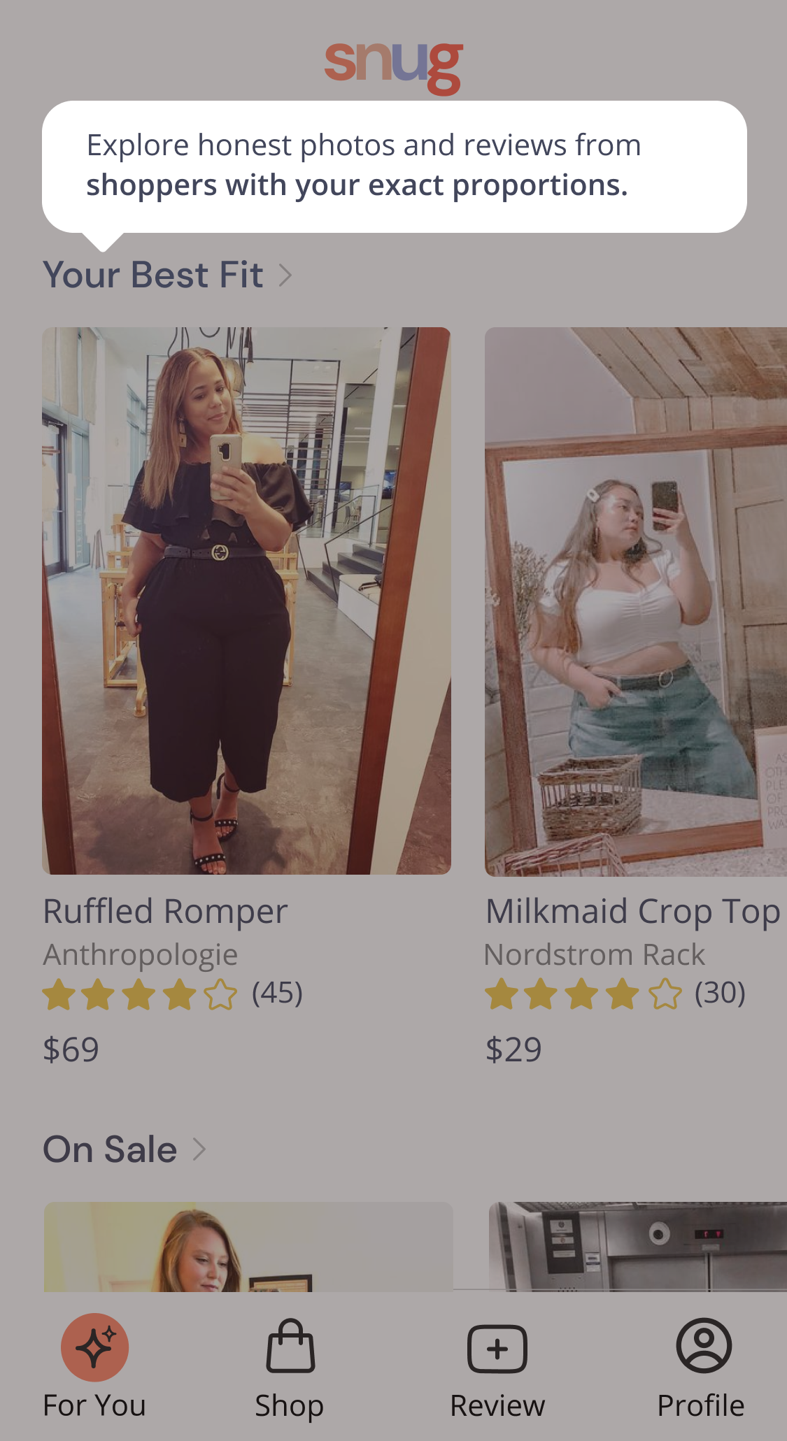
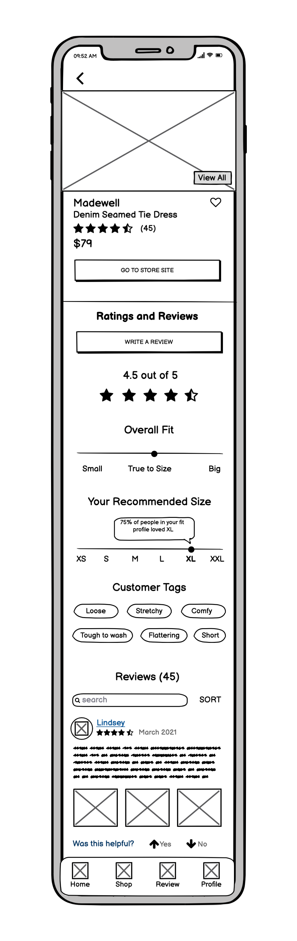
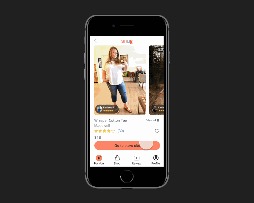
Photos and reviews from matching Fit Profiles
All of the content that Jessica interacts with is created by shoppers with her exact proportions. She can browse pictures and reviews to see what size to purchase.
Extensive fit guide based on reviews
On the product page there is an overview of sizing, fit, and ratings of the garment based on reviews. It will recommend the best size for Jessica and let her know how many women in her fit profile recommend that size.
Testing the Solution
After I built my solution, I conducted usability tests and iterated on my designs based on the feedback that I received.

USABILITY TESTS
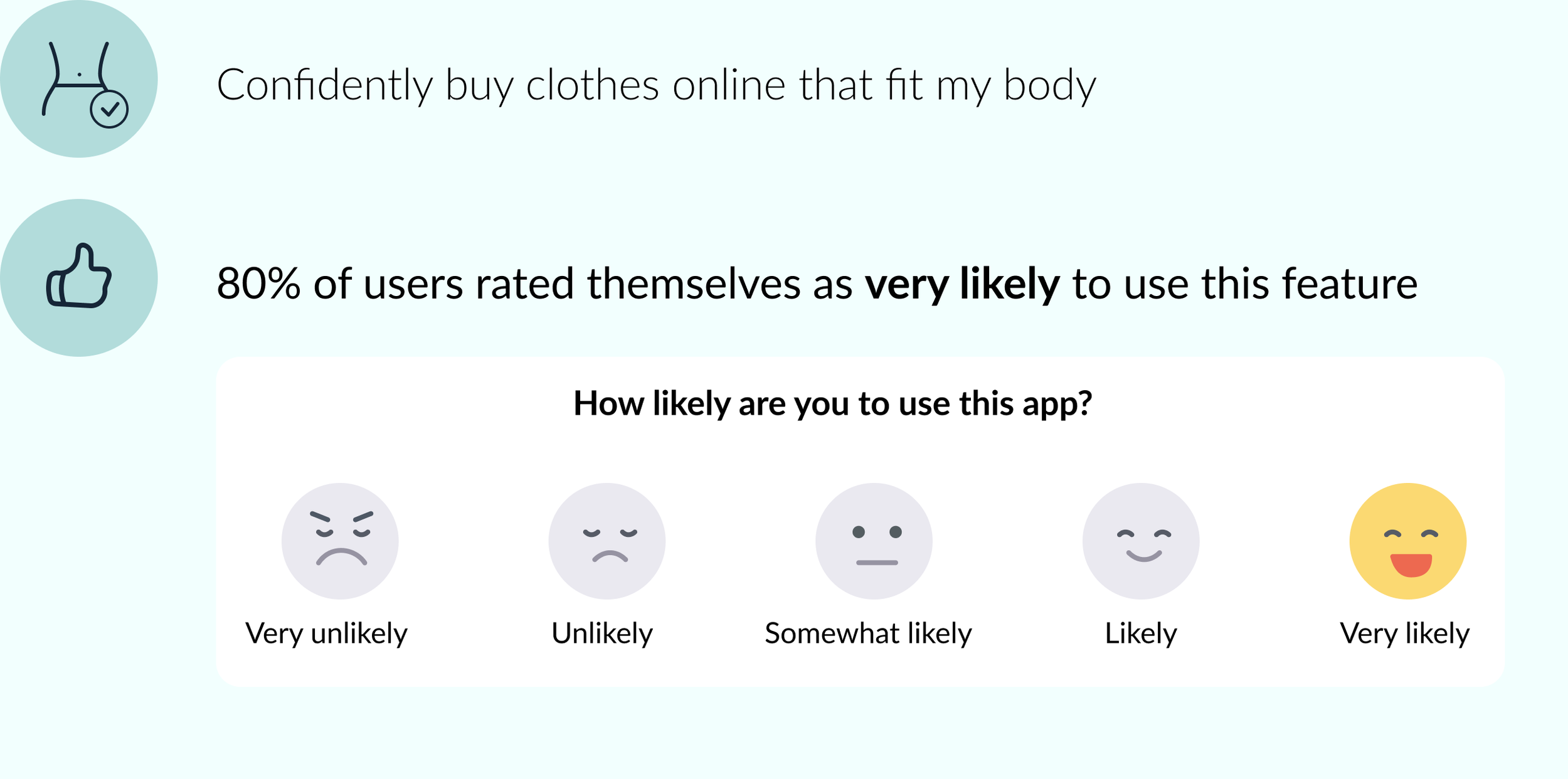
“Are my designs effective and did I solve Jessica’s problem?”
After conducting usability tests, it is clear that the designs solved Jessica’s problem. The participants reported that they would be very likely to use this app.
ITERATIONS
“How can I utilize user feedback to improve my designs?”
In my usability tests, participants identified aspects of the app that needed improvement. I utilized an affinity map to determine which improvements should be prioritized based on user value and amount of effort.

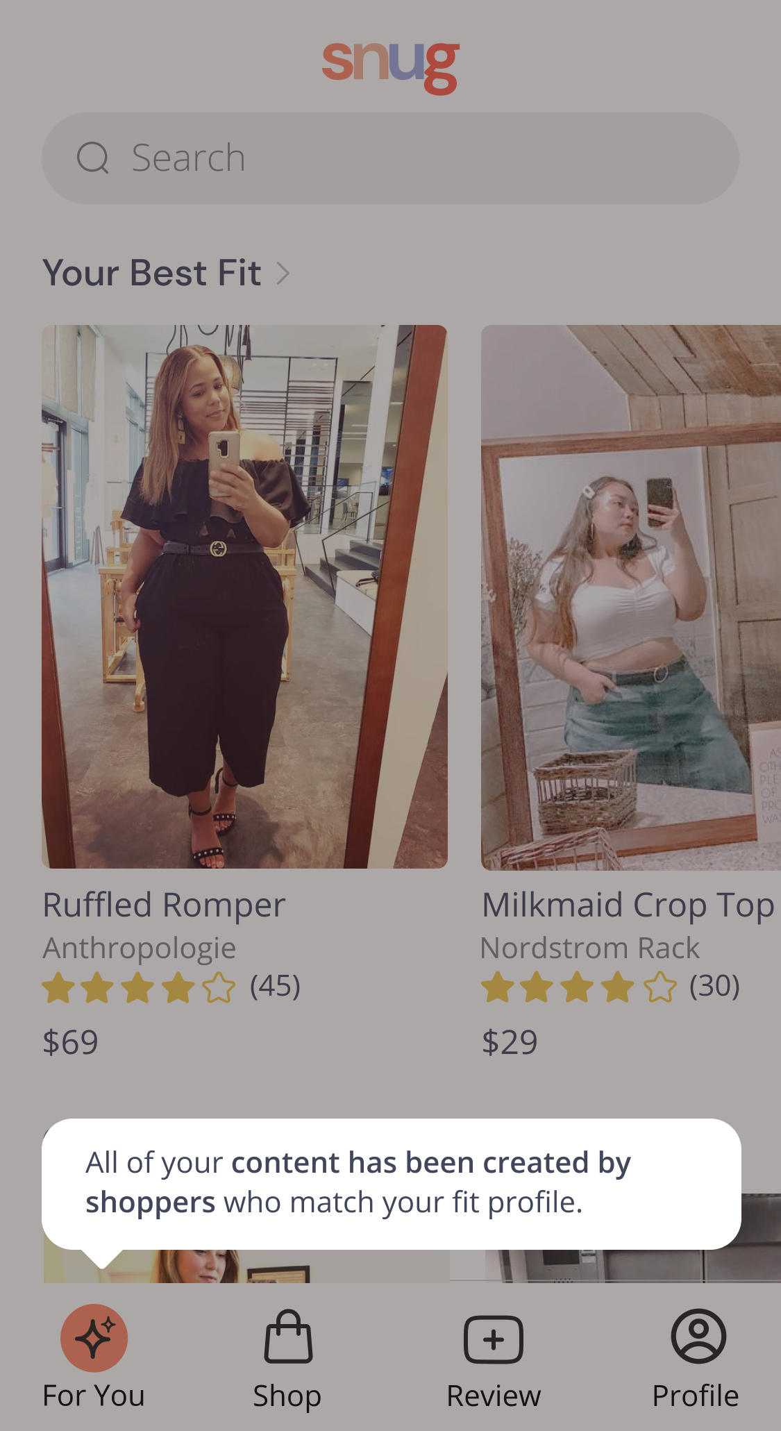
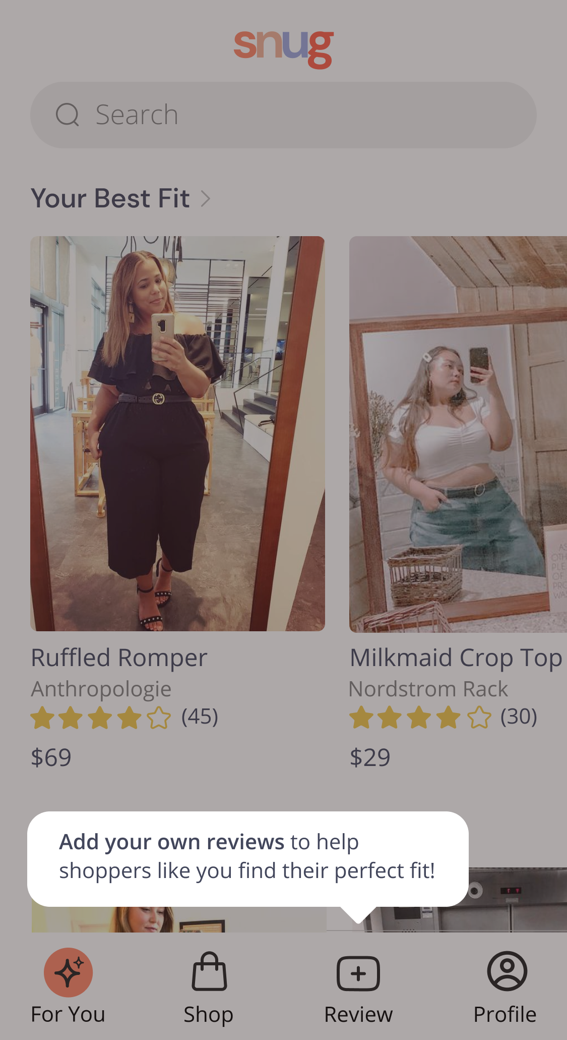
Included onboarding tooltips because users did not understand that the content was user generated.
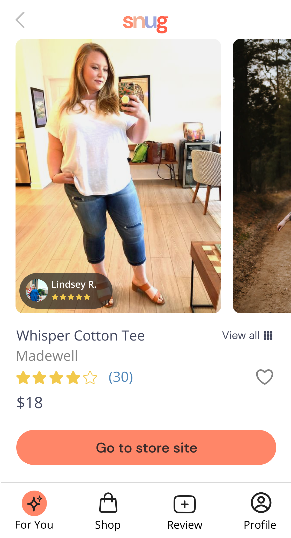
Included floating button over product photos demonstrating that the woman in the photo is a reviewer. Participants thought she was a paid model.
Changed the images of women to mirror selfies. The original images were too professional and participants thought the women in the photos were models.
Reflecting on the Process
Once I finished the project, I reflected on what I would have done differently and provided next steps.


REFLECTION
“What would I have done differently?”
I would have partnered with another designer or business partner to help run through ideas and ideate on the designs. Creating a concept for a new app on your own is quite difficult and it would have been helpful to have someone asking tough questions along the way and poke holes in the business plan so I can make it stronger.
“What would I do next if there was time available?”
I would test the new designs and conduct observational interviews as women measure their bodies. I would also recommend setting up a detailed business plan in order to ensure that the app is profitable and feasible to get enough user-generated content.
View Other Projects
Apartment List