

Re-imagining long form content
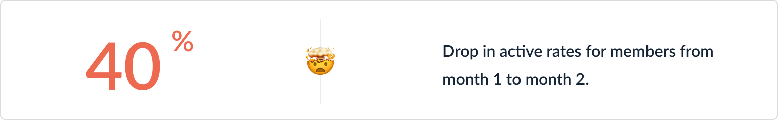
MasterClass members stop using our product very early into their membership. They cite lack of time as the main reason. They also express that they don’t feel like they can move onto a new class until they’ve finished the class that they’re currently watching. This project aims to address this user problem and create quick, diverse learnings that bring users back to the app every week.
Client: MasterClass
My Role: Product Designer
Project Time: Three weeks
The Challenge
Design a daily editorial native feature that makes it easy for a user to quickly learn something new every day.
My Role
I worked as the lead product designer on this project and mentored a UX Researcher who wanted to transition into design.
There was a 91% increase in frequency for users who engaged with this new feature.
Understanding the Problem
In order to better understand the problem space, I collaborated with our User Research and Insights teams to see what we can learn from existing data.
THE CURRENT EXPERIENCE
“What does our current experience look and feel like?”
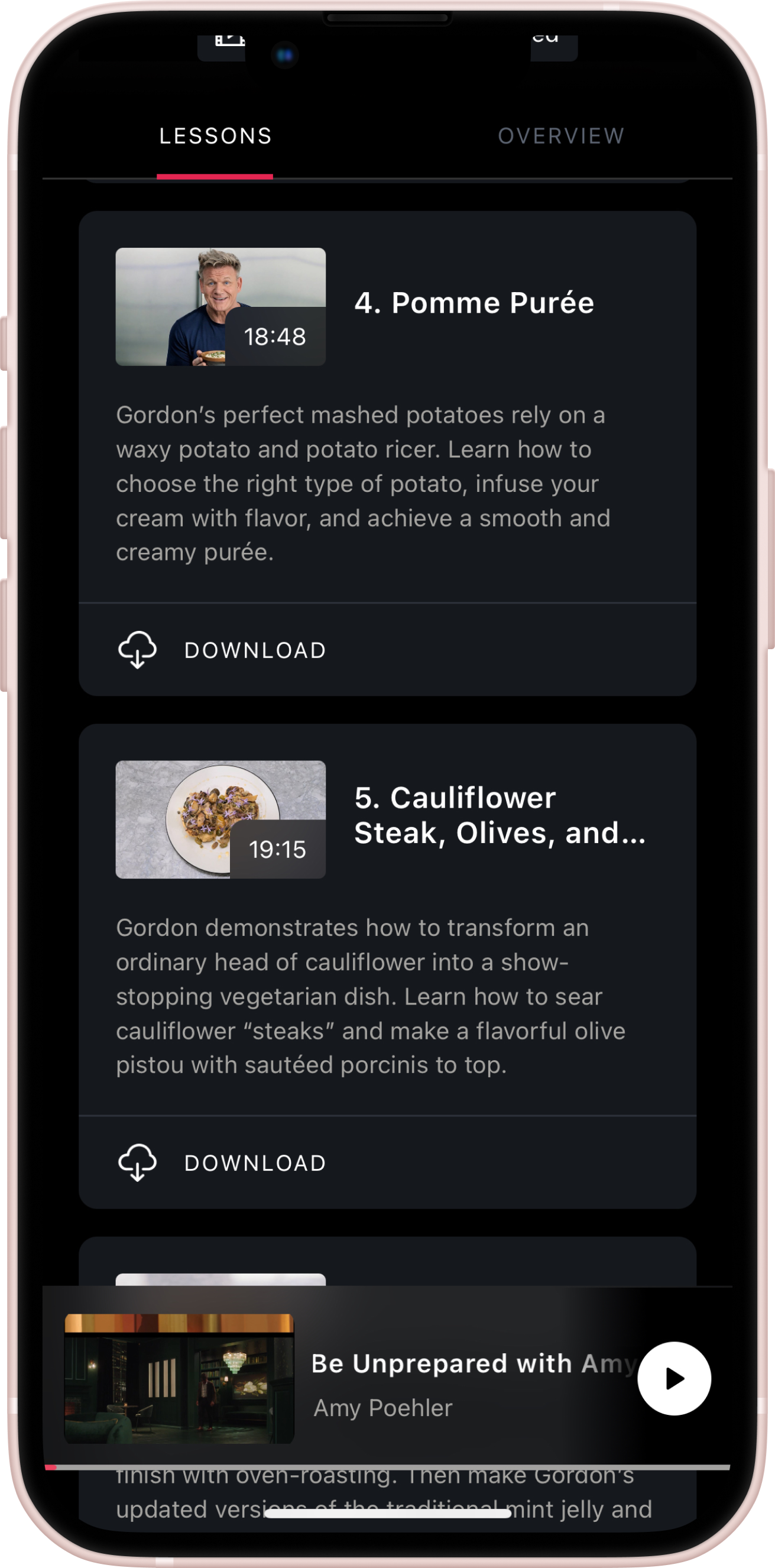
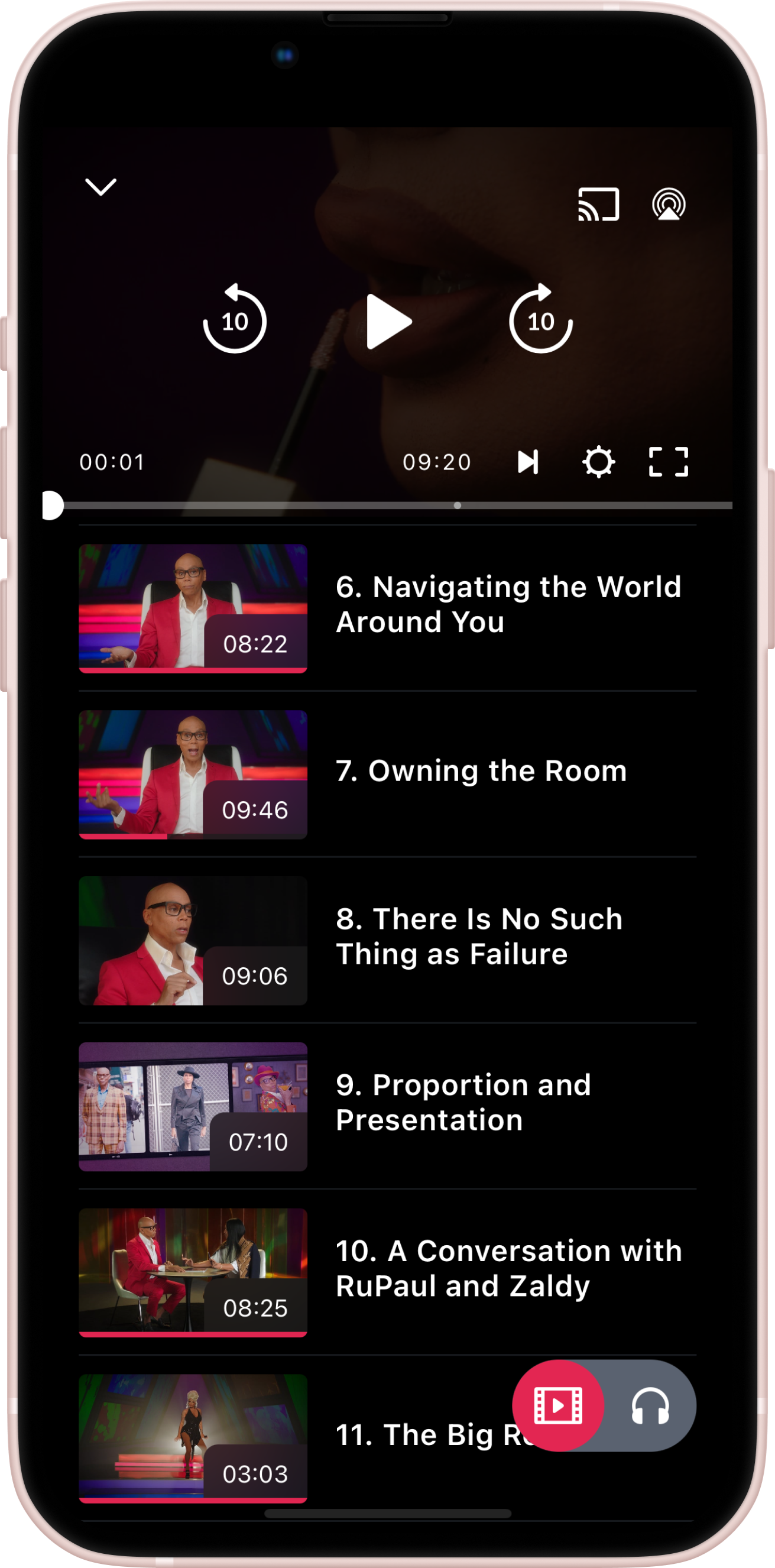
Our current experience focusses only on learning through video, which has a high barrier to entry. People learn differently and often need different mediums to process information. With people going back to the office and commuting via different transportation methods - being able to consume something in 2 to 3 minutes would be more realistic.
🎥 Video Only
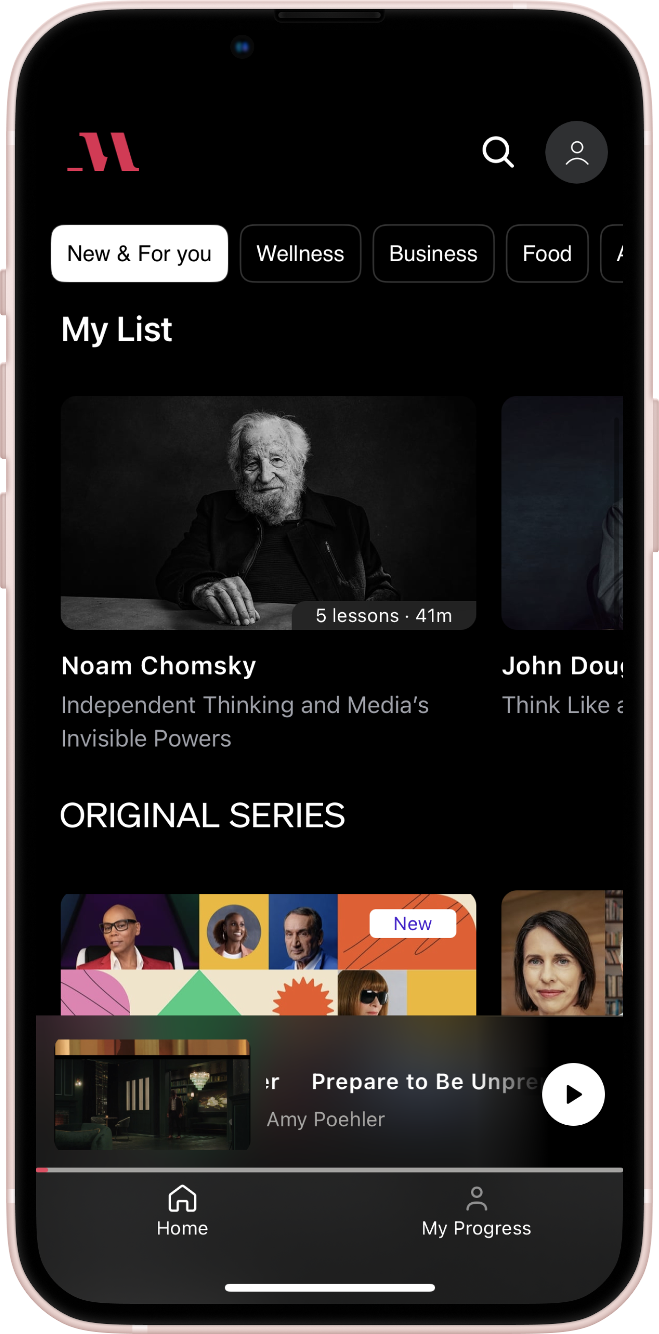
⏰ 5-20 minute long lessons
DATA & ANALYTICS
“How is our current experience performing? Where is there room for improvement?”
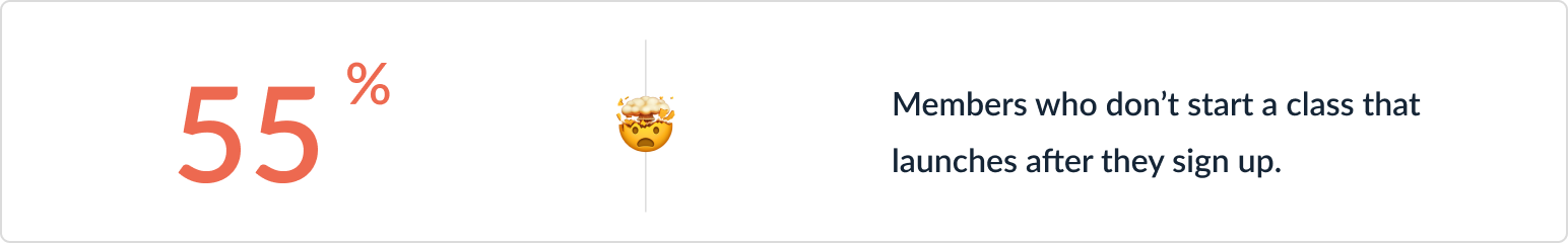
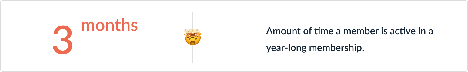
I partnered with our Insights team to pull statistics about our current experience. We found that very few users engage with MasterClass throughout their membership
USER RESEARCH
“Why do users stop watching so early in their membership? Why don’t they watch new content?”
I partnered with our User Research Team to better understand the reasoning behind user behavior.
“I don’t have the time to sit down and watch a full lesson. I’d like to watch something new but I feel like I should complete the class I’m currently watching first.”
MasterClass Member
The User Problem
Users want to learn something new every day but they don’t have the time to watch a full lesson and feel like they have to finish a class before starting something new.
Building the Solution
After defining the problem I began my design explorations by brainstorming with my team, wireframing potential solutions, and mocking them up into hi-fidelity designs for usability testing.
PRODUCT TEAM BRAINSTORM
“How can I generate a large amount of diverse solutions?”
In order to solve our user problem, I conducted a brainstorm session with the product, engineering, research, and insights teams that focussed on key “How Might We” statements. I worked with my PM to identify the best solution based on effort and impact.

“HMW make it easy for users to quickly learn something new every day?”
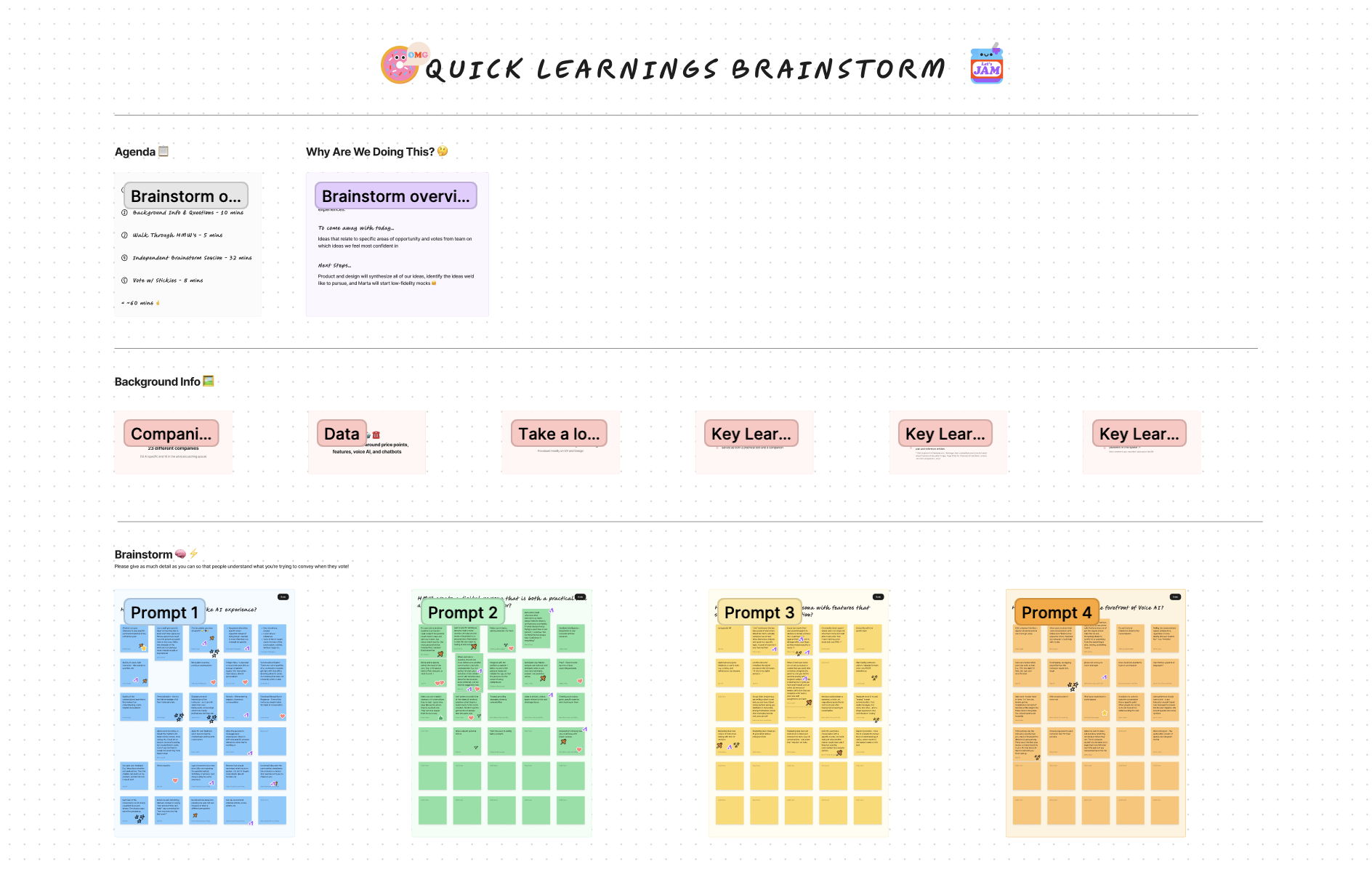
“Create text-based learnings that span a diverse set of topics and take less than 5 mins to complete.”
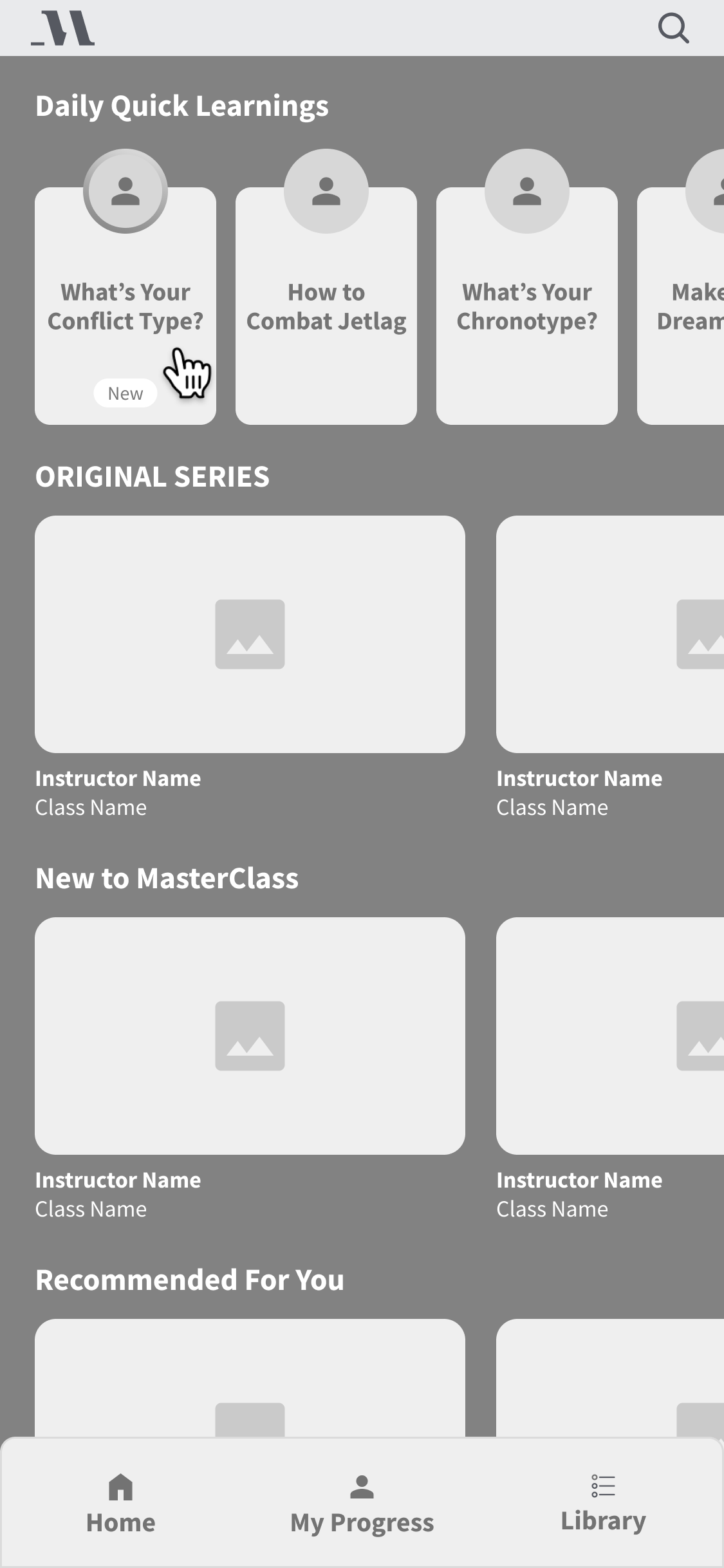
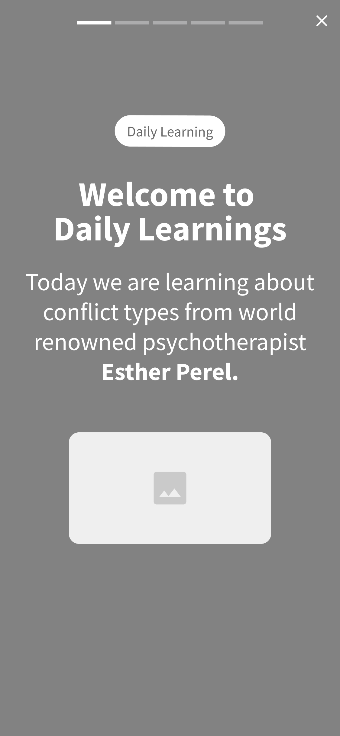
VISUAL EXPLORATIONS
“What should quick, text-based learnings look and feel like? ”
I began my design explorations with wireframes and focussed on the discovery of this feature and the user flow. After that, I mocked the wireframes up into hi-fidelity designs and prototyped for user testing.
🥚 Wireframes
🐣 High Fidelity
Testing the Solution
After designing the solutions I built prototypes, conducted usability tests, and iterated on my designs based on the feedback that I received.
USABILITY TESTS
“Are there any major usability issues? How can we improve?”
I conducted usability tests on usertesting.com with 12 participants on mobile devices. The goal of these tests was to determine if there were any major usability issues and to discover opportunities for iteration.

“I don’t need a tutorial to get started. Two Minute Learnings is pretty self-explanatory”
“I’m confused by the button at the end. Where does it take me?”
“I prefer to swipe between the different cards instead of clicking. This didn’t behave how I thought it would. ”
The Solution
After iterating on the feedback, I handed off the designs to our engineering team
SOLUTION REVIEW
“Do these designs meet the product requirements and solve the user problem?”
I iterated to the final version based on user feedback and handed off the designs to the engineering team. We built the new feature and launched it for A/B Testing.
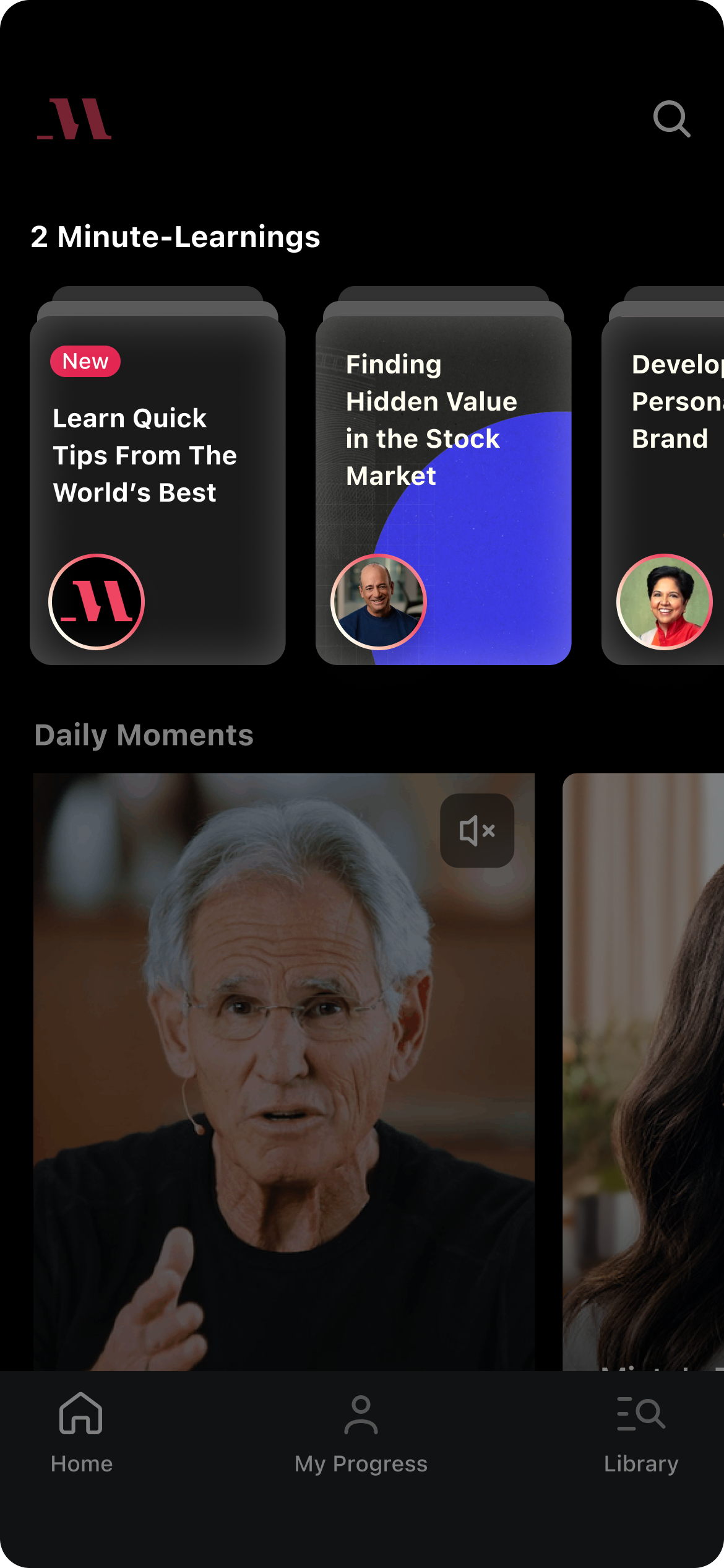
Visual Prominence on HP 👋
Learning tiles stand out from the rest of content and communicate that a user can expect a different kind of content.
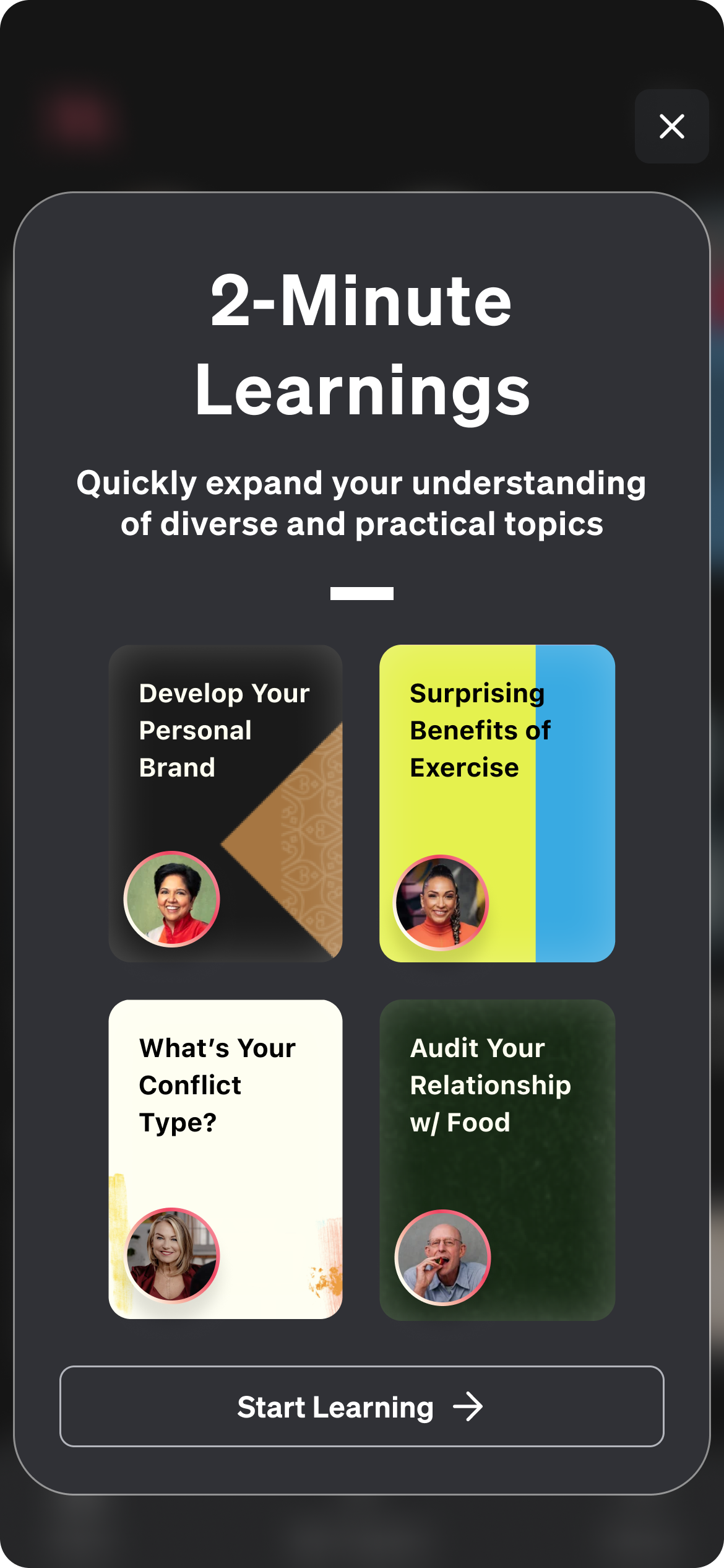
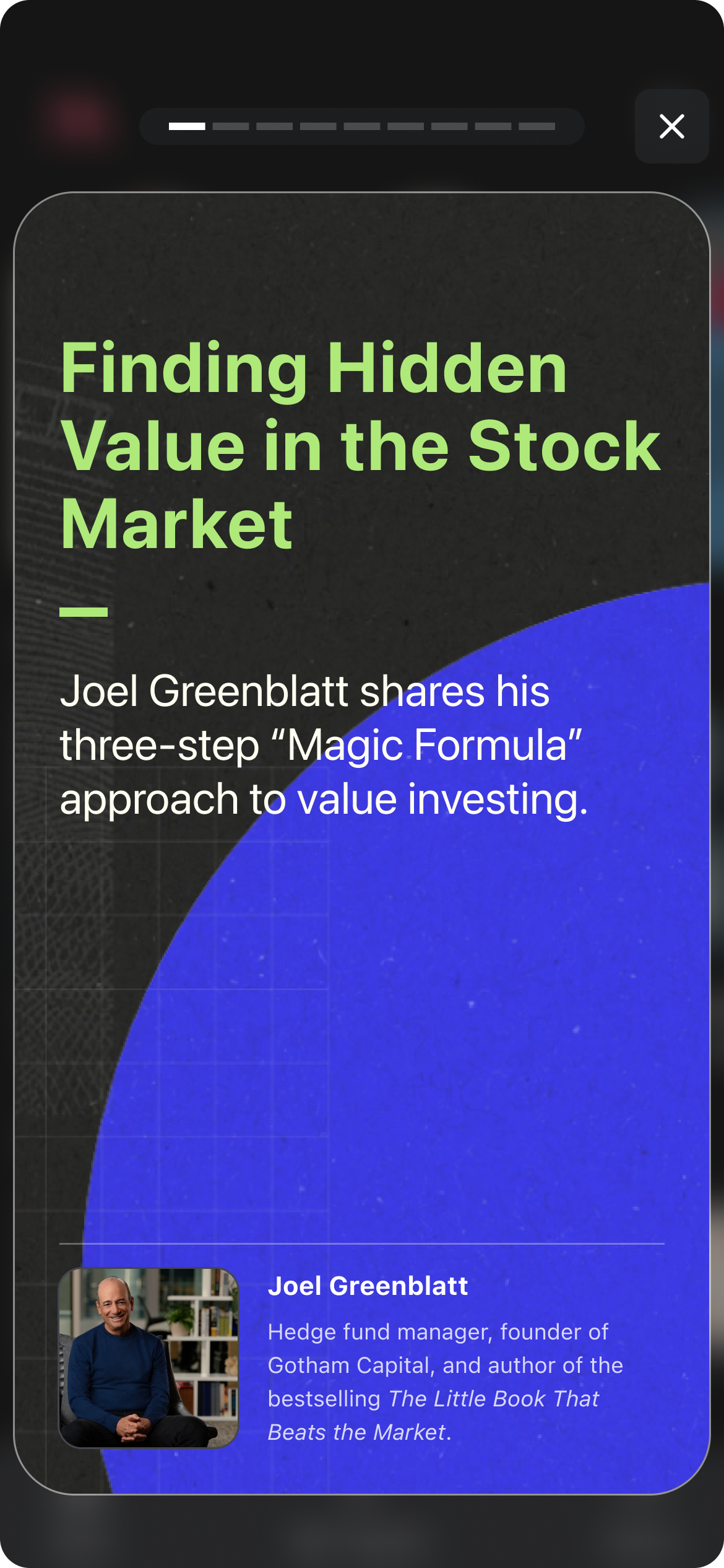
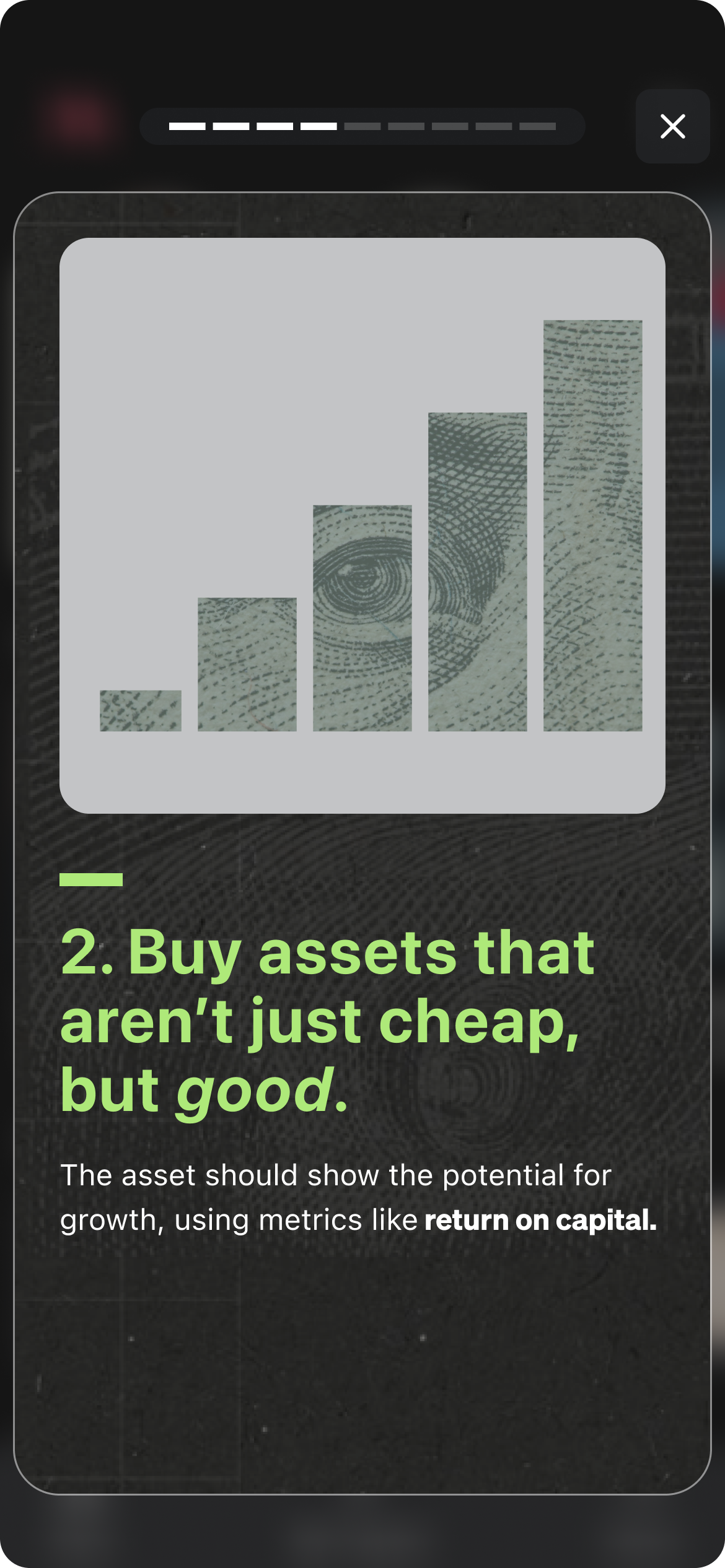
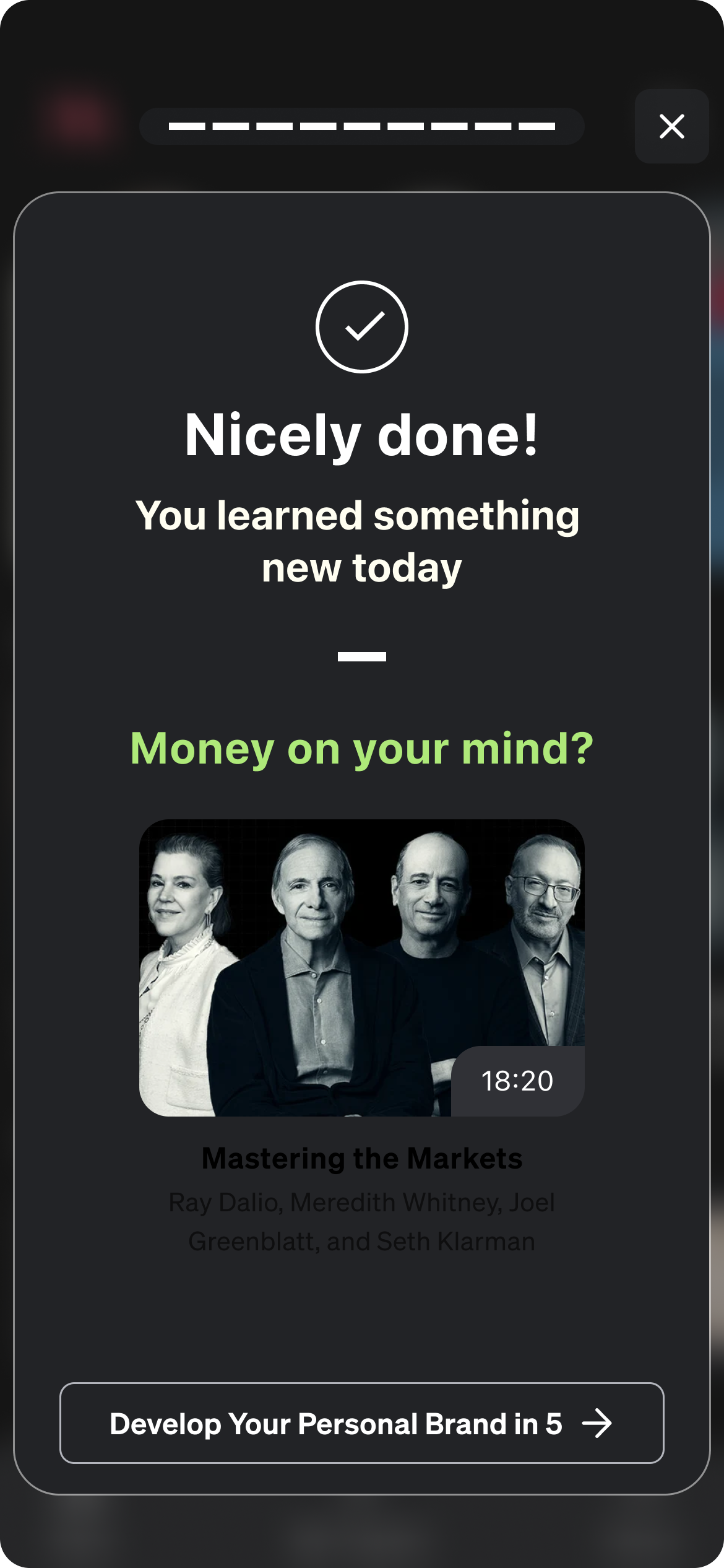
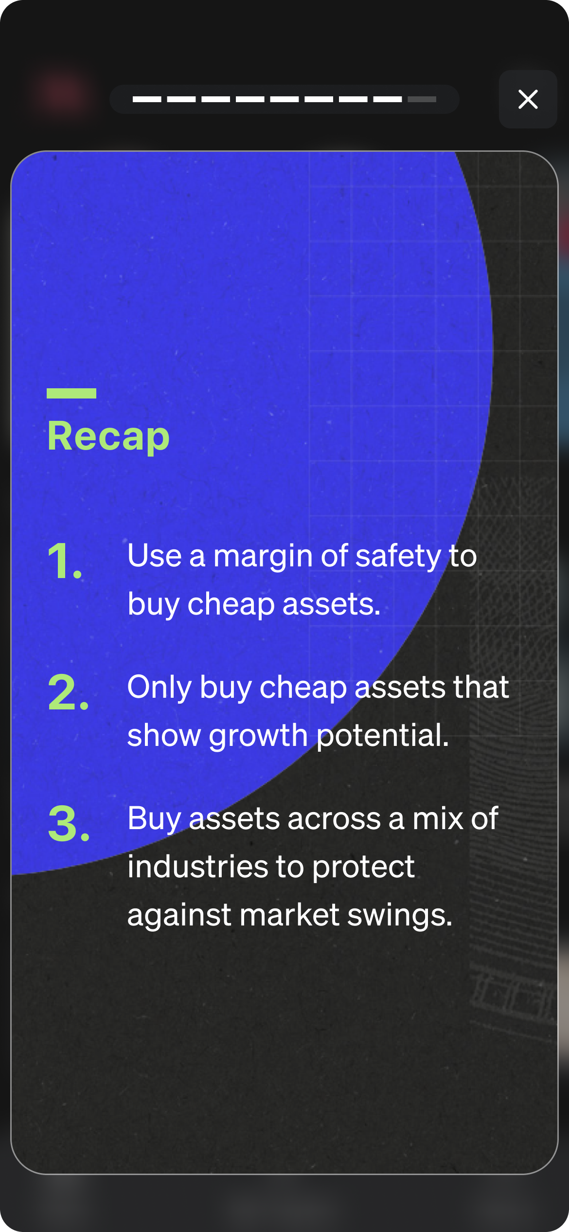
Bite-sized Learnings with Structure 🧠
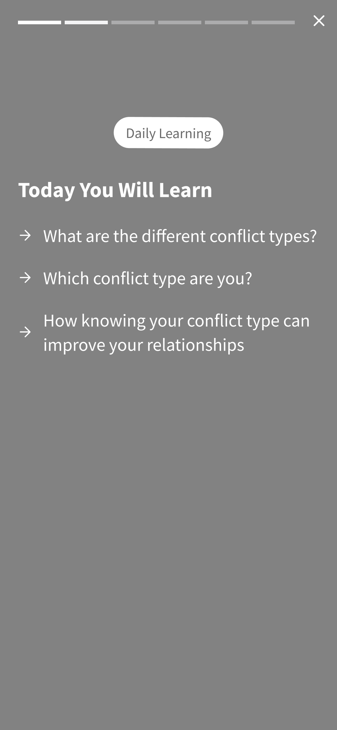
Each 2-Minute learning includes:
Quick introduction to what will be learned
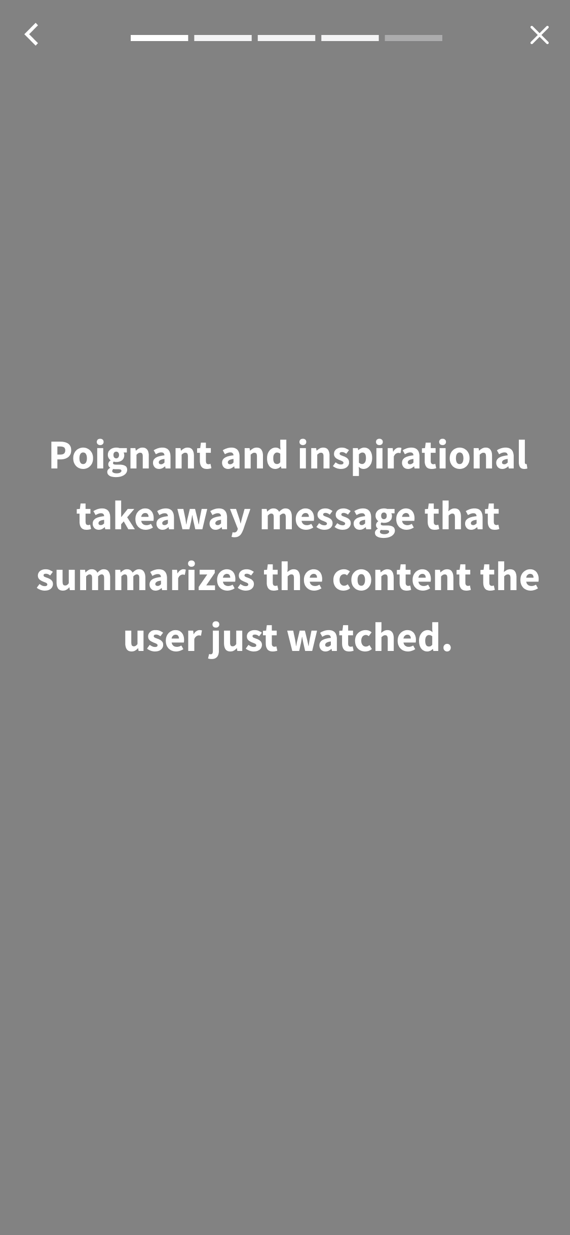
Visually stimulating screens that are easy to skim
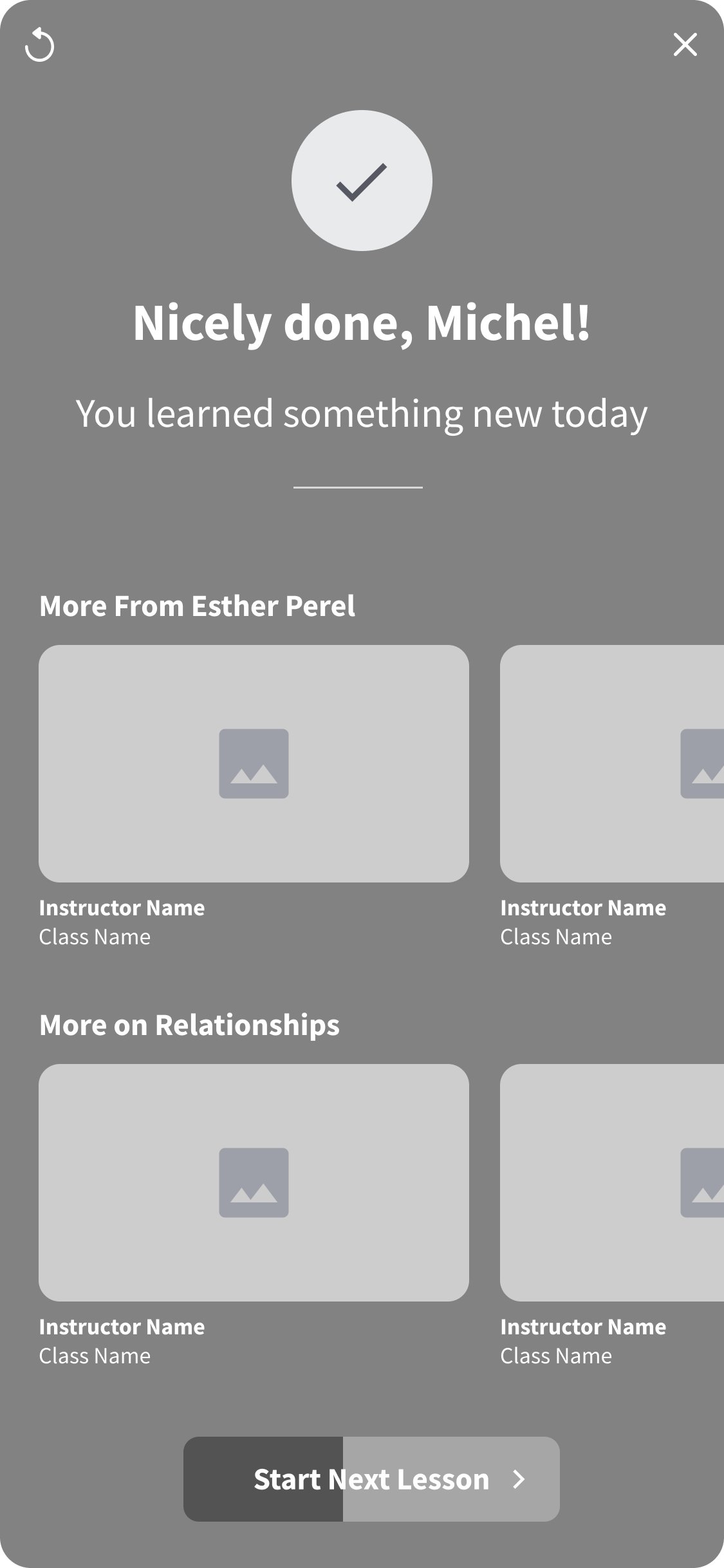
Summary of learnings with a delightful sense of completion
Seamless Interaction 🫥
Each 2-Minute Learning flows into the next which helps keep users learning and eliminates decision fatigue of what to watch next.
Winner
🤑
Winner 🤑
This design won and was productized 🎉
We increased active days by 3%
Increased frequency
📈
Increased frequency 📈
Reflecting on the Process
Once I finished the project, I reflected on what I would have done differently and provided next steps.
REFLECTION
“What would I have done differently?”
I would have connected with our engineers earlier in the process because they were incredibly innovative during this project and had capabilities that I wasn’t aware of at the start of this project. It would have helped have a clearer picture of what was feasible to build.
“What would I do next?”
I would create a more involved learning experience that includes video and checks for learning to make it feel more practical and fun.
View Other Projects

MasterClass 🤖 AI Team
MasterClass 📈 Growth Team