

Designing a new feature to increase traffic.
Apartment List was heavily impacted by a Google algorithm update and needed a feature that would help boost SEO and traffic to our site. We determined that there was a lot of opportunity for keywords associated with a Cost of Living Calculator. Additionally we felt that we could build a calculator that sets us apart from our competitors due to our rental market data.
Client: Apartment List
My Role: Product Designer
Project Time: Three weeks
The Challenge
Design a cost of living calculator for Apartment List that benefits our SEO through keywords and link-building. Leverage our existing market place research to beat our competitors and help users better understand the rental market.
My Role
I worked as the lead product designer on this project. I shared my work in design critiques with our design team and collaborated with stakeholders to build the final product.
Within one month, this solution drove 1,988 new sessions with a 27% registration rate.
Understanding the Problem
In order to better understand the problem space, I conducted competitive analysis, created persona cards, and determined product requirements with our SEO director, Project Manager, and design team.
COMPETITIVE RESEARCH
“What are competitors doing that I can learn from?”
My competitive research focused on Nerdwallet and moneygeek because they have the strongest SEO for Cost of Living Calculators and approach the problem space in different ways.
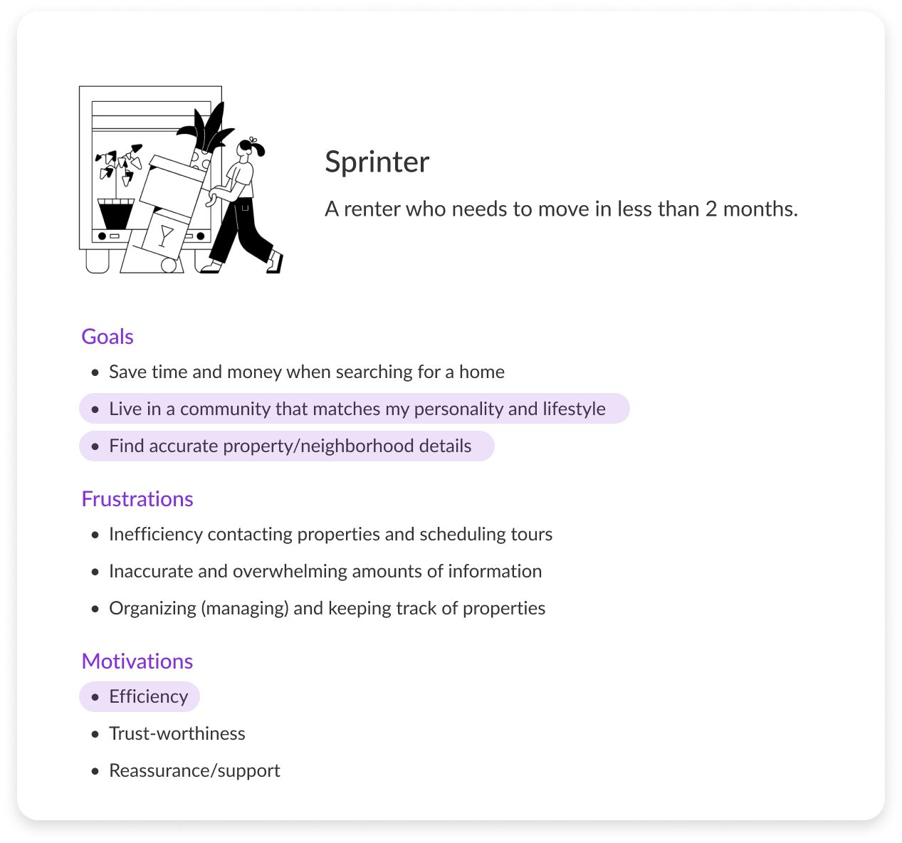
USER PERSONA
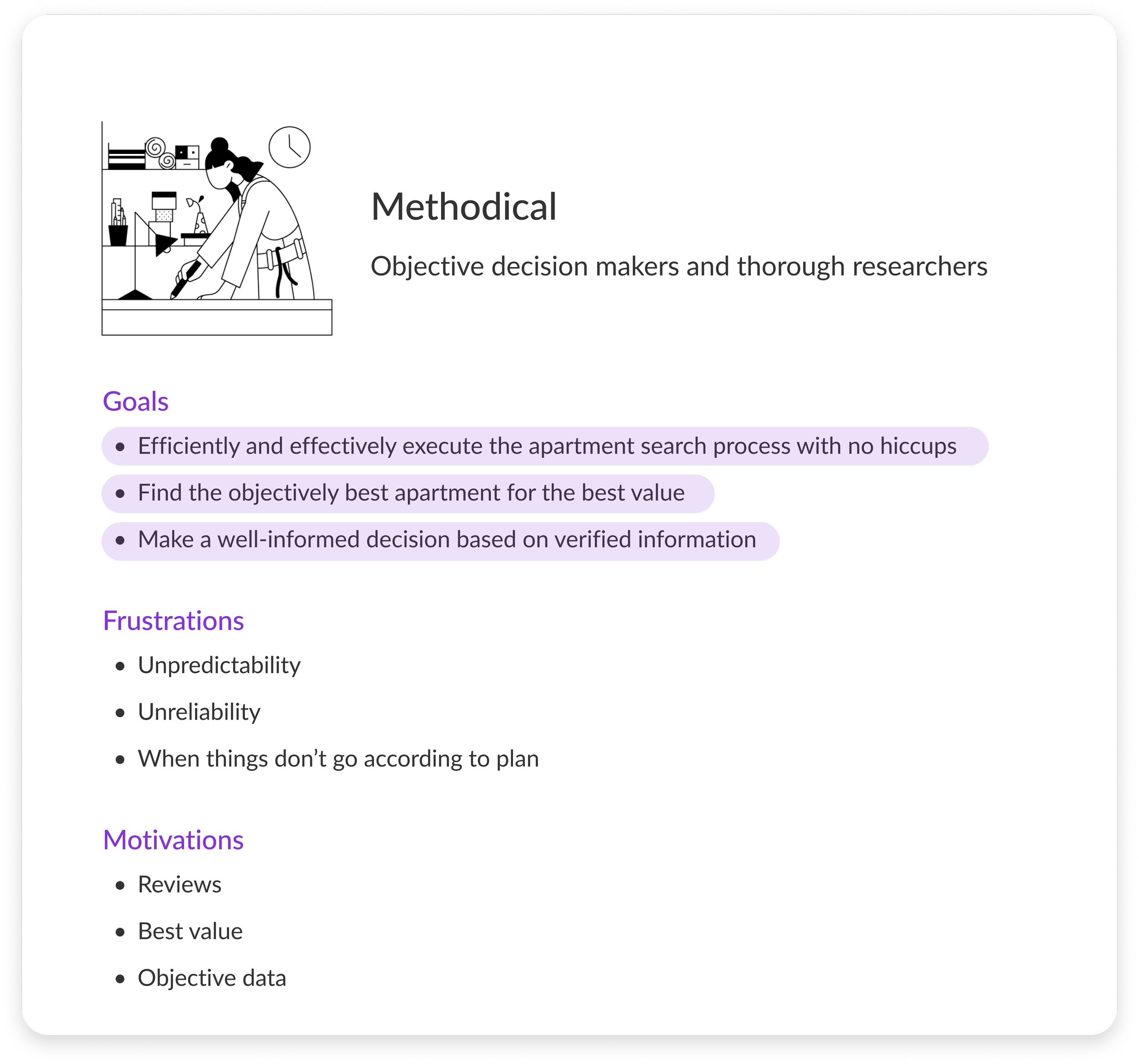
“How can this calculator best serve the needs of our Methodical Sprinter persona?”
In order to better understand our users, I partnered with our Director of User Research to create persona cards that summarize Apartment List’s main users: Methodical Sprinters. Here I have highlighted the traits that are most relevant to this project.
PRODUCT REQUIREMENTS
“What are the product requirements from Design, Product, and SEO?”
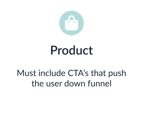
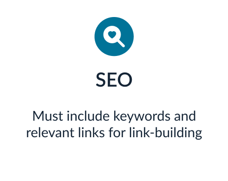
Before exploring designs, I collaborated with all stakeholders to ensure that our solution included the necessary components. Our SEO director, Product Manager, and design team came up with the following requirements:

The User Problem
As a Methodical Sprinter…
I’m considering moving to a different city but I’m not sure if I’m making the right decision because I don’t know how my quality of life will change if I make the decision to move.
As Apartment List…
We want to drive more potential renters to the website, but users don’t click on our links in search results because we rank lower than our competitors on Google.
Building the Solution
After defining the problem I began my design explorations, presented them to our design team, and iterated towards the final product.
DESIGN EXPLORATIONS
“How should the calculator look and feel?”
In these first explorations I focused mostly on including all of the product requirements for this project. These screens are my first attempt at trying to put everything together.
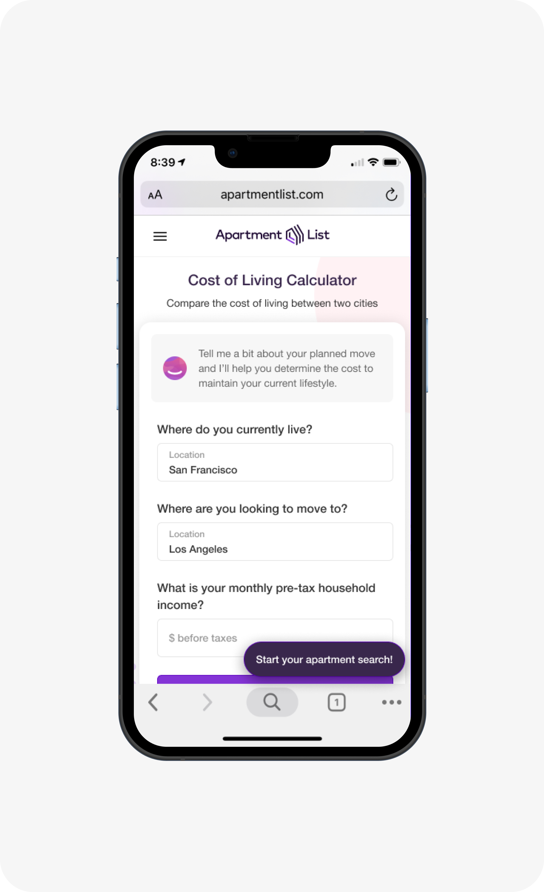
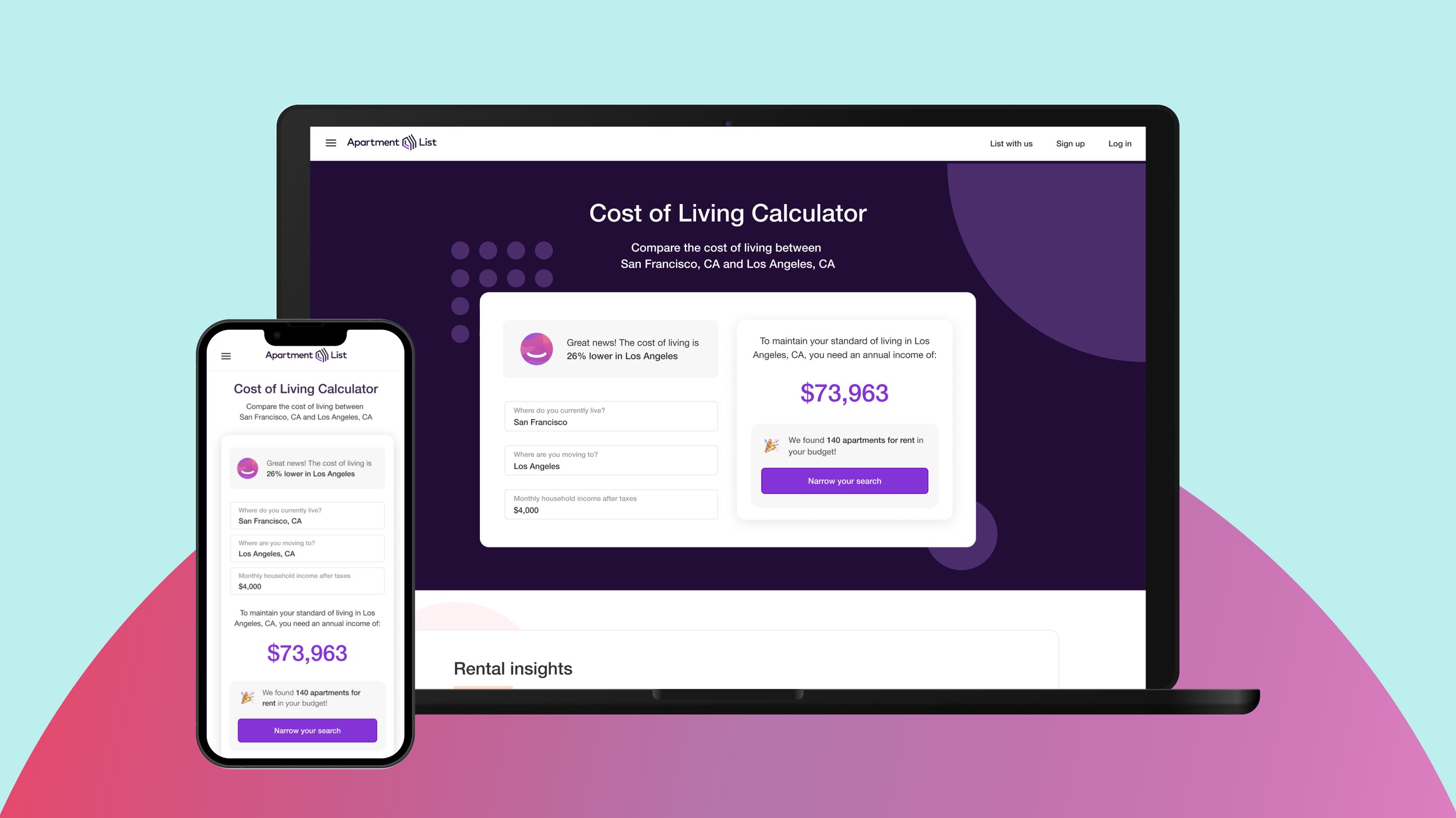
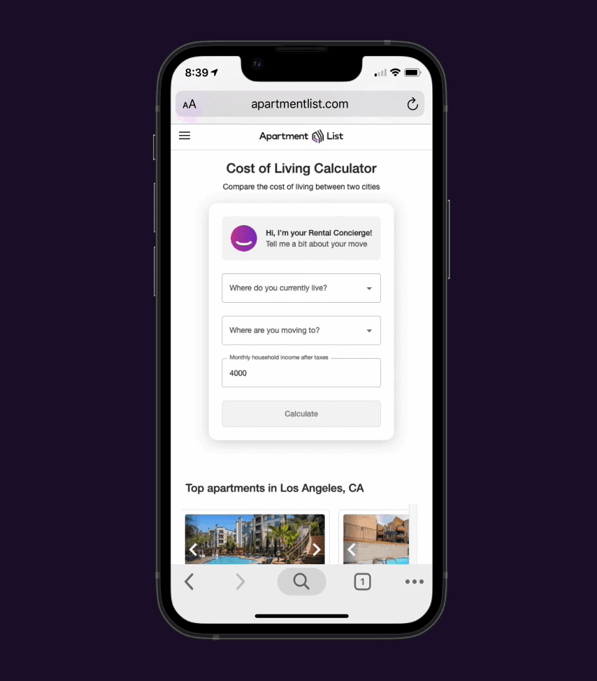
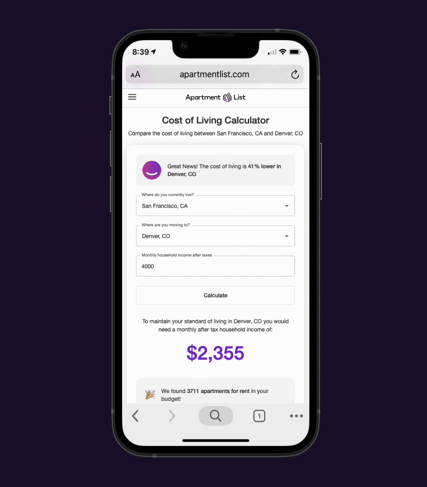
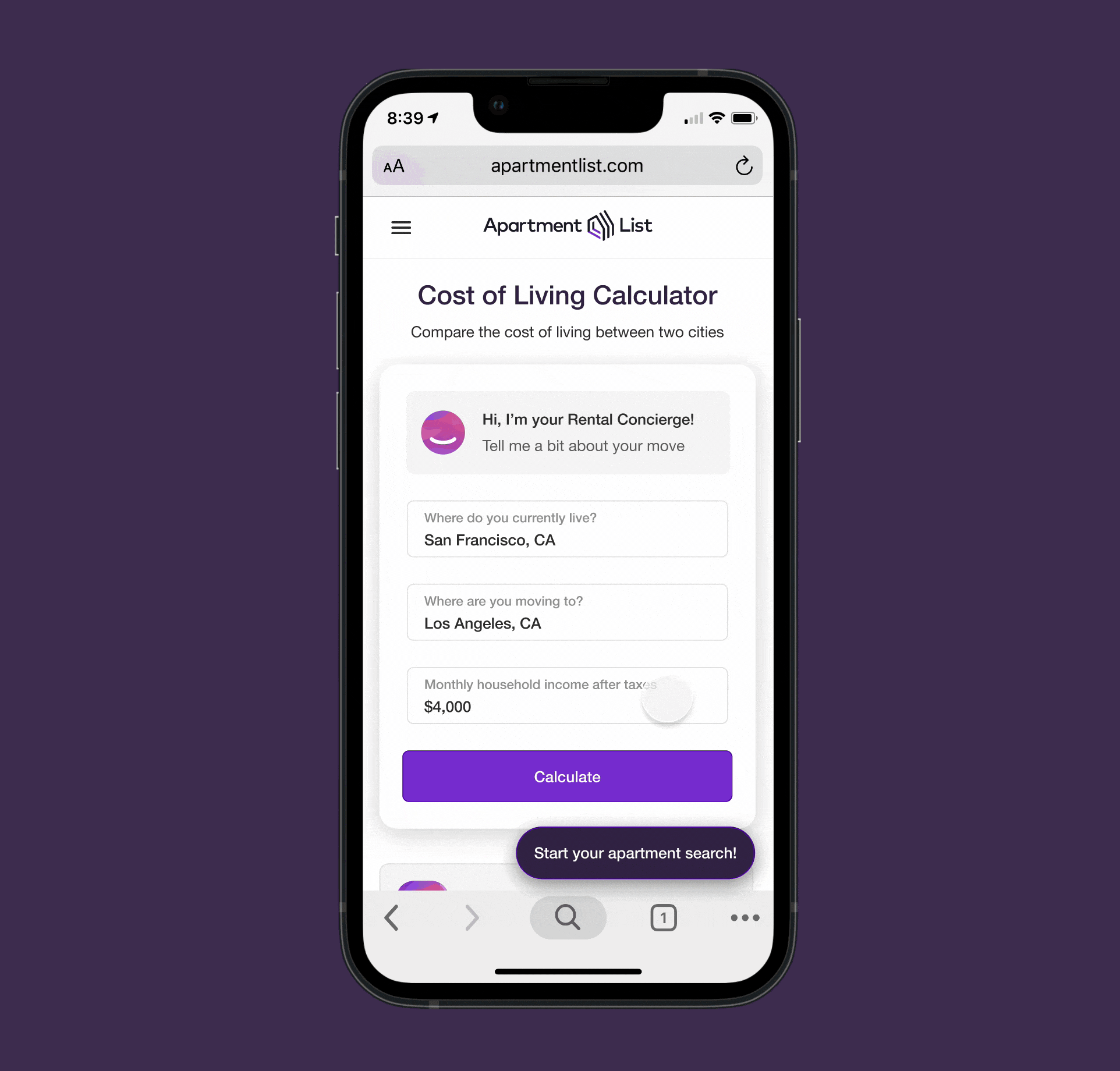
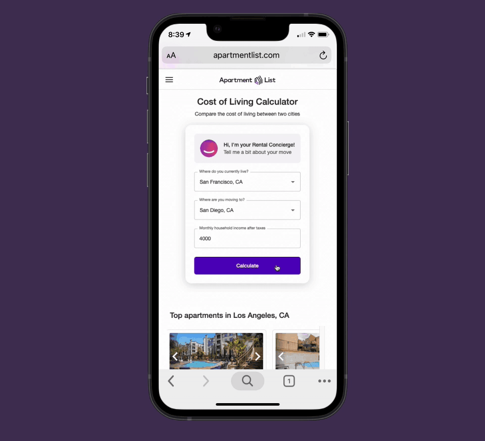
Calculator Landing Page with SEO keywords and headings, FAB to push users down funnel, and introduction to the Rental Concierge.
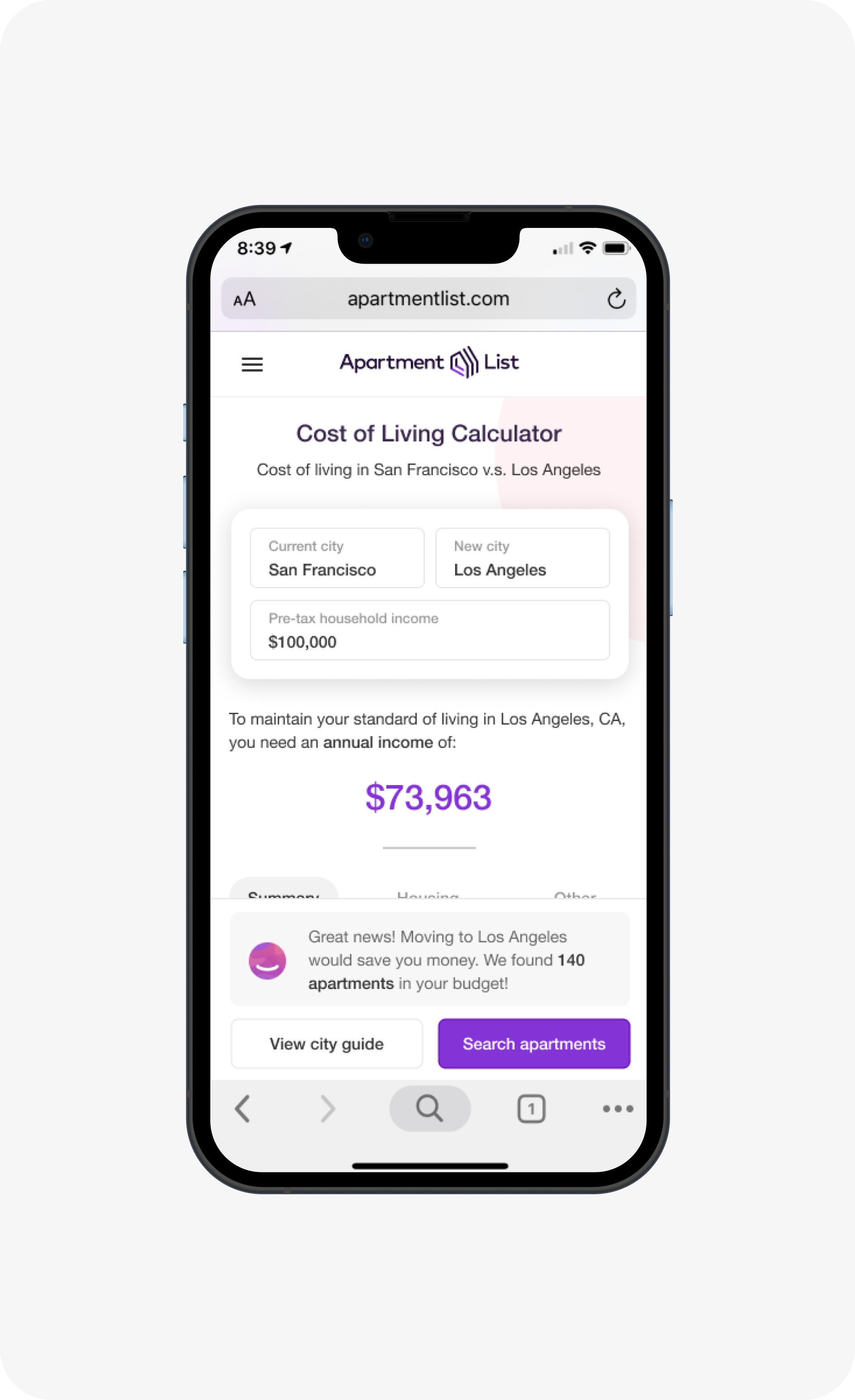
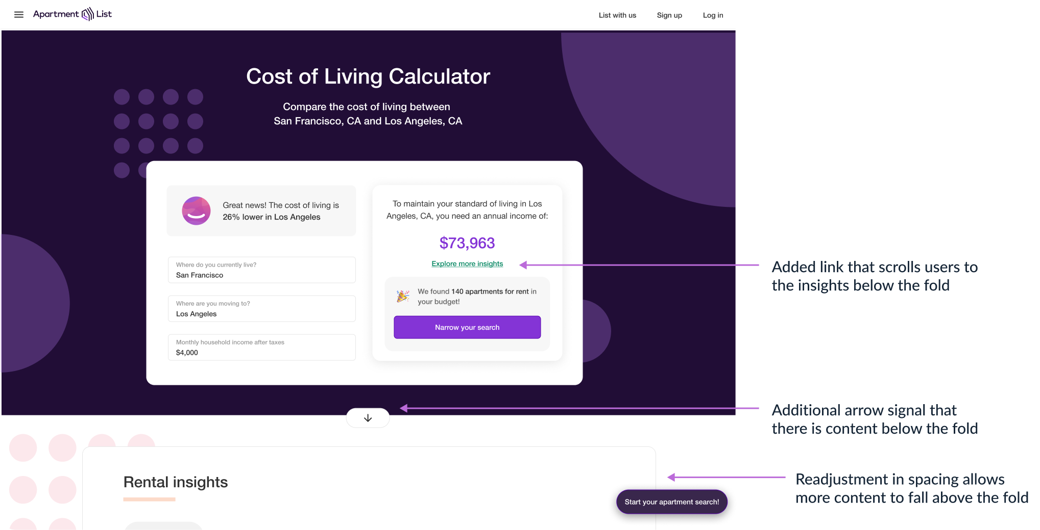
City Comparison Page with SEO keywords and headings, data summarization, and Rental Concierge Banner pushing users down funnel.
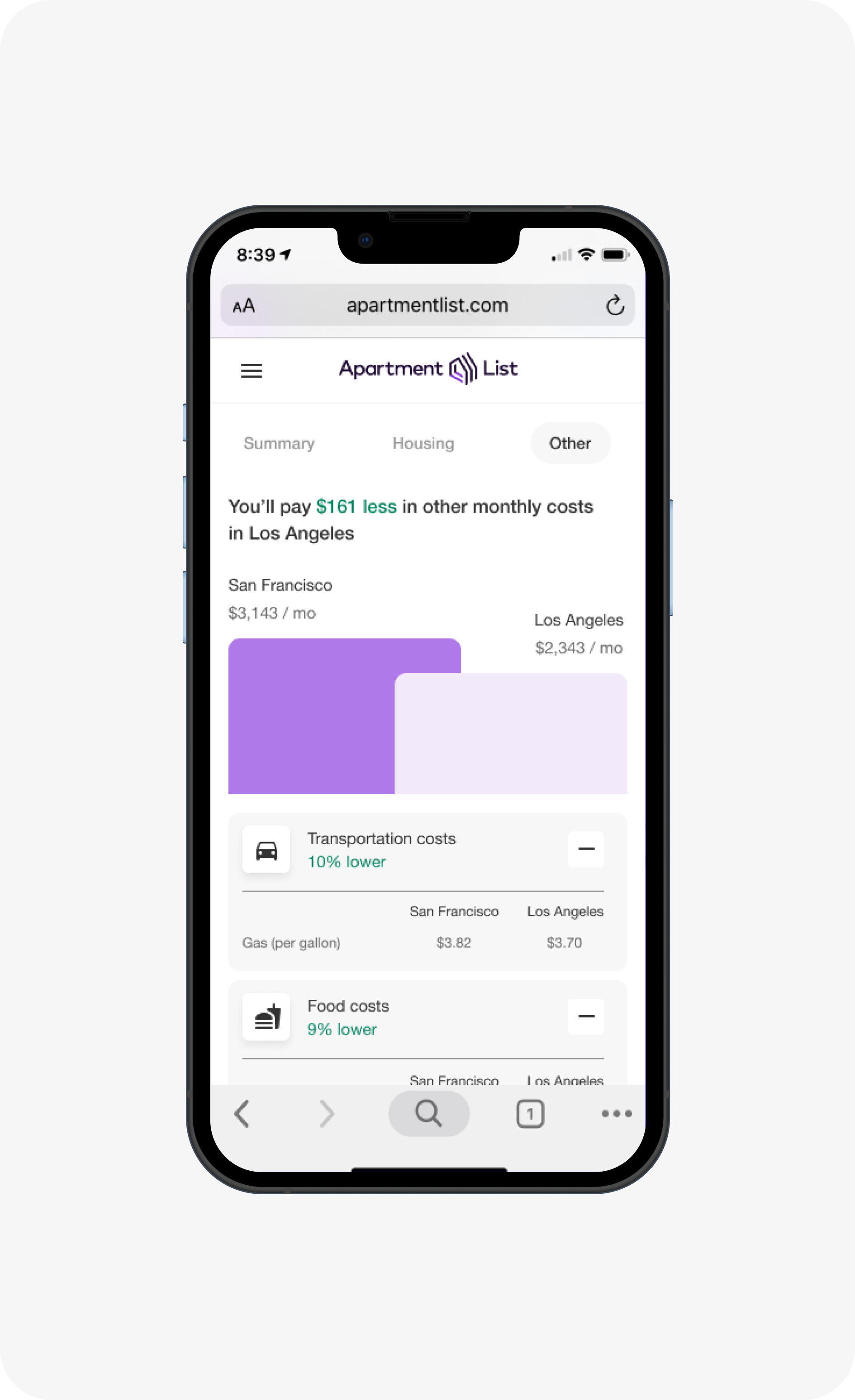
Scroll down City Comparison Page to Insights Section. There is data visualization, side by side cost comparison, and data summarization.
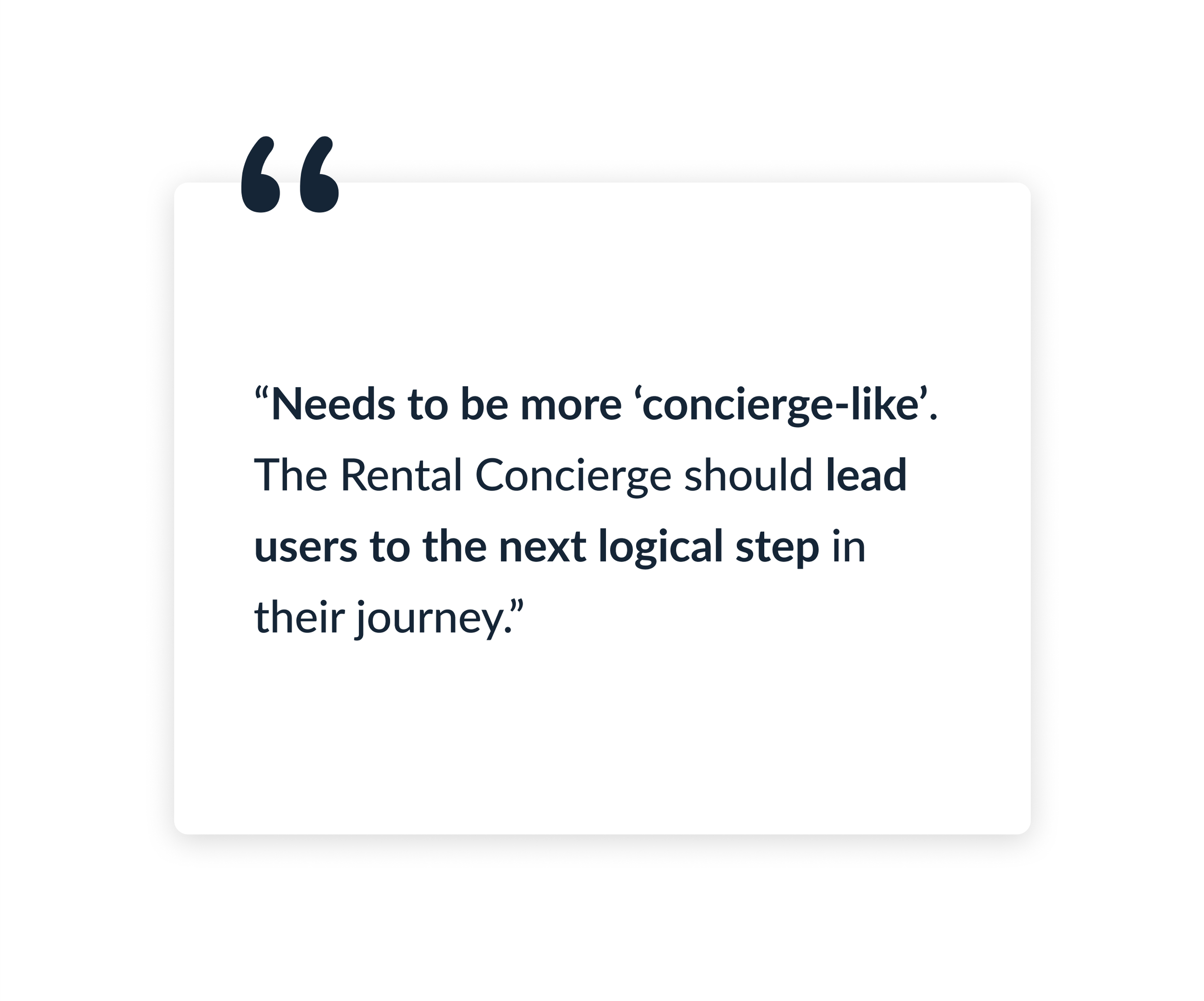
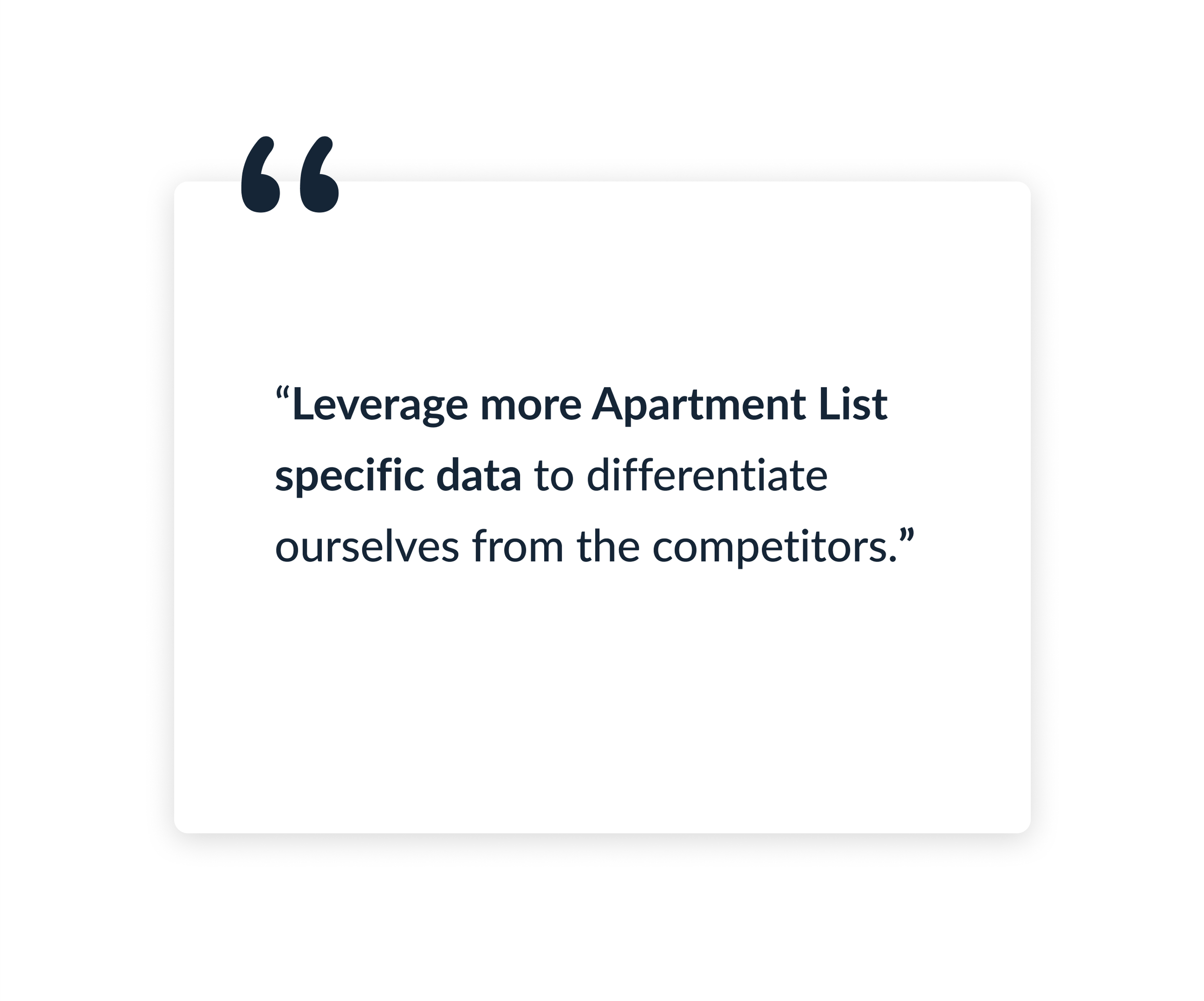
DESIGN FEEDBACK
“How can I improve these designs?”
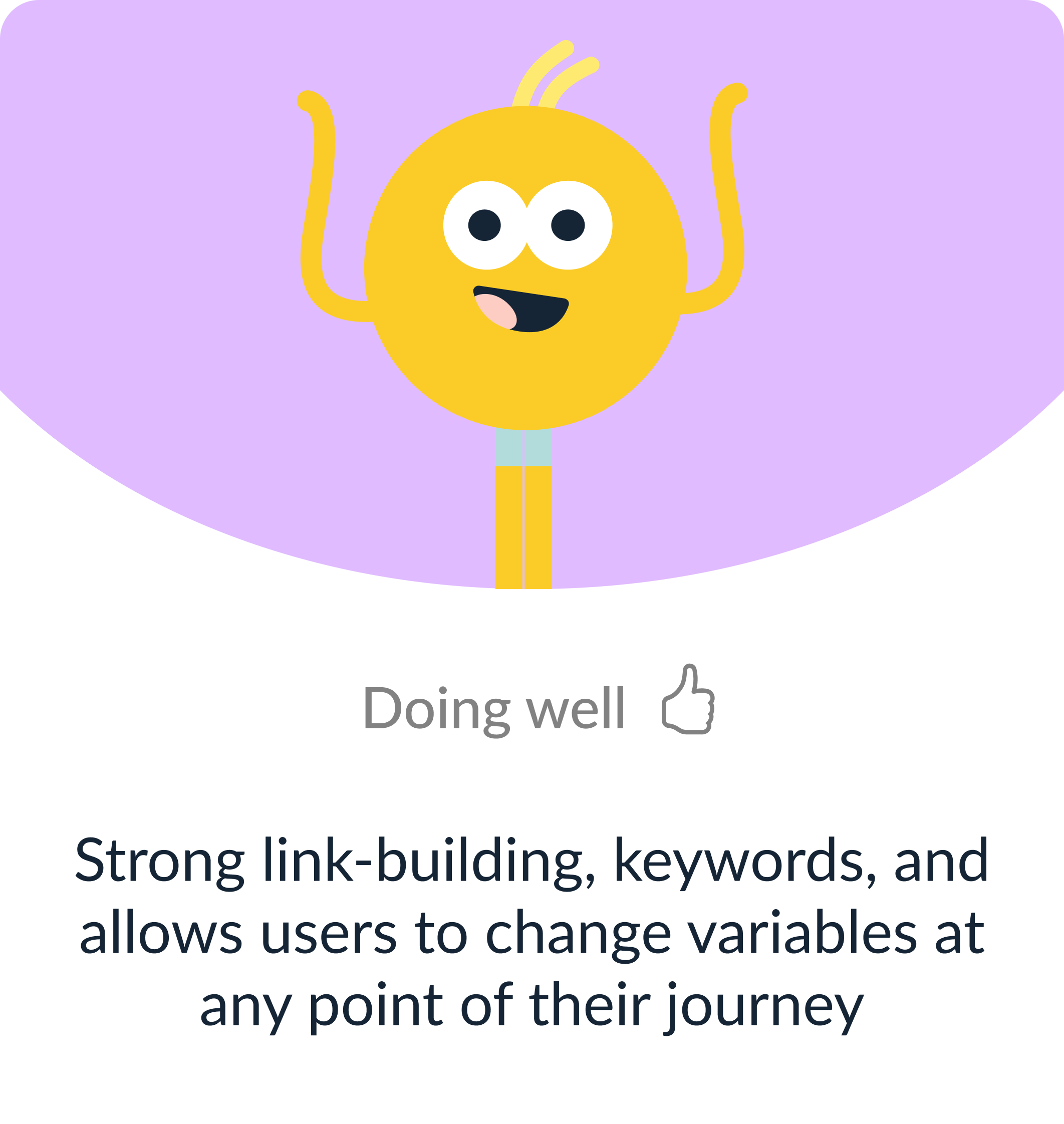
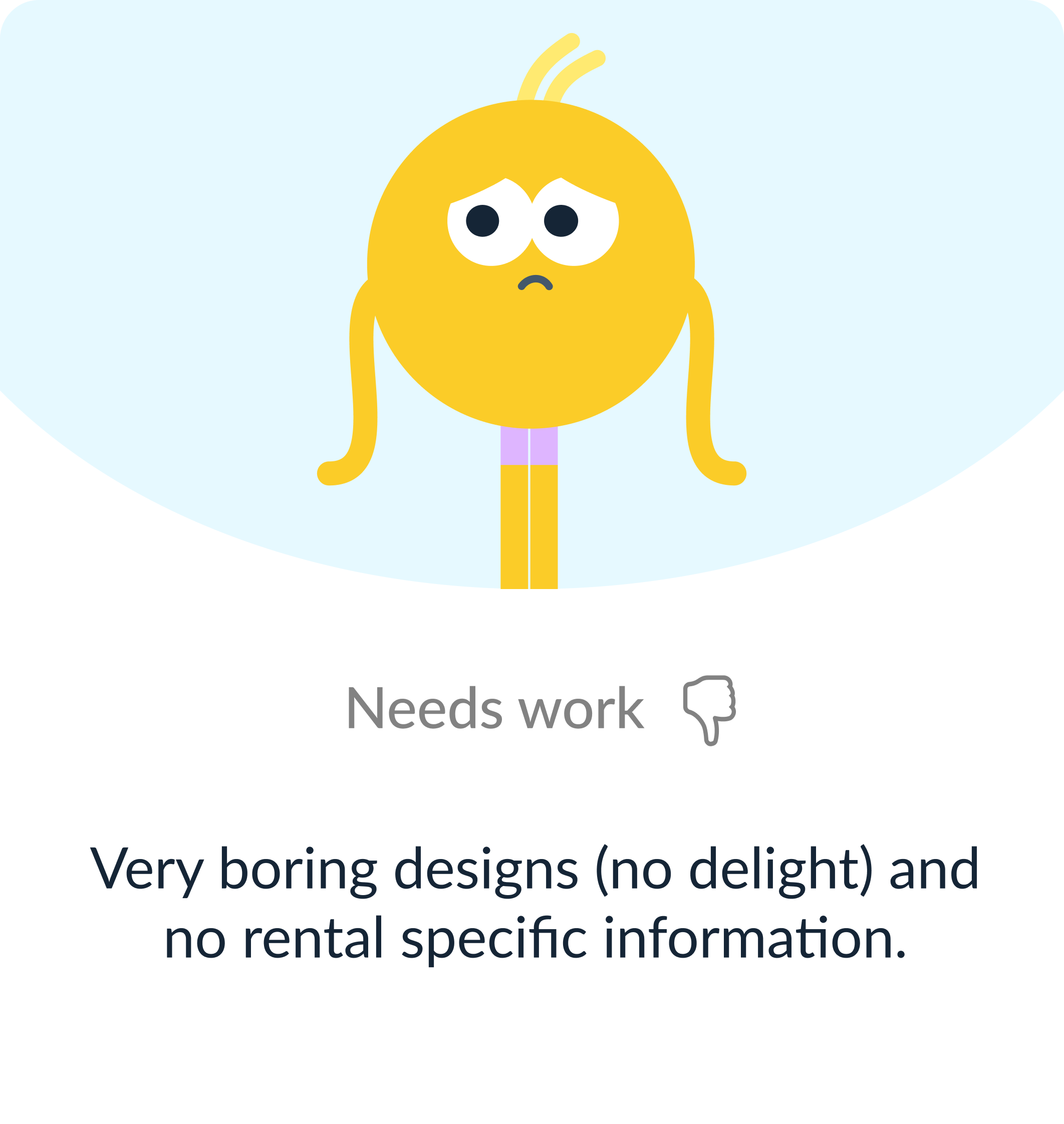
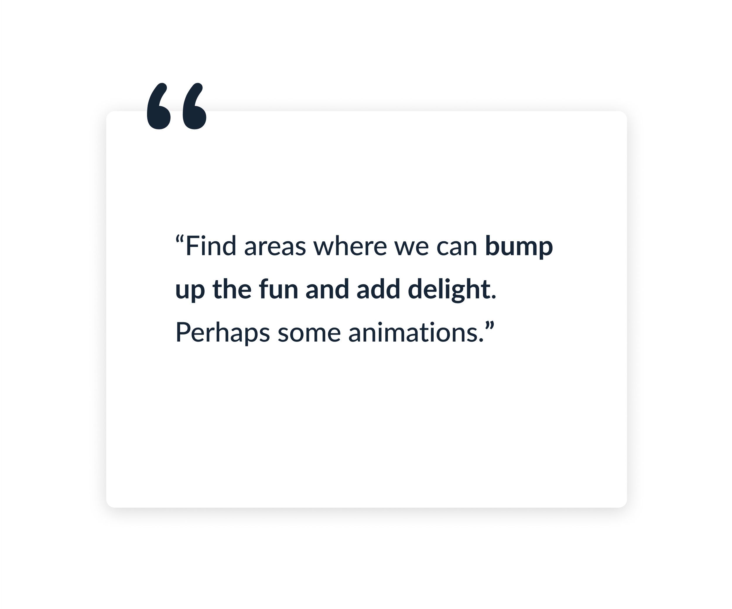
I shared my initial explorations with the design team in our weekly design critique. The majority of the feedback was to imbue more of the calculator with the Rental Concierge, leverage more data, and create moments of delight.
The Solution
After iterating on the feedback, I handed off the designs to our engineering team
SOLUTION REVIEW
“Do these designs meet the product requirements and solve the user problem?”
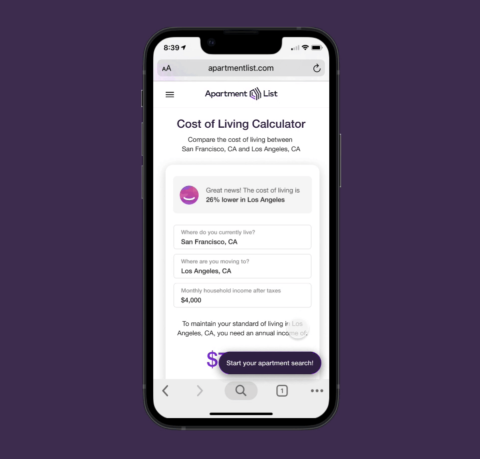
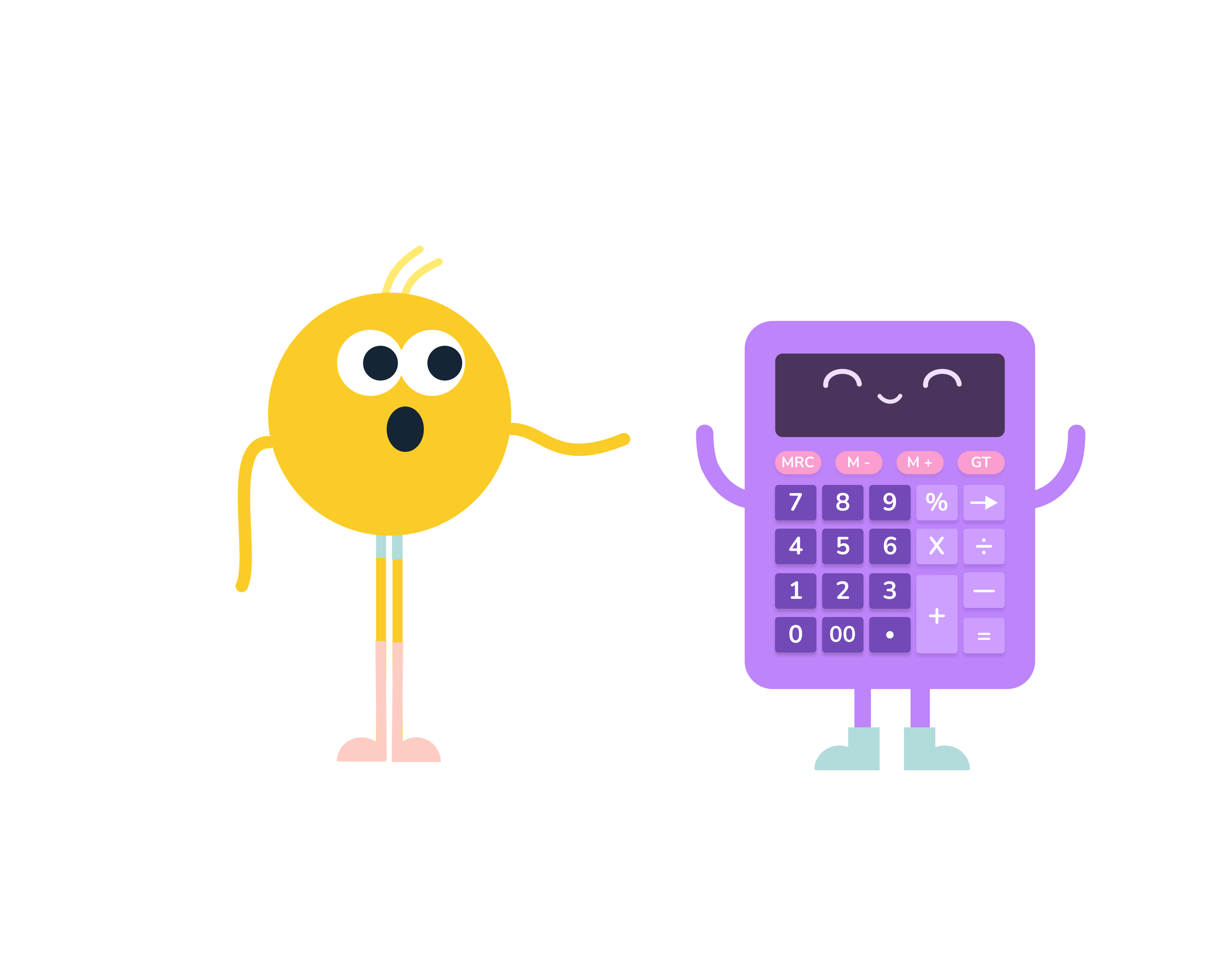
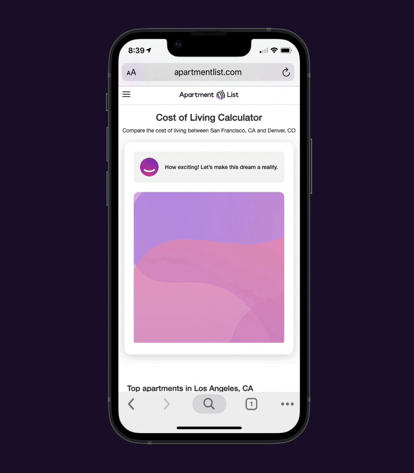
Rental Concierge 🛎️
Our Rental Concierge does the heavy-lifting by:
Summarizing complex data into easily digestible chunks
Suggesting relevant next steps for the user
Recommending properties or new cities for the user
SEO Gains 💪
This calculator is packed full of:
Keywords relevant to common searches for Cost of Living Calculators
Links to our blogs, other city pages, and property pages
Multiple headings and subheadings that can be easily crawled by Google bot to boost our SEO position
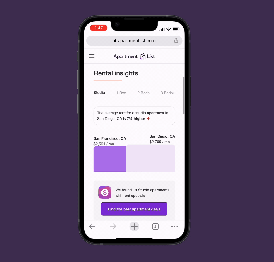
Rental Insights 📈
The calculator utilizes propriety data for the current rates of specific units in each city. None of our competitors have this.
Delight ✨
Although quite practical, this calculator has moments of delight such as:
An animated loading screen
Fun emojis 🎉
Animated data visualizations (deprioritized by product for first milestone)
Testing the Solution
After I built my solution, I conducted usability tests and iterated on my designs based on the feedback that I received.
USABILITY TESTS
“Are there any major usability issues? How can we improve?”
Once the engineers built the calculator, I conducted usability tests on usertesting.com with 12 participants on mobile and computer. The goal of these tests was to determine if there are any major usability issues or bugs that we had missed and also to discover opportunities for iteration in the future.
“I didn’t know that I needed to scroll past the calculator to see more insights.”

“Simple and quick! I loved that I could play around with calculator variables.”

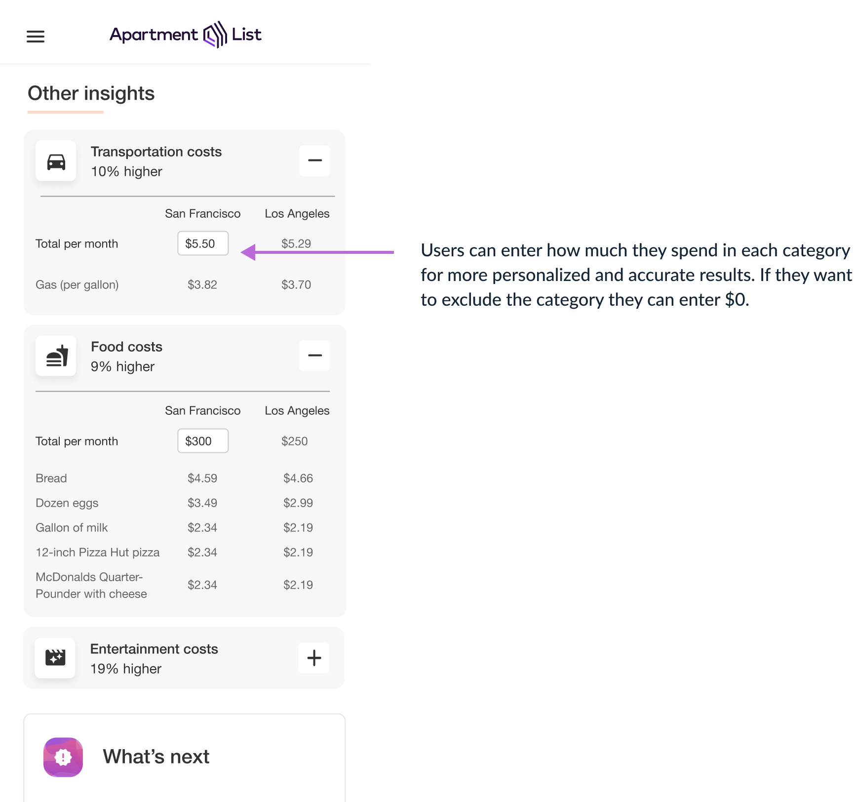
“I wish I could exclude costs that don’t pertain to me!”

PRIORITY REVISIONS
“How can I utilize user feedback to improve my designs?”
After collecting all of the user insights, I prioritized them and iterated on my original designs.
Reflecting on the Process
Once I finished the project, I reflected on what I would have done differently and provided next steps.
REFLECTION
“What would I have done differently?”
I would have broken this project up into smaller milestones. I sprinted in a matter of two weeks to get the final project finished, only for the engineering and product teams to descope a lot of my work. I wish that I had delivered a simpler V1, see how it tested, and then invested time iterating that was more focussed on usability tests.
“What would I do next?”
I would run a test with the new iterations based on our usability tests.
Iterate on how to make the “monthly income after taxes” step easier for users since several people experienced some friction at that step
View Other Projects

MasterClass 🤖 AI Team
MasterClass 📈 Growth Team